How cyborggirll Made This Talking Head Thumbnail AI Portrait — and How to Recreate It
This image works because it promises clarity. It does not try to shock the viewer or overwhelm them with design. Instead, it uses one calm face, one microphone, one short lead-in phrase, and one soft room to say: you are about to understand something. That is a powerful promise in short-form educational content.
The Core Hook
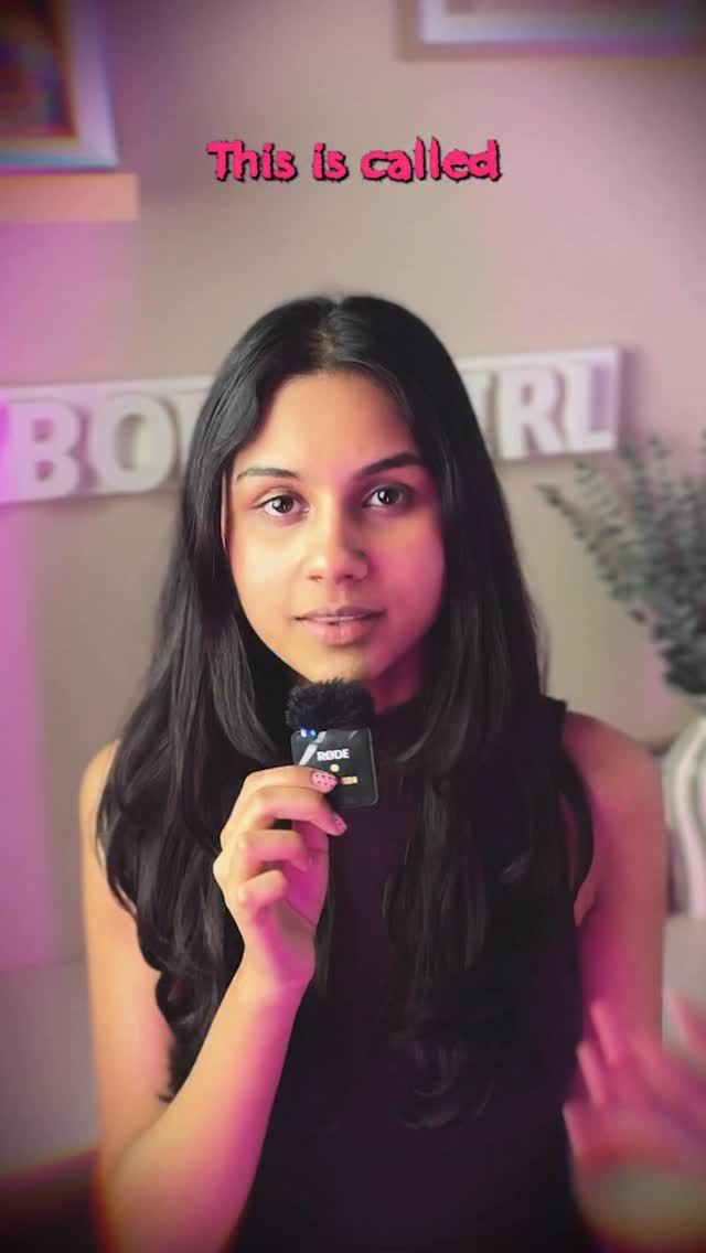
The strongest hook is the unfinished definition. “This is called” creates a knowledge gap immediately. The viewer instinctively wants the phrase completed. That makes the image effective even though it is visually simple. The face and microphone then confirm that the answer will be spoken clearly by a person, not hidden inside a dense graphic.
This kind of frame performs well because it converts curiosity into trust instead of curiosity into chaos. The viewer feels invited, not pressured. That is often better for educational and concept-first content.
Signal Table
| Signal | Evidence (from this image) | Mechanism | Replication Action |
|---|---|---|---|
| Knowledge gap | The top line begins a definition without finishing it | Partial language activates curiosity and completion bias | Use definition-fragment text when the content is concept-driven |
| Human clarity | The speaker is centered, clear, and looking directly at the viewer | Direct eye contact increases perceived trust and comprehension | Keep the explainer’s face large and readable in the center of the frame |
| Soft educational tone | The room is warm and calm, not institutional or aggressive | Gentle environments lower resistance to learning content | Use a soft creator-room backdrop for approachable educational framing |
| Format cue | The handheld microphone signals spoken explanation | Format cues reduce ambiguity about what kind of content this is | Include one clear prop that supports explanation or commentary |
| Minimal friction | The frame has almost no competing objects or overlays | Low visual noise makes the message easier to absorb quickly | Reduce all secondary elements unless they strengthen the definition hook |
Aesthetic Read
This is a strong example of soft-education visual language. It does not rely on corporate slides, textbook visual cues, or highly produced studio polish. Instead, it borrows the intimacy of creator media and uses that intimacy to make explanation feel human.
The slight pink-magenta cast on the frame gives it just enough digital personality to feel native to short-form platforms. That is important. The image remains serious enough to teach, but casual enough to fit a scroll-heavy environment.
Where This Format Transfers Well
This structure works for vocabulary explainers, psychology terms, design principles, AI concepts, dating-language breakdowns, cultural definitions, finance basics, and any other format where the goal is to introduce a phrase and make it feel understandable within seconds.
The transferable principle is simple: use a calm human face plus an incomplete teaching phrase to create a low-pressure curiosity loop.
Prompt Technique Breakdown
| Prompt chunk | What it controls | Swap ideas (EN, 2–3 options) |
|---|---|---|
| young woman with a handheld mic | Creates a trusted human explanation source | founder with a recorder mic; student with a small interview mic; coach holding a lapel mic |
| small top definition fragment | Generates curiosity and sets the educational mode | “this means”; “people call this”; “this term is” |
| warm blurred creator room | Keeps the frame approachable and intimate | soft office corner; lamp-lit bedroom desk; apartment creator nook |
| centered chest-up composition | Maximizes face readability and thumbnail performance | slightly tighter face crop; seated mid-shot; face-plus-gesture crop |
| soft platform-native polish | Connects the frame to Reels and TikTok aesthetics | subtle RGB edge fringe; light VHS softness; mild warm digital bloom |
Remix Playbook
Lock four elements first: one centered face, one speaking prop, one incomplete teaching phrase, and one warm uncluttered room. These create the entire educational promise of the frame. Once they are stable, you can adapt the format across many knowledge niches without losing consistency.
Use a one-change rule for iteration. Change only the phrase type, or the room tone, or the speaker energy, or the content category. For example, keep the same composition and lighting, but switch from psychology terms to startup jargon. Or keep the phrase structure and mic, but move from a warm room to a cooler office-like setting for a more serious tone. Controlled changes make the format repeatable and recognizable.
If a version feels too plain, improve the phrase and facial clarity before adding design elements. If it feels too crowded, remove overlays and trust the face plus the text fragment. The best result should feel like the clean first second of understanding something new.