How cyborggirll Made This If You Talking Head Thumbnail Breakdown — and How to Recreate It
This image works because it understands a core rule of short-form content: curiosity often beats completeness. Instead of over-explaining the topic inside the thumbnail, it gives the viewer a human face, a speaking gesture, and an unfinished text fragment. That is enough to create tension without exhausting the click.
Why the Simplicity Helps
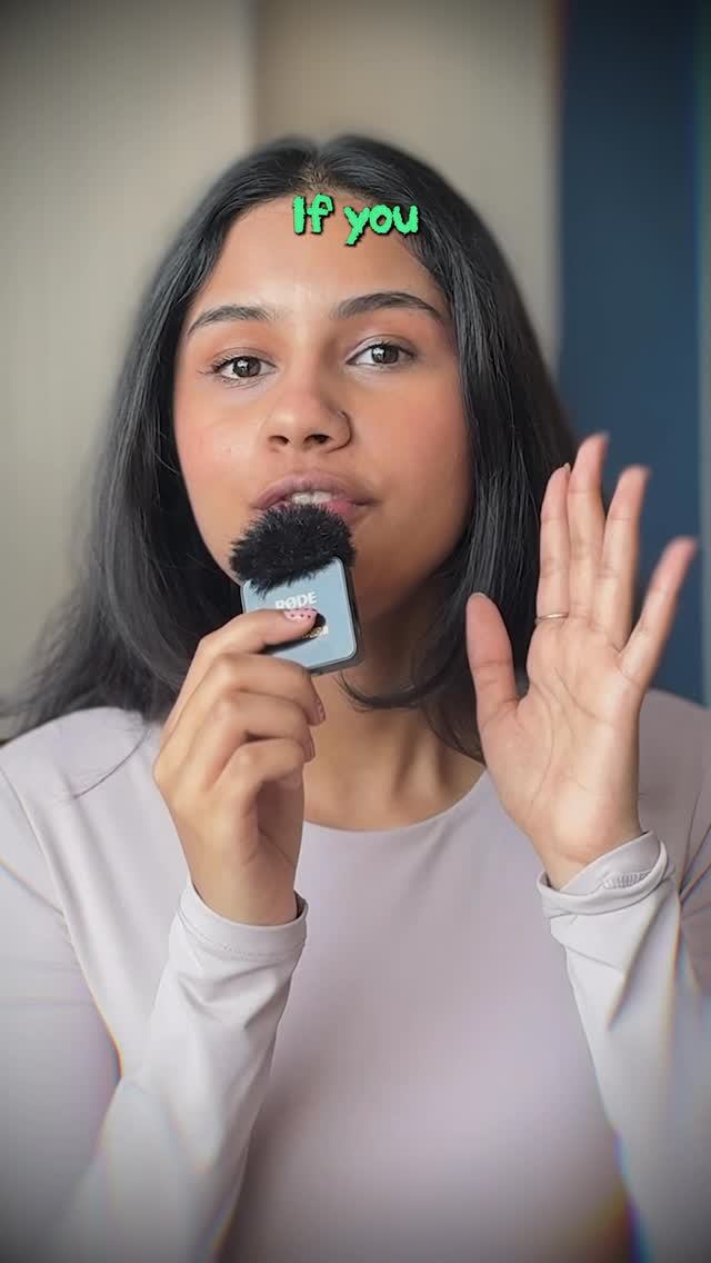
The most powerful element here is not design complexity. It is restraint. There is no crowded interface card, no stacked promises, no giant statistic, and no elaborate set. The creator is the message. The viewer sees a face, a microphone, and a hand raised mid-explanation, which immediately reads as “I have something important to tell you.”
The small “If you” headline is especially effective because it opens a sentence the viewer mentally wants to finish. That kind of incomplete phrasing is one of the oldest and most reliable mechanisms in click-driven content design.
Signal Table
| Signal | Evidence (from this image) | Mechanism | Replication Action |
|---|---|---|---|
| Direct eye contact | Speaker looks straight into camera | Direct gaze creates immediacy and trust | Center the creator and align the eyes with the viewer whenever possible |
| Authority prop | Visible handheld microphone | Mic suggests explanation, advice, or insider knowledge | Include one tool that signals the speaker is actively delivering content |
| Open-loop headline | Only “If you” appears at the top | Incomplete statements trigger curiosity and anticipation | Use partial hooks that invite the viewer to finish the thought |
| Gesture emphasis | Raised hand beside the face | Gestures add urgency and conversational realism | Capture one speaking gesture to make the still frame feel alive |
| Low-friction background | Soft indoor blur with no major distractions | Minimal setting keeps attention on face and message | Remove environmental noise so the face and text do the work |
Aesthetic Read
This kind of image is platform-native in the best way. It does not pretend to be a cinematic poster or a polished corporate ad. It looks like what it is: a creator speaking directly to an audience in a personal, low-barrier format. That authenticity is part of the appeal.
The subtle chromatic distortion around the edges adds just enough modern feed energy to keep the frame from feeling plain. It supports the thumbnail rather than dominating it. That is the right balance for minimal short-form covers.
Prompt Technique Breakdown
| Prompt chunk | What it controls | Swap ideas (EN, 2–3 options) |
|---|---|---|
| “young woman creator in a tight medium close-up speaking directly to camera” | Main subject clarity and emotional proximity | “talking-head creator portrait”, “close-up explainer host”, “direct-to-camera educator frame” |
| “holding a compact handheld microphone” | Authority and content-delivery signal | “portable mic visible”, “creator mic near the mouth”, “interview-style handheld audio prop” |
| “minimal headline text placed at the top reading ‘If you’” | Hook design and open-loop tension | “partial curiosity headline”, “unfinished sentence starter”, “micro-hook title” |
| “vertical mobile-video cover format” | Platform-native composition | “Reels cover layout”, “TikTok-style portrait frame”, “Shorts thumbnail crop” |
| “minimal creator-economy cover design” | Overall visual discipline | “simple social content cover”, “clean personal-branding thumbnail”, “direct creator promo frame” |
Why This Formula Is Reusable
This kind of talking-head cover is extremely reusable because it is built on one of the most durable attention formulas online:
1. One clear face.
2. One conversational gesture.
3. One authority prop.
4. One unfinished promise.
5. One clean background.
That structure works across education, marketing, AI tutorials, coaching, lifestyle content, and personal-brand commentary. The exact topic can change, but the attention mechanics stay effective.
Remix Playbook
Hook remix: switch “If you” to “Before you,” “Don’t do this,” “Nobody tells you,” or “Stop scrolling if...”
Gesture remix: point upward, pinch fingers for precision, hold up one finger, or lean in with an open palm.
Tone remix: make the image warmer and friendly, sharper and urgent, calmer and expert, or more playful with expression and text color.
Prop remix: swap the mic for a phone, notebook, tablet, or headphones if the content niche changes.
Platform remix: adapt the same core image for a carousel opener, webinar invite, story slide, or YouTube Shorts cover.
Execution Advice
The easiest way to weaken a thumbnail like this is to overcompensate for simplicity by adding too much text or too many decorative graphics. That usually reduces curiosity rather than increasing it. The strength of this image is that it leaves just enough unsaid.
If you want similar covers to perform well, focus on unfinished language and visible human delivery. A thumbnail like this should feel like the first half-second of a conversation. When viewers sense that the next sentence matters, they are much more likely to click.