How cyborggirll Made This iPhone Tech Tracking Poster Breakdown — and How to Recreate It
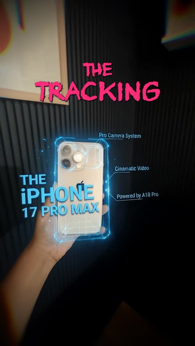
This image works because it understands how short-form tech content is actually consumed. It does not try to look like a billion-dollar keynote stage. Instead, it starts with a believable handheld phone shot, then wraps that shot in glowing HUD graphics, quick spec labels, and aggressive title typography. That combination creates a product-launch feeling without needing a real launch-budget visual system.
The Attention Mechanism
The strongest thing here is the contrast between the base image and the overlay language. The base is simple: one hand, one phone, dark room, real-world capture. The overlay does the heavy lifting. Blue holographic outlines and right-side labels imply technical authority, while the rough pink headline adds social-video urgency. Together, they tell the viewer: “this is a product reveal, but in creator-native language.”
That matters because polished corporate design often underperforms in feed environments where viewers are used to creator-made explainers, leaks, comparisons, and hype edits. This format feels more native to scrolling platforms, which makes it easier to stop on.
Signal Table
| Signal | Evidence (from this image) | Mechanism | Replication Action |
|---|---|---|---|
| Real-world product proof | The phone is physically held in one hand instead of floating in a render void | Tangible realism makes the teaser feel immediate and believable | Use a real handheld product base before adding design layers |
| Tech authority cue | Blue HUD frame and spec callouts surround the device | Annotation graphics imply expertise and feature depth | Add 2-4 focused labels rather than cluttering the entire image |
| Scroll-stopping title energy | The top headline uses rough pink lettering with a hype-post feel | Texture and contrast turn the title into an emotional hook | Use one loud headline style that feels creator-native, not corporate-smooth |
| Dark-stage focus | The background is dim and mostly featureless | Low distraction pushes the eye toward the phone and overlays | Keep the room dark and texturally simple |
| Premium DIY mood | The composition feels designed but still rooted in a real handheld shot | That hybrid tone matches how modern creator tech content spreads | Balance one clean product object with one layer of stylized post-production |
Aesthetic Read
The image sits in a useful lane between leak culture, mock keynote art, and social promo thumbnail design. The dark wall texture gives it enough seriousness to feel intentional, while the graphics keep it from becoming just another phone-in-hand photo. This is important: the format does not require perfect realism, but it does require a believable object and believable framing.
The blue HUD treatment is especially effective because it hugs the phone instead of floating randomly in space. That makes the graphics feel attached to the object rather than pasted over it. When creators want this style to work, alignment matters more than complexity.
Where This Format Transfers Well
This structure transfers well to laptops, cameras, gaming handhelds, headphones, smart glasses, and even software feature teasers shown on a screen. The reusable principle is simple: start with a grounded hardware shot, then add just enough interface theater to imply value, speed, and expertise.
It also works outside hardware. You can use the same composition logic for app-feature reveals, AI tool demos, and side-by-side “spec comparison” posts as long as the base object remains legible and central.
Prompt Technique Breakdown
| Prompt chunk | What it controls | Swap ideas (EN, 2–3 options) |
|---|---|---|
| one hand holding a flagship phone | Creates physical realism and instant product focus | hand holding a compact camera; hand lifting wireless headphones; hand presenting a gaming handheld |
| blue holographic HUD around the device | Adds the high-tech promotional wrapper | green diagnostic overlay; red gaming UI shell; white minimalist product wireframe |
| dark acoustic-panel background | Provides low-cost depth without distracting scenery | black foam wall; dim studio curtain; matte charcoal wall with soft blur |
| rough pink title plus cyan product text | Defines the creator-native hype tone | acid yellow urgency headline; silver minimalist title; bold red breaking-news strip |
| hybrid real photo plus motion-graphics polish | Keeps the image between realism and promo stylization | leak-poster vibe; YouTube thumbnail polish; futuristic app-launch promo |
Remix Playbook
Lock four things first: one central object, one real handheld perspective, one dark uncluttered room, and one graphic overlay system. Those are the structural pieces that make this format legible in a feed. Once they are stable, you can vary headline tone, object category, or UI color without losing the template.
Use a one-change rule for iteration. Change only the product type, or the overlay color, or the title mood, or the environment texture. For example, keep the same dark room and hand pose, but switch from a phone teaser to a camera body reveal. Or keep the phone and layout, but convert the blue HUD into an all-white industrial wireframe system. Controlled variation will always outperform random graphic stacking.
If the result starts feeling too cheap, improve alignment and spacing before adding more effects. If it starts feeling too sterile, roughen the headline or lower the room polish. The best version feels like a creator built a launch poster overnight and somehow made it look expensive.