How cyborggirll Made This This Effect Is Called Thumbnail Breakdown — and How to Recreate It
This image works because it turns a tutorial promise into an open loop. Instead of naming the effect immediately, it pauses right before the answer. That small delay is enough to make the viewer mentally lean forward, especially when the image already signals that an explanation is coming.
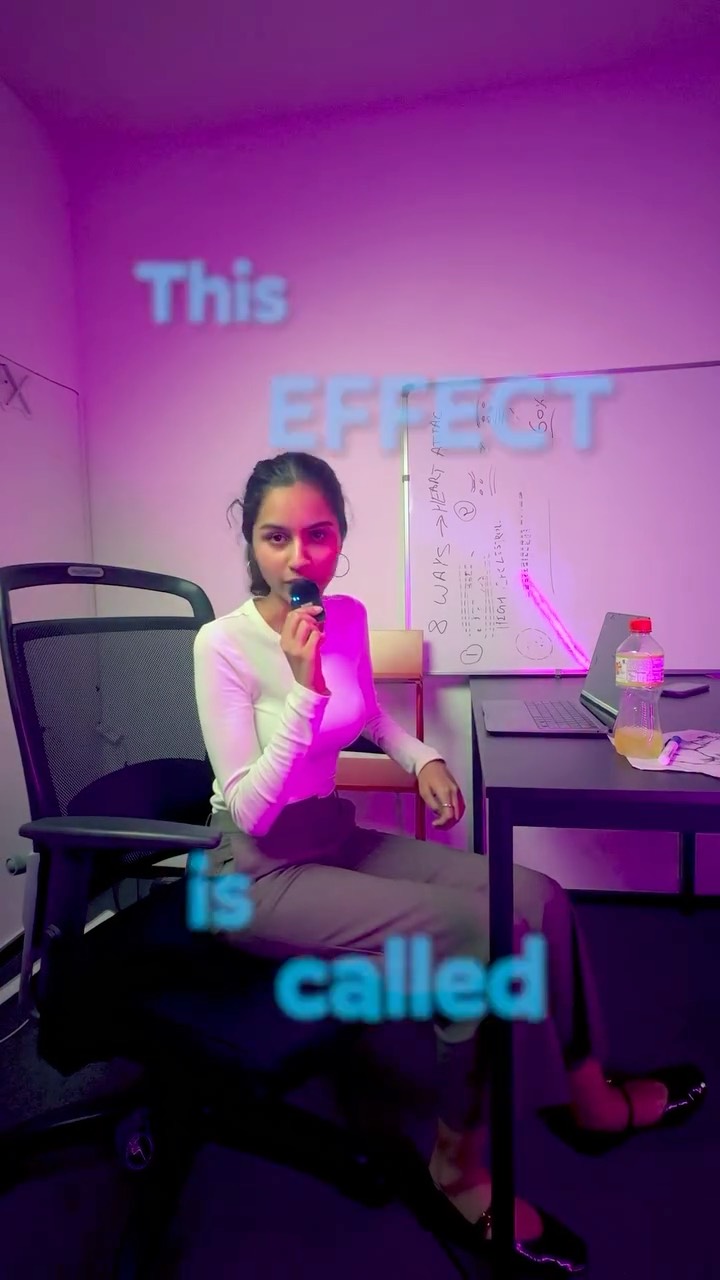
Why the Cover Feels Clickable
The visual structure says “someone is about to teach me something.” The microphone, the seated creator posture, the desk, and the whiteboard all imply instruction. The text then withholds the final piece, which creates the click incentive.
The room also matters. Because the setup looks modest and real rather than overly polished, the content feels accessible. Viewers are more likely to believe they can replicate the effect themselves when it is presented from a normal creator workspace instead of a premium production environment.
Signal Table
| Signal | Evidence (from this image) | Mechanism | Replication Action |
|---|---|---|---|
| Incomplete tutorial hook | Text only says “This EFFECT is called” | Open-loop phrasing encourages viewers to click for completion | Write the title as the start of an explanation, not the finished statement |
| Teaching context | Microphone, whiteboard, laptop, seated host | Objects signal that the creator is explaining a method | Include one or two teaching props that support the promise |
| Authentic workspace | Modest desk setup and room lighting | Relatable environments make the technique feel attainable | Use believable creator-room context instead of studio perfection |
| Strong color contrast | Blue text against magenta-purple room tones | Contrast helps the headline remain readable and vivid | Choose text and ambient colors that separate clearly |
| Low-friction personality | Direct gaze and relaxed seated pose | Approachable delivery improves trust | Present the host as conversational rather than formal |
Aesthetic Read
This is a useful example of creator-first educational design. The image is not trying to be cinematic. It is trying to be compelling enough to stop the scroll while still feeling like a real tutorial. That balance is important because trust is often lost when thumbnails feel too exaggerated or too artificial.
The scattered text placement is also clever. Instead of stacking the whole message in one block, the words are distributed down the frame. That creates a reading journey and subtly forces the eye to stay on the image for a fraction longer.
Prompt Technique Breakdown
| Prompt chunk | What it controls | Swap ideas (EN, 2–3 options) |
|---|---|---|
| “young female creator seated sideways in an office chair” | Main presenter setup and authenticity level | “creator seated at a desk”, “host in a home-office chair”, “tutorial speaker in a casual room” |
| “floating blue headline words reading ‘This EFFECT is called’” | Curiosity mechanism and text hierarchy | “open-loop tutorial text”, “incomplete effect title”, “staggered explanatory hook” |
| “desk, laptop, and marker-covered whiteboard” | Tutorial context and credibility | “home studio teaching setup”, “simple explainer workspace”, “creator learning environment” |
| “pink-purple ambient light” | Mood and thumbnail distinctiveness | “soft magenta room glow”, “moody creator lighting”, “purple accent ambiance” |
| “creator explainer thumbnail for an AI or editing effect tutorial” | Overall platform and niche framing | “short-form editing lesson cover”, “AI tutorial social thumbnail”, “effect breakdown creator graphic” |
Why This Formula Is Reusable
This format is reusable because it relies on a strong educational-content template:
1. Put one teacher-like presenter in frame.
2. Add a prop or setting that signals explanation.
3. Use an unfinished title.
4. Keep the room realistic.
5. Let the thumbnail ask a question the video will answer.
That system works for editing tricks, app features, AI workflows, study tips, life hacks, and creator tutorials of all kinds. The exact topic changes, but the psychological structure stays effective.
Remix Playbook
Hook remix: change “This effect is called” to “This trick is,” “This tool does,” “This setting fixes,” or “This is why...”
Prop remix: replace the whiteboard with a monitor, tablet, sketchbook, phone screen, or projector wall.
Lighting remix: make the space warmer, cooler, more minimal, or more energetic depending on audience style.
Pose remix: stand at the whiteboard, lean over the desk, point toward text, or hold up an example result.
Niche remix: use the same structure for design tutorials, productivity explainers, coding tips, marketing lessons, or business content.
Execution Advice
The easiest mistake in thumbnails like this is telling the whole story immediately. If the cover fully explains the effect, the click motive drops. This image avoids that by preserving a tiny information gap.
For similar educational thumbnails, the best rule is to reveal the setup, not the payoff. Give viewers enough confidence that the content is useful, but keep the final label, method, or result inside the video. That gap is where the click usually happens.