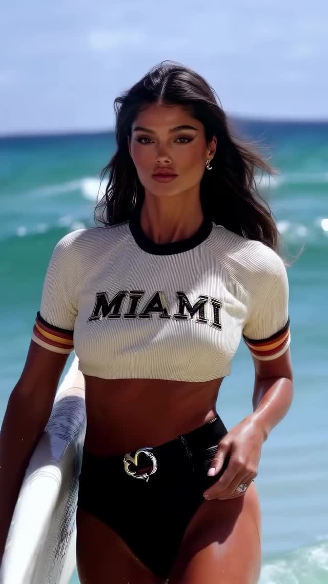
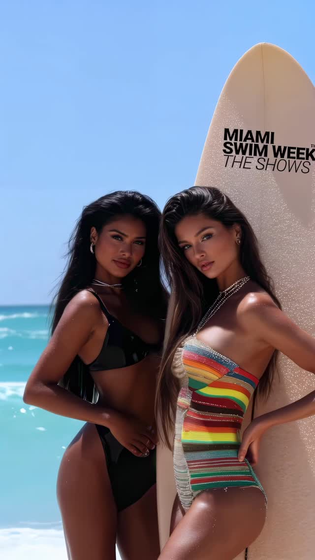
How dreamfall.art Built This Miss Universe Miami Swim Week AI Portrait
At first glance, this image feels simple: one model, one board, one clean horizon. That simplicity is exactly why it performs. The frame removes noise and keeps only three visual anchors: the face, the bold MIAMI chest typography, and the surfboard edge. Your eye lands in less than a second, which is critical for short-feed platforms where users decide instantly whether to keep watching.
The second growth lever is contrast stacking. Warm skin tones against cool turquoise water create immediate separation, while the black waistline and black collar compress the palette into clear, memorable blocks. Nothing is muddy. Nothing competes. It reads as a fashion statement and a location statement at the same time, so the post can attract both style audiences and travel/summer audiences without changing the creative.
The third lever is identity clarity. The image does not rely on a complicated story. It says: confident, coastal, athletic-chic. That clarity makes caption writing easier and improves remixability for creators who need repeatable formats. If your audience remembers one silhouette and one text element after a fast swipe, the post has already won half the battle.
Signal Table: What Makes It Replicable
| Signal | Evidence (from this image) | Mechanism | Replication Action |
|---|
| Fast visual hierarchy | Face + MIAMI logo + surfboard are the only dominant anchors | Low cognitive load increases hold rate in first second | Limit hero frame to 3 anchors; remove all secondary props |
| Temperature contrast | Warm skin against cool ocean cyan | Color opposition increases subject separation and perceived sharpness | Lock warm subject grade, push background toward aqua/teal by 8-12% |
| Athletic-fashion crossover | Sporty crop tee plus swimsuit silhouette | Cross-category styling broadens audience entry points | Mix one sport cue and one glam cue in wardrobe prompt |
| Clean geometry | Vertical board line on left, body line center-right | Structural lines guide gaze through the frame | Place one tall prop at edge; keep subject near center-right |
Where This Format Works Best
- Swimwear drops: Perfect for showing fit and mood together. Change only shirt text and accessory.
- Travel reels cover frame: Works as a hook image before montage clips. Keep ocean horizon clean.
- Personal brand refresh: Useful when repositioning toward confident lifestyle content. Swap logo word to your own city/brand.
- Summer challenge templates: Easy to recreate with one friend, one board, one location.
Not ideal scenarios
- Product-detail campaigns that require close macro visibility of small items.
- Narrative-heavy posts where environment storytelling matters more than portrait impact.
- Low-light indoor shoots; this concept depends on hard daylight contrast.
Three Transfer Recipes
-
Urban transfer
Keep: single subject, bold chest typography, edge prop line.
Change: ocean to concrete wall, surfboard to skateboard.
Slot template (EN): {city wall} {cropped logo tee} {vertical prop} {confident summer mood}
-
Fitness transfer
Keep: warm/cool color contrast, medium-full framing, clean background.
Change: swim bottom to training shorts, board to yoga mat.
Slot template (EN): {minimal outdoor gym} {sport crop top} {single equipment prop} {high-energy tone}
-
Beauty transfer
Keep: direct gaze, hard daylight highlights, low-clutter composition.
Change: wardrobe to monochrome dress, prop to tote bag.
Slot template (EN): {coastal promenade} {monochrome outfit} {clean accessory} {editorial confidence}
Aesthetic Read You Can Recreate
The image succeeds because it feels engineered, not random. The subject occupies roughly 60% of frame height, which is enough to show fashion silhouette while preserving location context. A single hard key from the sun creates clear highlight geometry on cheekbones and shoulders. Instead of filling shadows with artificial softness, the frame uses ambient ocean bounce, so contrast remains crisp but skin still looks alive.
Color discipline is tight: white, black, tan, and turquoise. That four-color system gives the post an instantly recognizable look. The surfboard is not only a prop; it is also a compositional ruler that keeps the eye from drifting off frame-left. Typography on the shirt behaves like built-in headline text, reducing the need for heavy graphic overlays. The overall result is fashion-editorial polish with low production complexity, which is exactly the combination most solo creators need.
Prompt Blocks That Actually Control the Output
| Prompt chunk | What it controls | Swap ideas (EN, 2-3 options) |
|---|
| subject count + age | Prevents extra people and keeps portrait authority | "one adult woman" / "one adult man" / "one adult surfer" |
| wardrobe identity tokens | Locks style category and silhouette clarity | "logo crop tee" / "minimal rash guard" / "sports bra + jacket" |
| prop placement | Creates structural line and visual rhythm | "surfboard on frame-left" / "skateboard on frame-right" / "tennis racket vertical edge" |
| lighting direction + hardness | Defines mood and skin contrast | "hard noon sun" / "golden-hour side light" / "overcast soft key" |
| lens feel + crop | Controls distortion and fashion proportion | "70mm medium-full" / "50mm half-body" / "85mm tight portrait" |
Remix Playbook for Next 4 Runs
Baseline Lock (first runs): lock composition (subject + edge prop), lock lighting direction (hard sun from front-right), lock palette contrast (warm skin vs cool background).
One-change rule: adjust only 1-2 knobs each generation so you can measure what caused improvement.
- Run 1: establish base with exact wardrobe and board placement.
- Run 2: change only location (beach to pier), keep everything else fixed.
- Run 3: change only color palette accents (sleeve stripe colors), keep lighting and lens fixed.
- Run 4: change only expression and hand gesture for caption fit testing.