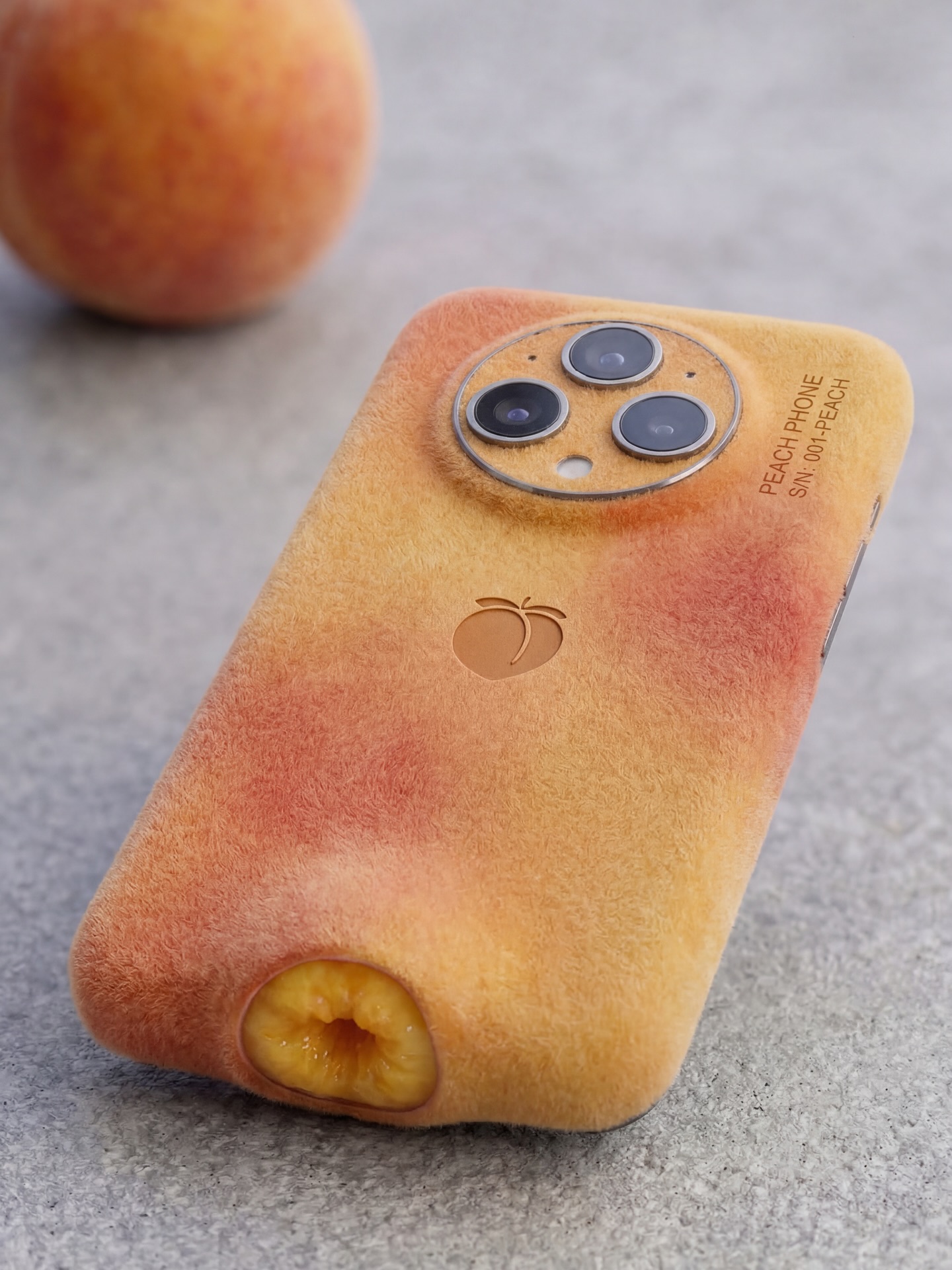
The fastest surreal images are the ones that can be understood in half a second. This one nails that test. It is a phone, and it is a peach, at the same time. The joke lands immediately, but the image keeps holding attention because it is not treated like a joke alone. The fuzzy fruit skin, the camera ring, the logo placement, the soft grey tabletop, and the blurred supporting peach all make the concept feel like a serious product launch for an object that should not exist.
That is the core reason the image works. It uses premium product-photography language to elevate a ridiculous idea. If the render were sloppy, the concept would feel disposable. Instead, it feels like a speculative brand campaign. The ad-like seriousness gives the absurdity more power, not less.
For creators, this is a great lesson in impossible-object content. The concept itself can be simple. The real craft lives in how convincingly the fantasy is staged. When the surrounding visual system behaves like a real advertisement, the impossible object becomes much more memorable.
The first driver is instant hybrid recognition. A peach is one of the most readable fruit forms, and a modern phone camera cluster is one of the most readable tech signals. Combining the two makes the image extremely accessible. Viewers do not need explanation to understand the premise, and that speed is a major reason concept images like this travel well.
The second driver is tactile curiosity. The fuzzy peach surface on a phone shape creates an immediate sensory contradiction. Phones are usually smooth, hard, and cold. Peaches are soft, warm-looking, and velvety. The brain lingers because it wants to resolve that mismatch. Texture is the real engine of this image, not just shape.
The third driver is ad realism. The clean tabletop, shallow depth, restrained palette, and single support prop all tell the viewer that this is being presented like a real product. The humor is stronger because the image refuses to wink too hard. It lets the realism do the setup and the object do the punchline.
| Signal | Evidence (from this image) | Mechanism | Replication Action |
|---|---|---|---|
| Immediate concept clarity | Peach skin wrapped around a recognizable smartphone form | Fast recognition makes the visual idea easy to repost and explain | Choose hybrid objects where both source identities remain obvious at first glance |
| Texture contradiction | Velvety fruit fuzz covering a tech device | Unexpected material swap keeps viewers staring longer | Use one strong material mismatch as the main fascination point |
| Clean campaign framing | Minimal grey surface and one blurred peach support prop | Commercial restraint makes the impossible device feel oddly plausible | Treat surreal concepts with real product-photo discipline |
| Premium absurdity | Readable logo, camera module, and polished product angle | Brand-like execution turns novelty into a design fantasy | Add small believable brand cues without overcrowding the frame |
The strongest decision is the simplicity of the frame. The image does not need a kitchen scene, a hand holding the device, or a pile of extra peaches. It understands that one supporting fruit is enough. That leaves room for the product texture to stay dominant. A lot of surreal object posts fail because they over-explain themselves with too many props. This one trusts the viewer.
The peach skin rendering is also handled intelligently. It is not just orange coloring on a phone. The soft mottled color, the fuzzy nap, and the little bottom fruit cavity all work together to sell the fruit identity. Those details are what make the concept feel finished instead of superficial. When building impossible objects, surface truth matters more than cleverness alone.
The camera module placement is another subtle success. It keeps the device unmistakably modern. Without that tech signature, the object would read more like a novelty case or decorative prop. The image needs that lens cluster to preserve the product-fiction, and it uses it well.
| Observed | Why it matters | How to recreate it |
|---|---|---|
| Soft fuzzy peach texture across the full shell | Anchors the fruit identity at material level | Make the source object visible through texture, not just color |
| Large circular three-lens camera island | Keeps the device readable as contemporary tech | Preserve a recognizable hardware signature from the original gadget |
| Single blurred peach in the background | Confirms the concept without adding clutter | Use one real source-object prop as supporting evidence |
| Grey stone-like tabletop | Provides a premium neutral stage for the warm peach tones | Choose a restrained surface that contrasts the hybrid object gently |
| Minimal branding and logo | Makes the concept feel like a speculative ad instead of a meme graphic | Add one or two believable product cues, then stop |
This approach works extremely well for impossible-product concept accounts, AI industrial-design pages, speculative branding, design humor feeds, and prompt libraries focused on natural-material tech hybrids. It is especially strong when the goal is to make people smile first and admire the craft second.
It is less ideal for functional product demos, engineering showcases, or scenes where the audience expects realism without humor. This image wins by balancing plausibility with absurdity.
{fruit texture} {device category} {single support prop} {neutral surface} {premium realism}{tech form} {organic skin texture} {simple logo cue} {supporting produce} {soft daylight}{hybrid product} {material mismatch} {one evidence object} {commercial lighting} {clean background}If you want to recreate this kind of image, do not start with “fruit phone.” That is too vague. Start by defining the exact device orientation, then the fruit texture, then the support prop, then the lighting behavior. Once those are stable, the concept feels designed instead of improvised. In surreal product imagery, order matters because plausibility is fragile.
| Prompt chunk | What it controls | Swap ideas (EN, 2-3 options) |
|---|---|---|
| smartphone back view with large circular triple camera module | Tech readability and contemporary product identity | modern phone back shot; camera-island smartphone; premium handset rear view |
| realistic peach fuzz skin with yellow-orange blush | Fruit identity and tactile contradiction | velvety peach shell; fuzzy fruit texture; soft blush-peach rind surface |
| single blurred peach in background | Source confirmation and visual evidence | one support peach prop; matching fruit in soft focus; background produce cue |
| grey stone tabletop in soft daylight | Ad realism and premium minimalism | neutral product surface; cool grey slab table; clean stone tabletop shot |
| small logo and product text | Speculative-brand credibility | minimal branding cue; tiny model text; restrained product mark |
| high-end impossible object photography | Overall tone, stopping the image from becoming cartoonish | premium surreal ad render; believable concept product photo; polished industrial design mockup |
Start by locking the object silhouette first. If the device does not read clearly as a phone, the whole hybrid idea weakens. Once the tech form is stable, solve the fruit skin texture. Only after that should you add the support peach, logo, and text cues. This sequence keeps the image from becoming a blob of orange texture with random cameras attached.
A practical four-step iteration path would be: first generate the phone back shape on a neutral table. Second, wrap it in convincing peach fuzz and color mottling. Third, add the background peach as supporting evidence. Fourth, refine the camera ring, small text, and subtle lighting. That order gives you a much cleaner result than trying to force tech identity, fruit identity, and campaign polish simultaneously in one step.
The larger lesson is simple. Surreal product images perform best when they take one ridiculous material swap and execute it with total seriousness. This image succeeds because it never breaks that rule.