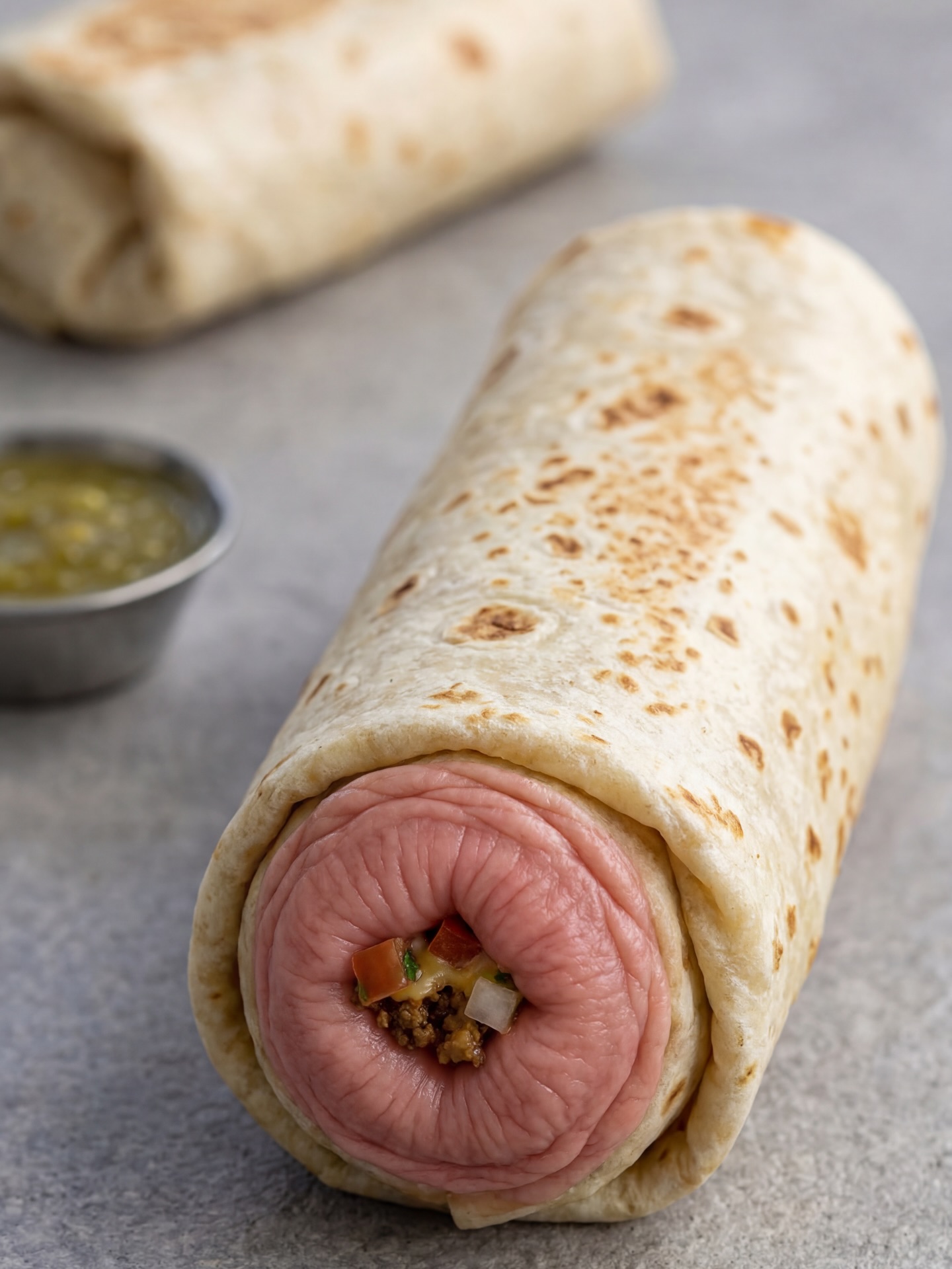
This image works because it weaponizes familiarity. At a glance, the viewer sees a burrito. A beat later, the front opening breaks expectation and turns the food into something unsettling, almost anatomical. That delay is the entire engine of the image. The brain wants to classify it as normal comfort food, then has to renegotiate what it is looking at. That moment of hesitation is what gives the picture its grip.
For creators, this is a useful lesson in shock design. Disturbing images do not always need explicit gore or a complex horror setting. Sometimes the strongest effect comes from keeping almost everything ordinary and changing one structural detail so radically that the entire object becomes uncanny. Here, the tortilla, the tabletop, the salsa cup, and even the background blur all behave like standard food photography. Only the front opening breaks the rules, and that single rupture does the job.
The food-photography discipline is what makes the concept more effective. If the lighting were murky or the set were cluttered, the image would feel like random internet weirdness. Because the shot is clean, centered, and softly lit, the object feels intentionally designed. That seriousness elevates the absurdity. The image reads less like a meme and more like conceptual commercial photography gone slightly wrong.
| Signal | Evidence (from this image) | Mechanism | Replication Action |
|---|---|---|---|
| Recognition trap | The tortilla body and tabletop setting look fully normal before the viewer notices the transformed opening | The mind commits to a food category first, making the later disruption more memorable | Keep 80-90% of the object familiar and mutate only one crucial recognition point |
| Clean studio seriousness | The wrap is photographed like a premium product shot with soft light and shallow depth of field | Professional presentation makes the surreal transformation feel more intentional and striking | Light the object like a catalog food image even when the concept is grotesque |
| Minimal supporting set | The gray table, blurred second wrap, and salsa cup provide context without competing with the main object | A restrained environment protects the core visual twist and improves readability | Use only one or two secondary cues to establish category, then stop |
The answer is restraint. The image never spills into chaos. There is no gore, no splatter, no dark horror lighting, and no theatrical framing. The uncanny effect comes from precision. A very specific area of the wrap is altered, and everything else remains believable. That narrow distortion is what creates discomfort. The viewer cannot dismiss it as full fantasy because too much of the image still behaves like reality.
The shallow depth of field also helps. By keeping the transformed front opening in sharp focus and pushing everything else soft, the image guides the eye exactly where the disturbance lives. This is useful for creators exploring surreal food or body-horror-lite concepts. If the whole frame screams equally loud, the image becomes exhausting. If one element carries the threat and the rest remains normal, the picture becomes much stickier.
| Observed | Why it matters for the look |
|---|---|
| Realistic tortilla texture with browned blister spots | Anchors the image in ordinary food realism |
| Single transformed front opening | Concentrates the uncanny effect into one precise disruption point |
| Blurred second wrap and salsa cup | Provide category context and make the main object feel more believable |
| Neutral gray tabletop | Keeps the frame calm so the surreal twist remains dominant |
| Soft food-studio lighting | Prevents the image from tipping into cheap horror aesthetics |
This approach is less ideal for mainstream food advertising, cozy recipe content, or maximal horror scenes. The image wins because it sits in an unstable middle zone between culinary realism and conceptual discomfort. Push it too far in either direction and it loses its edge.
Three transfer recipes are especially effective. Keep the clean tabletop, the realistic food texture, and the single uncanny alteration. Change the food category, mutation location, or supporting condiment. Template one: {familiar food object} photographed like a clean studio product shot, with one anatomy-inspired transformation at the main opening or bite point. Template two: surreal food photography, neutral set, realistic textures, one precise body-like distortion, no gore. Template three: {everyday dish} made subtly uncanny through one altered structural detail, shallow depth of field, restrained background.
To recreate this image, write the prompt as food photography first and conceptual mutation second. If you start from horror language, the result usually becomes too graphic or too messy. The power here comes from cleanliness and control.
| Prompt chunk | What it controls | Swap ideas (EN, 2–3 options) |
|---|---|---|
| realistic tortilla wrap with toasted spots | Food-category realism and tactile familiarity | warm pita pocket; flaky pastry shell; grilled sandwich crust |
| uncanny flesh-toned circular opening | Main disturbance point and conceptual shock | wrinkled fruit-like cavity; eyelid-like fold; shell opening with skin-like creases |
| gray tabletop and soft background blur | Set neutrality and focus control | stone slab; matte concrete surface; muted studio counter |
| small salsa cup and second wrap in the background | Context reinforcement without competition | dipping sauce ramekin; blurred side dish; second duplicate object |
| soft diffused macro food light | Believability and clean discomfort balance | window-lit food shot; softbox tabletop lighting; gentle editorial macro light |
| photoreal surreal food image | Medium identity and anti-cartoon tone | conceptual food photography; uncanny culinary still life; grotesque-but-clean product render |
Lock three things first: the normal food body, the single altered opening, and the clean studio tabletop. Those are the structural controls. Then change only one or two variables per pass so the image stays coherent.
The practical takeaway is simple: unsettling images become more effective when they are composed with discipline. Keep the object mostly normal, let one detail go wrong with precision, and resist the urge to add more shock than the concept actually needs.