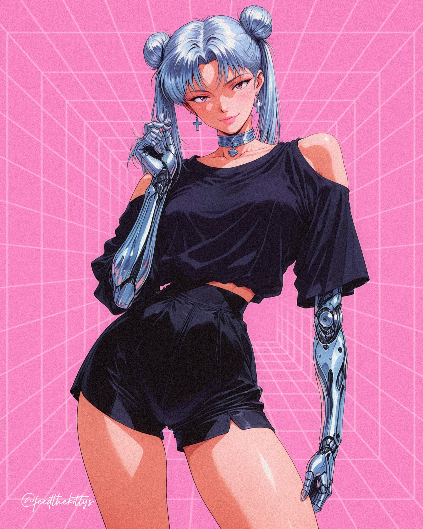
How feedthekittys Made This Silver Haired Cyborg Anime Poster — and How to Recreate It
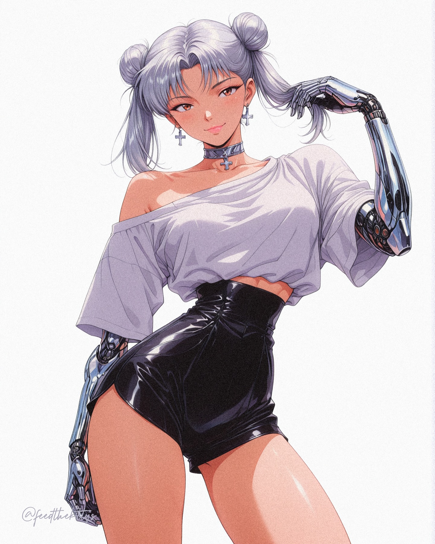
This image works because it strips the idea down to a few bold signals and pushes each one hard: white background, metallic limbs, glossy shorts, silver hair, and a low-angle pose that turns the character into an instant icon. There is no worldbuilding clutter here. The frame is built like a poster, so the viewer gets the concept in one second.
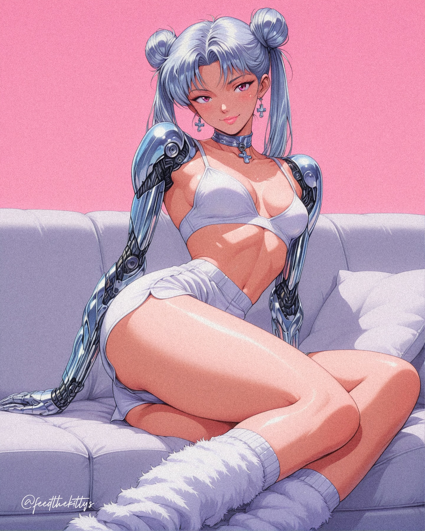
The real power comes from contrast. Soft face, cute hair buns, and loose shirt styling meet hard chrome, black vinyl shine, and a dominant body angle. That tension is the hook. The image feels fashionable and dangerous at the same time, which is exactly why it reads stronger than a generic cyborg portrait.
| Signal | Evidence (from this image) | Mechanism | Replication Action |
|---|
| Fast readability | Pure white background and one centered character | Nothing competes with the silhouette, so the concept lands instantly | Remove environment first and make the character silhouette carry the whole frame |
| Material contrast | Chrome arms against soft skin and glossy black shorts | Mixed textures create visual tension and premium polish | Lock one soft material, one reflective metal surface, and one glossy fashion piece |
| Power pose | Low-angle view and long leg emphasis | Perspective makes the character feel iconic, not merely cute | Use a low camera angle and keep the torso-to-leg transition clean and elongated |
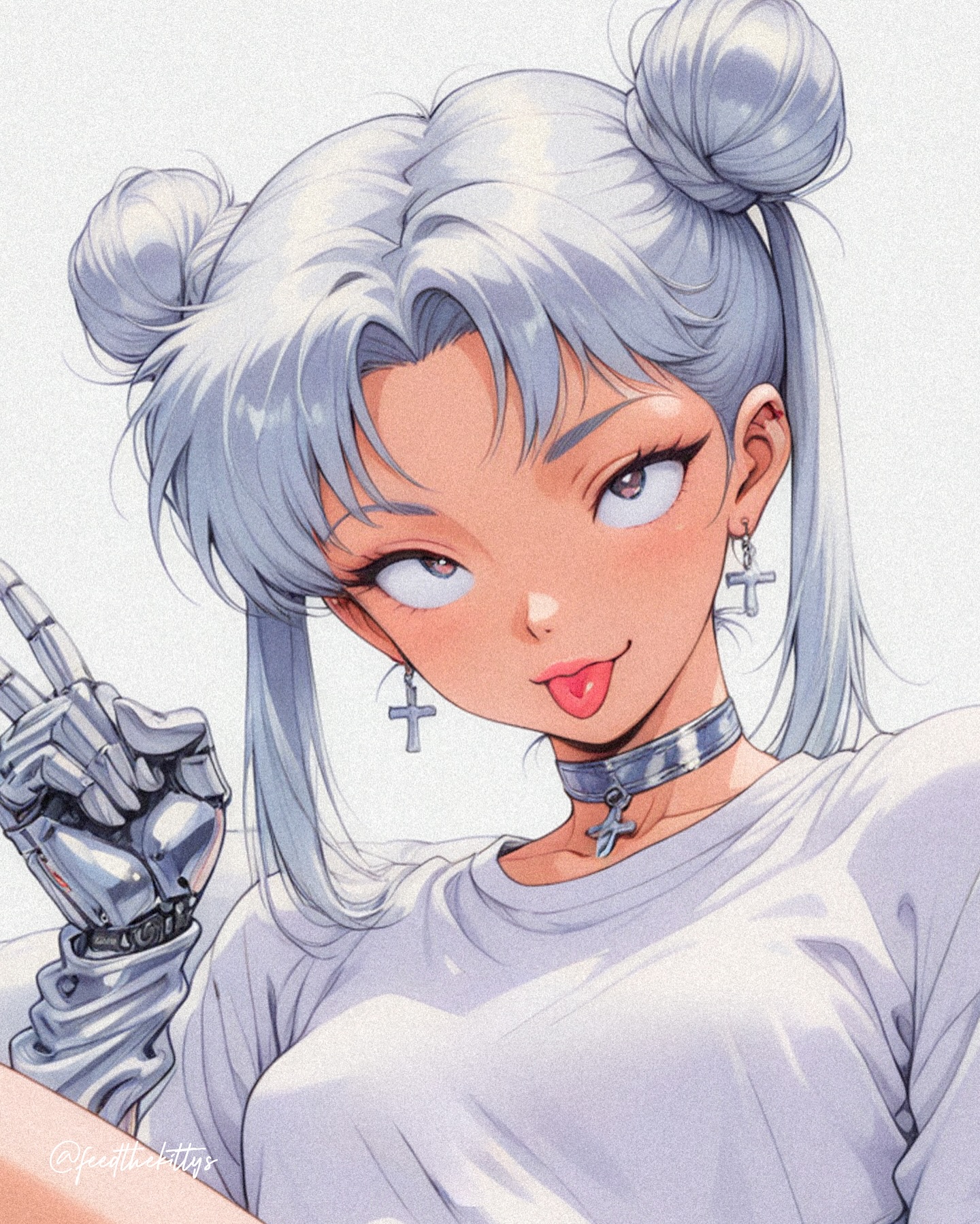
| Memorable styling | Twin buns, cross jewelry, off-shoulder shirt | Three distinct styling cues make the design easy to remember and remix | Choose 2-3 accessories or hair details that are specific enough to become identity markers |
This format is ideal for character posters, avatar-style promo art, anime fashion drops, fan-art accounts, and creators building a repeatable original-girl series. It also transfers well to AI creators who want a strong thumbnail, because the white background makes the subject pop immediately on crowded feeds.
It is less useful for narrative scenes, emotional worldbuilding, or cozy slice-of-life work. The image succeeds by being direct, sharp, and simplified. If you overload it with environment, the entire concept weakens.
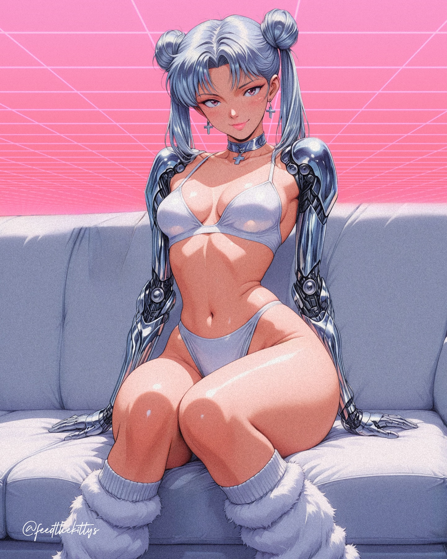
A good transfer recipe is simple: keep the white background, keep the low-angle glamour framing, keep the contrast between human softness and machine hardness. Then change only the fashion story. Swap the shirt for a bomber, swap the shorts for a metallic skirt, or change the jewelry language from crosses to tech tags while preserving the same silhouette logic.
What makes the aesthetic feel expensive
The first thing to study is the silhouette. The pose creates a clear hourglass shape with asymmetry in the shoulders and arms, which keeps the figure alive even without scenery. The second is the highlight design. The metal limbs and black shorts are not just shiny; they are used as rhythm points that guide the eye from top to bottom. The third is the restraint in color. Silver, white, black, and warm skin carry almost the entire frame. That discipline is why the image feels poster-ready instead of noisy.
| Prompt chunk | What it controls | Swap ideas (EN, 2–3 options) |
|---|
| silver twin-bun cyborg girl | Character identity and immediate recognizability | pink bob cyborg girl; black twin-tail android muse; platinum pixie robot idol |
| low-angle fashion poster pose | Dominance, leg emphasis, and thumbnail impact | heroic runway stance; tilted hip pose; upward glam shot |
| oversized off-shoulder white T-shirt | Softness and casual contrast against cybernetic hardware | cropped oversized sweater; off-shoulder jersey top; loose tech tee |
| glossy black high-waisted shorts | Material shine and sensual fashion tension | latex mini skirt; black vinyl bodysuit bottom; patent leather shorts |
| pure white seamless background | Poster clarity and concept speed | light gray studio backdrop; white gradient void; minimalist editorial white set |
How to iterate without breaking the look
Start by locking three things: the low-angle framing, the chrome arm design, and the white-background poster treatment. Those are the non-negotiables. After that, use the one-change rule. First run: change only the hairstyle. Second run: keep hair but swap the top. Third run: keep outfit but change one jewelry language. Fourth run: test a new expression while preserving the same camera angle. This gives you variety without losing the core identity system.
That is the broader lesson from the image: viral-looking character work is often less about complexity and more about high-contrast decisions that are impossible to miss.