How feedthekittys Made This Pink Cyber Girl Chrome Suit — and How to Recreate It
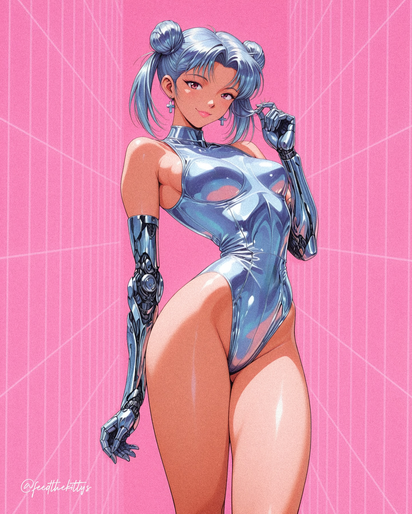
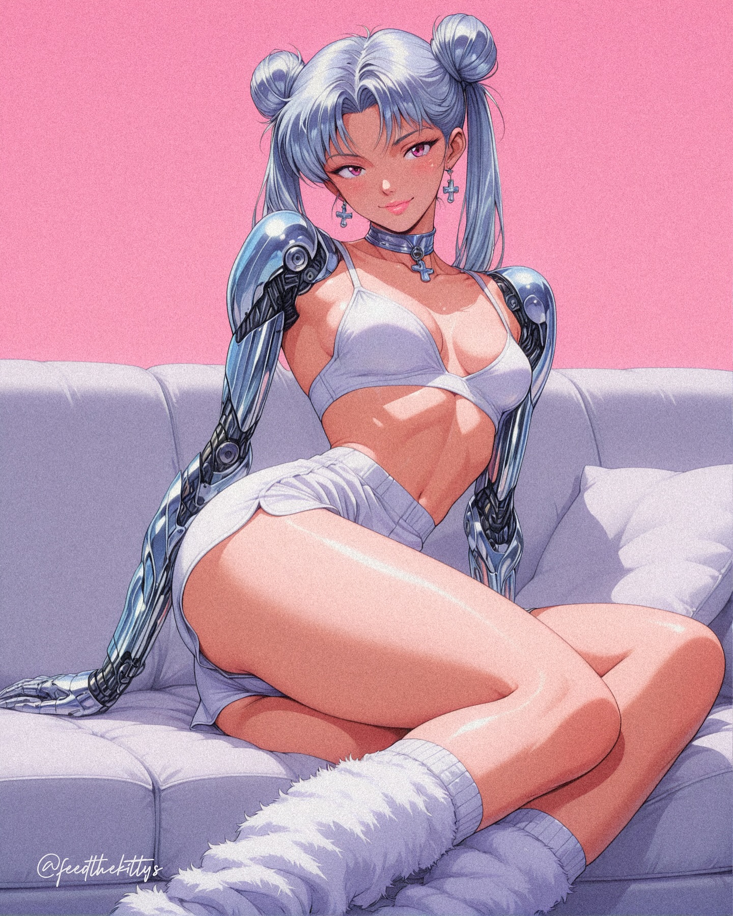
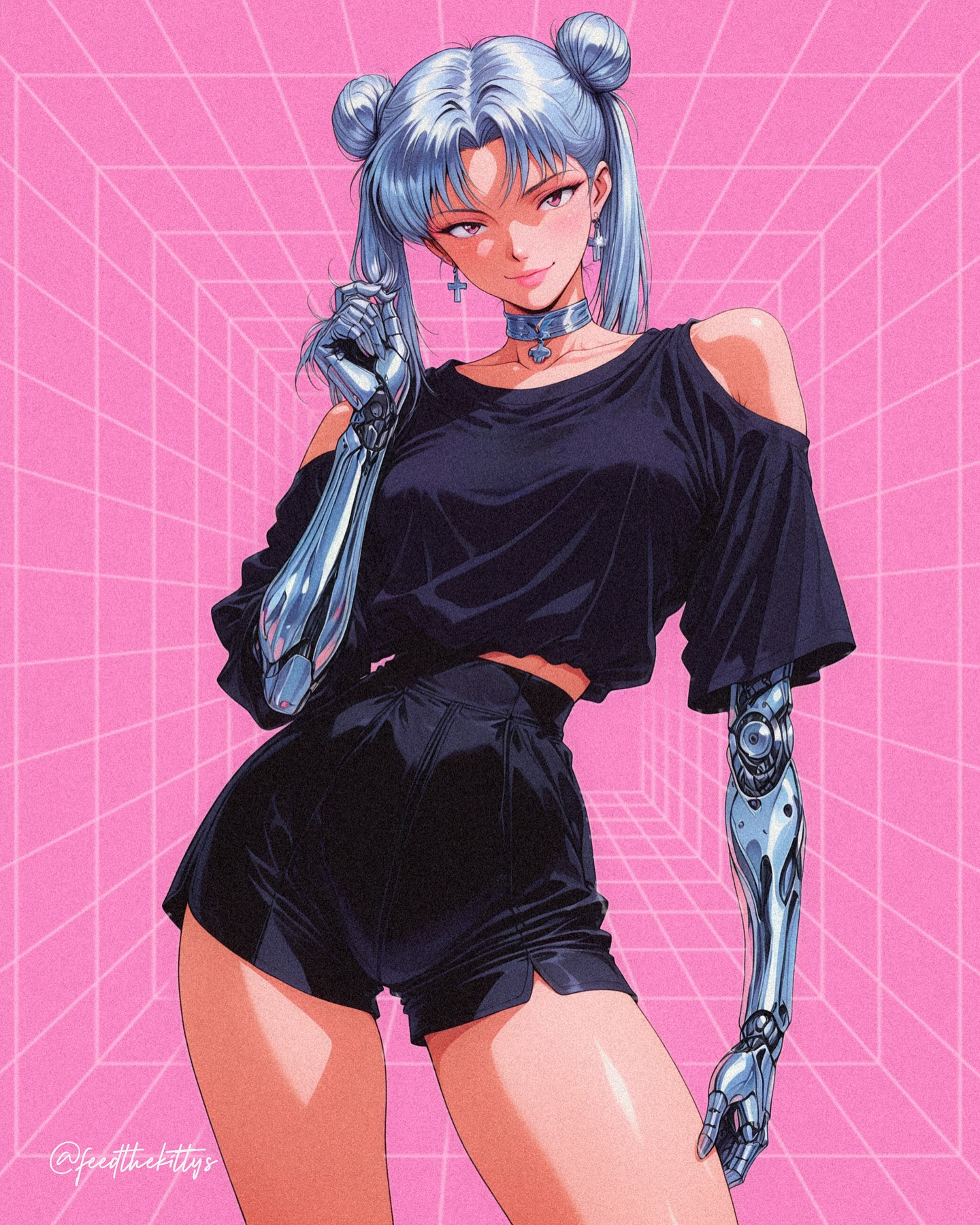
This image works because it understands that futurism has to be readable fast. The creator is not hiding the concept inside a complicated city scene or a dense pile of effects. Instead, the frame uses a few high-impact signals: chrome bodysuit, robotic arms, blue twin-bun hair, and a bright pink grid backdrop. That is enough to communicate the whole world in a second. For creators, that is a strong lesson. If the visual concept is clear, you do not need to overbuild the environment.
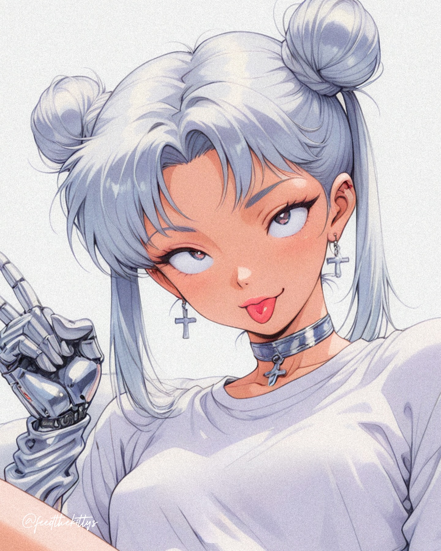
The second reason it lands is contrast between softness and machinery. Her face, hair, and expression are warm and approachable, while the metallic arms and mirror-finish bodysuit push the image into a cybernetic fantasy zone. That contrast makes the design feel more complete. A purely robotic image can feel cold. A purely glamorous image can feel generic. Here, the blend makes the poster memorable.
The pink grid background is doing more work than it seems. It creates a retro-digital stage that feels playful rather than threatening. That matters because it shifts the mood away from hard cyberpunk and closer to pop-fashion futurism. This is why the image feels like a cover or poster, not a battle scene. The background is not telling a story. It is reinforcing a tone.
| Signal | Evidence (from this image) | Mechanism | Replication Action |
|---|
| Fast concept clarity | Chrome bodysuit, robotic arms, blue hair, pink grid all read immediately | The viewer understands the genre and tone without needing extra explanation | Choose 3-4 major futuristic cues and make each one unmistakable |
| Soft-meets-mechanical contrast | Warm face and playful pose are paired with full chrome prosthetic arms | The image feels stylish rather than emotionally flat | Balance one human-soft feature set with one hard mechanical feature set |
| Pop-futurist background | Bright pink perspective grid replaces a dark city or lab scene | The frame stays graphic, clean, and more shareable | Use one bold graphic backdrop instead of a cluttered sci-fi environment |
| Reflective material drama | The bodysuit and arms are covered in high-value specular highlights | Material rendering makes the image feel premium and high-effort | Write material finish precisely and make the lighting serve that finish |
Where this visual language transfers best
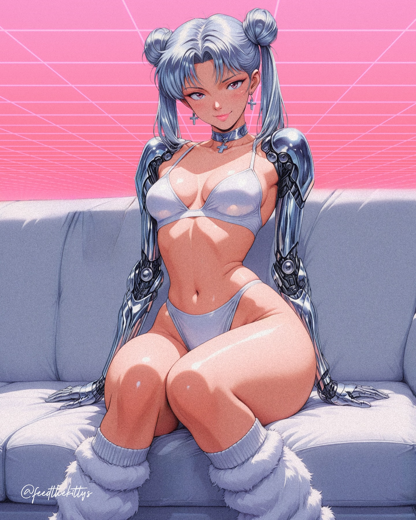
- Character poster drops: keep the clean background and let body design plus material finish carry the concept.
- AI fashion moodboards: keep the cyber arms and swap only wardrobe cut, color, or hairstyle.
- Game splash-art experiments: use the same silhouette logic but shift the background from playful grid to more serious faction color schemes.
- Prompt teaching pages: this is a strong example of how one material decision can define the whole image.
This format is less effective for narrative sci-fi scenes, action choreography, or gritty dystopian worldbuilding. It is designed for clean icon readability. If you add too much scenery or too many props, the poster strength drops quickly.
Three transfer recipes
- Transfer 1 Keep: chrome body material, robotic limbs, centered pose. Change: background color and hairstyle. Slot template:
{cyber girl}, {material finish}, {graphic backdrop}, {fashion stance}.
- Transfer 2 Keep: pop-futurist mood and bright background. Change: wardrobe from bodysuit to jacket, dress, or athletic set. Slot template:
{subject}, {cybernetic details}, {outfit category}, {retro-digital background}.
- Transfer 3 Keep: one hand-near-face gesture and full-body central framing. Change: arm design, earring style, and accent color. Slot template:
{pose}, {mechanical limb design}, {accent accessory}, {clean poster render}.
What the aesthetic is really doing
The image feels effective because it treats futurism like graphic design, not just genre dressing. The pink background, centered figure, and mirrored highlights all work together like a layout system. That is why the poster reads so cleanly. The creator is not simply drawing a cyber character. They are arranging a set of visual signals into an instantly legible package.
The shiny chrome suit is especially important. It gives the frame a premium artificiality that matches the robotic arms without making the character look fully armored. That keeps the image in a fashion register. For creators, this is a valuable distinction. The same cyber idea can become either combat-heavy or editorial depending on material choice alone.
| Observed | Recreate |
|---|
| Pink grid gives the image a retro-digital stage | Use one bold graphic environment instead of a detailed narrative setting |
| Body materials carry the sense of futurism | Specify reflective finish and mechanical detail more precisely than broad genre words |
| Centered full-body pose keeps the poster balanced | Use symmetrical spacing when the subject design is already visually rich |
| Blue hair softens the otherwise metallic design | Add one organic feature to stop cyber characters from feeling too cold |
| Highlights are crisp and intentional | Design the lighting around the material response, not just around mood adjectives |
Prompt technique breakdown
| Prompt chunk | What it controls | Swap ideas (EN, 2–3 options) |
|---|
| chrome cutout bodysuit | Fashion identity and reflective spectacle | liquid-metal dress; mirrored jacket; glossy latex suit |
| full cybernetic arms | Mechanical world cue and silhouette complexity | one robotic arm; biomechanical sleeves; translucent prosthetic limbs |
| blue twin-bun hairstyle | Soft character identity and playful tone | short silver bob; pink ponytail; black blunt-cut hair |
| bright pink perspective grid background | Poster mood and retro-futurist setting | neon teal tunnel; purple halftone field; white hologram grid |
| one hand near the face | Attitude and elegance | arms crossed; hands on hips; both hands lifted |
| polished anime cyber-fashion rendering | Finish quality and medium identity | comic cover cyber style; softer painted glam; retro anime cel print |
How I would iterate this without losing the pop-cyber clarity
Lock these three things first: the chrome material, the robotic arms, and the pink grid background. Those are the visual anchors. If you change them all at once, the image stops reading as a clean cyber-fashion poster and becomes generic stylized fanart.
- Run 1: keep pose and background fixed, only test hairstyle changes.
- Run 2: keep the body silhouette fixed, then vary how intricate the mechanical arm design becomes.
- Run 3: keep all subject design markers fixed and test alternate backdrop colors within the same grid system.
- Run 4: keep the graphic structure locked and experiment with how glossy or matte the main outfit should feel.
The bigger takeaway is that strong futuristic art becomes more shareable when it behaves like a poster first and a lore dump second. This image gets that balance right.