@burberry ad test. Staring @iam_zlu Inspired by the best @young_emperors - - - - - - - #vfx #fashion #fashionweek #artdirector #ai
@burberry ad test. Staring @iam_zlu Inspired by the best @young_emperors - - - - - - - #vfx #fashion #fashionweek #artdirector #ai
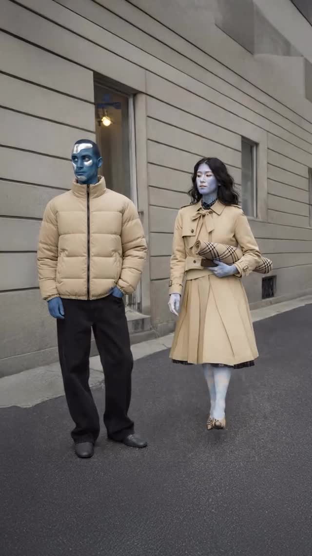
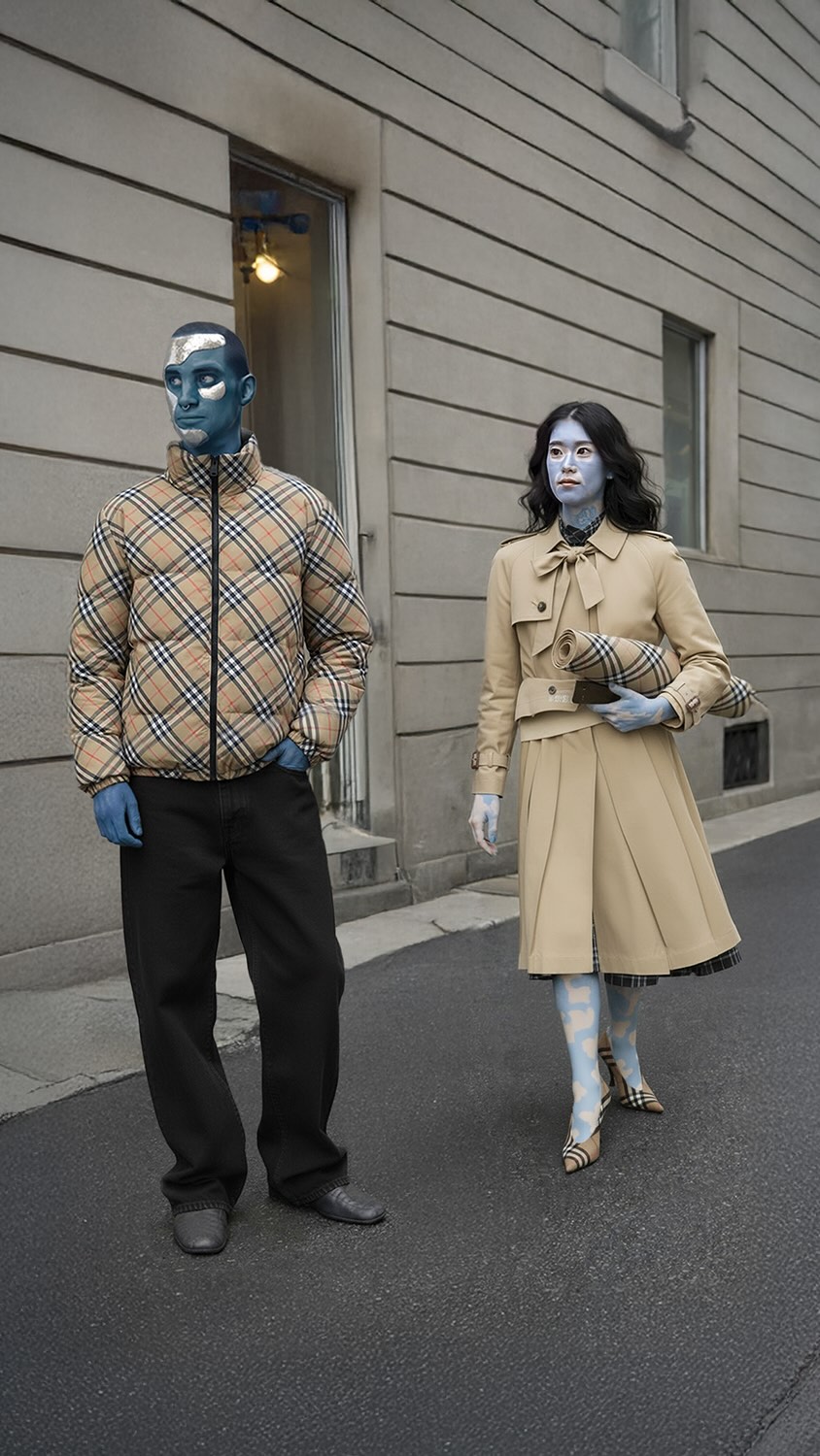
This image feels editorial because it combines discipline with surprise. The composition is controlled, the palette is mostly neutral, and the architecture is intentionally plain. Then one sharp deviation appears: blue-painted skin on both subjects. That single high-contrast decision gives the post instant identity.
For creators, this is a valuable growth pattern. You do not need ten dramatic elements. You need one unmistakable visual signal, then a clean environment that lets that signal breathe. Here, beige clothing and gray walls create a quiet stage, so the blue tone reads as deliberate concept work rather than random effect.
The frame also benefits from social readability. Two full-body figures, clear spacing, no clutter, no confusion. Even at thumbnail size, users understand “street style with a surreal color code.” That clarity is exactly what helps saves and shares.
| Signal | Evidence (from this image) | Mechanism | Replication Action |
|---|---|---|---|
| Single standout hook | Blue-painted skin against neutral wardrobe | One strong anomaly grabs attention quickly | Pick one visual variable to exaggerate and keep everything else restrained |
| Editorial restraint | Muted wall, empty road, minimal props | Low noise increases concept legibility | Use plain backgrounds and remove non-essential objects |
| Pair dynamics | Two subjects with complementary outfits | Relational storytelling adds rewatch value | Stage two-character interactions instead of solo static posing |
| Clear silhouette | Full-body framing with spacing between subjects | Improves feed readability on mobile | Keep full figures visible and avoid overlap-heavy posing |
{two walkers} {neutral wardrobe} {single surreal styling signal} {clean city backdrop}{duo street fashion} {one accent effect} {night urban lights} {editorial framing}{two models} {clean geometry} {single conceptual color code} {minimal background}The strongest decision is contrast hierarchy, not saturation. Most of the frame lives in soft neutrals: stone gray, beige, black, asphalt. That calm base allows the blue paint to function like punctuation. The eye lands on faces first, then scans clothing textures, then returns to the color anomaly. This loop increases dwell time without requiring aggressive visual clutter.
The camera distance also matters. Full-body framing preserves outfit storytelling and walk rhythm, which supports a fashion narrative rather than a beauty close-up. The empty street removes competing stories, so the post feels intentional and premium.
| Prompt chunk | What it controls | Swap ideas (EN, 2-3 options) |
|---|---|---|
| Subject count + relation | Narrative density | “two walkers side by side”, “duo crossing street”, “pair in offset stride” |
| Wardrobe baseline | Visual calm and style identity | “beige tailoring”, “monochrome streetwear”, “minimal utility layers” |
| Surreal accent | Scroll-stopping hook | “blue skin paint”, “metallic face sheen”, “single-color body makeup” |
| Location geometry | Background noise control | “plain stone facade”, “concrete corridor”, “clean urban wall lines” |
| Lighting profile | Mood coherence | “overcast soft daylight”, “flat cool daylight”, “diffused neutral light” |
| Camera distance | Outfit readability | “full-body medium-wide”, “knee-up editorial”, “street portrait 35mm” |
Baseline lock: (1) two-subject walking composition, (2) neutral wardrobe majority, (3) one surreal visual accent only.
One-variable iteration keeps your learning clean and makes style scaling faster.