Télécommande égarée ?
Avec l’application Samsung SmartThings, le smartphone se transforme en télécommande complète pour la TV Samsung : changer de chaîne, régler le volume, lancer ses applis… tout est possible directement depuis l’écran du téléphone. Plus besoin de fouiller entre les coussins du canapé.
How iam_zlu Built This Samsung SmartThings TV Remote CTA — and How to Recreate It
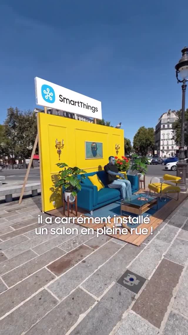
This image is a strong example of experiential marketing that is built for social distribution, not just foot traffic. The brand does something visually paradoxical: it places a private domestic scene in a public street. That contrast creates an immediate curiosity trigger. People stop, look, and photograph because the context feels wrong in an interesting way. The post then inherits that “wait, what is this?” energy in the feed.
The second growth advantage is color architecture. The blue sofa and yellow wall create an unmistakable two-color system that remains readable even in small thumbnails. On top, the signboard clearly ties the visual surprise to a product ecosystem narrative (smart home, connected life, everyday comfort). This is why the format works beyond one city: the concept is modular, but the visual identity stays consistent.
Signal Table
Signal
Evidence (from this image)
Mechanism
Replication Action
Context Reversal
Indoor-style living room installed on a sidewalk
Creates instant novelty and stop-scroll curiosity
Place a familiar private scene into an unexpected public location
Color System
High-contrast blue and yellow furniture/backdrop
Improves recall and thumbnail performance
Lock two dominant brand colors and repeat across all props
Brand Anchor
Large SmartThings sign above installation
Converts spectacle into brand memory
Keep logo/sign readable from wide framing
Human Scale Proof
One person sitting naturally on sofa
Makes the setup feel usable, not just decorative
Direct talent to perform simple everyday behavior (sit, scroll, relax)
Best-Fit Scenarios and Limits
Smart-home launches: perfect fit because the setup visualizes comfort in real-world context; change props to product category.
City roadshow campaigns: fit because it travels well and remains photogenic in different districts; keep color block constant.
Retail collaboration pop-ups: fit because passersby become UGC creators on site; add QR code action point nearby.
Awareness-first brand refresh: fit because concept is instantly legible even without long caption copy.
Not ideal for technical deep-dive messaging: the format prioritizes spectacle over detailed feature education.
Not ideal in visually chaotic locations: too much surrounding clutter weakens contrast impact.
Not ideal when permissions are limited: street installs require logistics, safety, and municipal coordination.
Three Transfer Recipes
Kitchen-on-the-Plaza — Keep: domestic scene in public street, two-color identity, one user in action. Change: living room props to kitchen props. Slot template (EN): {public location} {home scene module} {brand color pair} {casual human action}
Office-in-the-Park — Keep: elevated brand sign and wide framing. Change: sofa to workstation and device demo counter. Slot template (EN): {urban park} {workspace setup} {hero signboard} {demo interaction}
Bedroom-at-Transit Hub — Keep: paradox concept + clean composition. Change: furniture set and lighting mood for softer storytelling. Slot template (EN): {transit plaza} {private-room props} {cohesive palette} {everyday comfort narrative}
Aesthetic Read
What makes this frame visually effective is geometric clarity. The installation reads as a simple stage: horizontal floor deck, vertical yellow wall, and a top sign cap. That shape grammar makes the concept understandable before the viewer reads any text. The stone pavement in foreground acts as a natural runway, guiding attention toward the activation zone. Color use is strategic rather than decorative; blue and yellow do the heavy lifting while plants add realism and soften hard edges. The scene also benefits from daytime honesty. Bright sunlight and real city detail create proof that the activation genuinely exists in public space, which increases trust and share intent.
Prompt Technique Breakdown
Prompt chunk
What it controls
Swap ideas (EN, 2–3 options)
Concept block
Core novelty mechanism
“living room on sidewalk”, “kitchen in plaza”, “bedroom in station forecourt”