How iam_zlu Made This SmartThings Buds Ad AI — and How to Recreate It
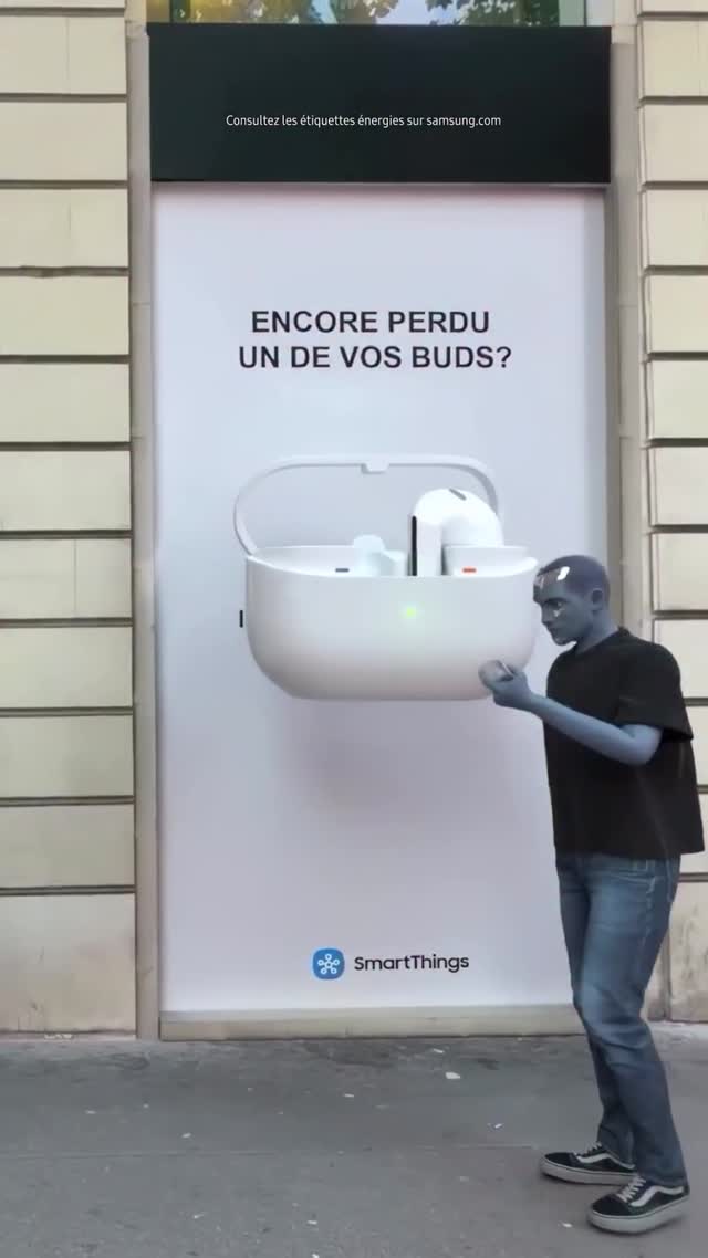
This image is a strong example of attention by visual contradiction. A clean, corporate product billboard is paired with a human figure that looks slightly unreal, almost like a 3D character dropped into real life. That mismatch creates instant curiosity, and curiosity buys watch time.
Creators often try to go viral by adding more elements. This post does the opposite: one product visual, one human reaction, one clear text question. Minimal structure, maximum readability.
Why It Performs on Social
The first viral mechanic is scale shock. The giant earbud case dominates the frame, so viewers understand the product immediately. The second mechanic is narrative tension: is the person real, stylized, or AR? That ambiguity encourages replay. The third mechanic is headline clarity in plain language (the “lost one bud” pain point), which connects to a common user frustration.
| Signal |
Evidence (from this image) |
Mechanism |
Replication Action |
| Scale interruption |
Oversized earbud case graphic filling most of poster |
Stops scroll by disproportion visual impact |
Use one hero object at exaggerated scale against normal street context |
| Reality mismatch |
Blue-gray subject looks composited against real facade |
Triggers second look and comments about authenticity |
Add one deliberate style mismatch (color tint, motion treatment, render texture) |
| Clear pain-point copy |
Question about losing one earbud |
Immediate personal relevance drives shares |
Use short, problem-led headline that mirrors a daily annoyance |
| Clean frame hierarchy |
Poster centered, person in lower-right as reaction cue |
Fast comprehension on mobile |
Lock one primary block and one human counterpoint, avoid clutter |
Best Use Cases and Transferability
Best-fit scenarios
- Tech accessory launches: Pain-point headline + oversized product visual is highly legible.
- City campaign mockups: Works for creators presenting speculative ad concepts in real urban settings.
- AR filter storytelling: The “is this real?” effect aligns with mixed-reality narratives.
- Problem-solution carousels: First slide can be this interruption image, followed by practical fixes.
Not ideal
- Luxury editorial portrait pages: Commercial billboard language can break emotional intimacy.
- Dense educational explainers: Single-frame ambiguity may distract from technical depth.
- Handcrafted artisan branding: Urban commercial tone may feel too industrial.
Transfers (exactly 3 recipes)
-
Food-delivery transfer
Keep: giant product/object scale, one human reaction figure, clean headline question.
Change: earbud case to takeaway box, tech copy to hunger-delay pain point.
Slot template (EN): {city billboard} with oversized {product}, one person reacting, short question headline, realistic street capture
-
Fintech transfer
Keep: minimalist facade framing, centered display, lower-corner human anchor.
Change: product render to card/wallet UI, headline to spending-control tension.
Slot template (EN): {urban facade} + {oversized fintech visual} + {single reaction subject}, clean typography, neutral daylight
-
Public service transfer
Keep: high-contrast object scale and direct question style.
Change: commercial prop to safety/health icon, reaction subject to passerby silhouette.
Slot template (EN): {public campaign board}, oversized {icon/object}, one passerby interaction, concise problem-led copy
Aesthetic Breakdown: Why It Feels Contemporary
This frame sits between documentary and synthetic media. The architecture, pavement, and billboard proportions feel real, while the human subject tint introduces a digital layer. That hybrid aesthetic reflects current feed culture where AI, AR, and real capture are constantly blended.
Typography also does structural work. The headline sits in open negative space above the product render, creating immediate readability. The product image is bright and centered, giving the eye a stable anchor before it moves to the human figure. This read order is efficient and mobile-native.
Finally, color economy keeps noise low. Whites and neutrals dominate, with only denim blue and skin tint as contrast. This helps the conceptual trick stand out without visual chaos.
| Observed |
Recreate |
| Single oversized hero object |
Scale one product visual to dominate center field |
| One-person reaction anchor |
Place a subject at frame edge to humanize scale |
| Clean text zone |
Reserve whitespace for a short problem headline |
| Urban neutrality |
Use beige/gray facades and soft daylight for realism |
| Subtle synthetic cue |
Add one controlled stylistic mismatch (tint or texture shift) |
Prompt Technique Breakdown
| Prompt chunk |
What it controls |
Swap ideas (EN, 2-3 options) |
| Billboard architecture |
Spatial credibility of campaign scene |
"inset storefront billboard", "metro ad wall", "bus-stop lightbox" |
| Hero object scale |
Scroll-stopping visual impact |
"oversized earbuds", "giant card render", "enlarged app icon" |
| Headline directive |
Immediate relevance |
"short question copy", "pain-point statement", "problem hook line" |
| Human counterpoint |
Relatability and scene narrative |
"single passerby", "user checking phone", "person reacting to ad" |
| Hybrid style cue |
Contemporary AR/AI impression |
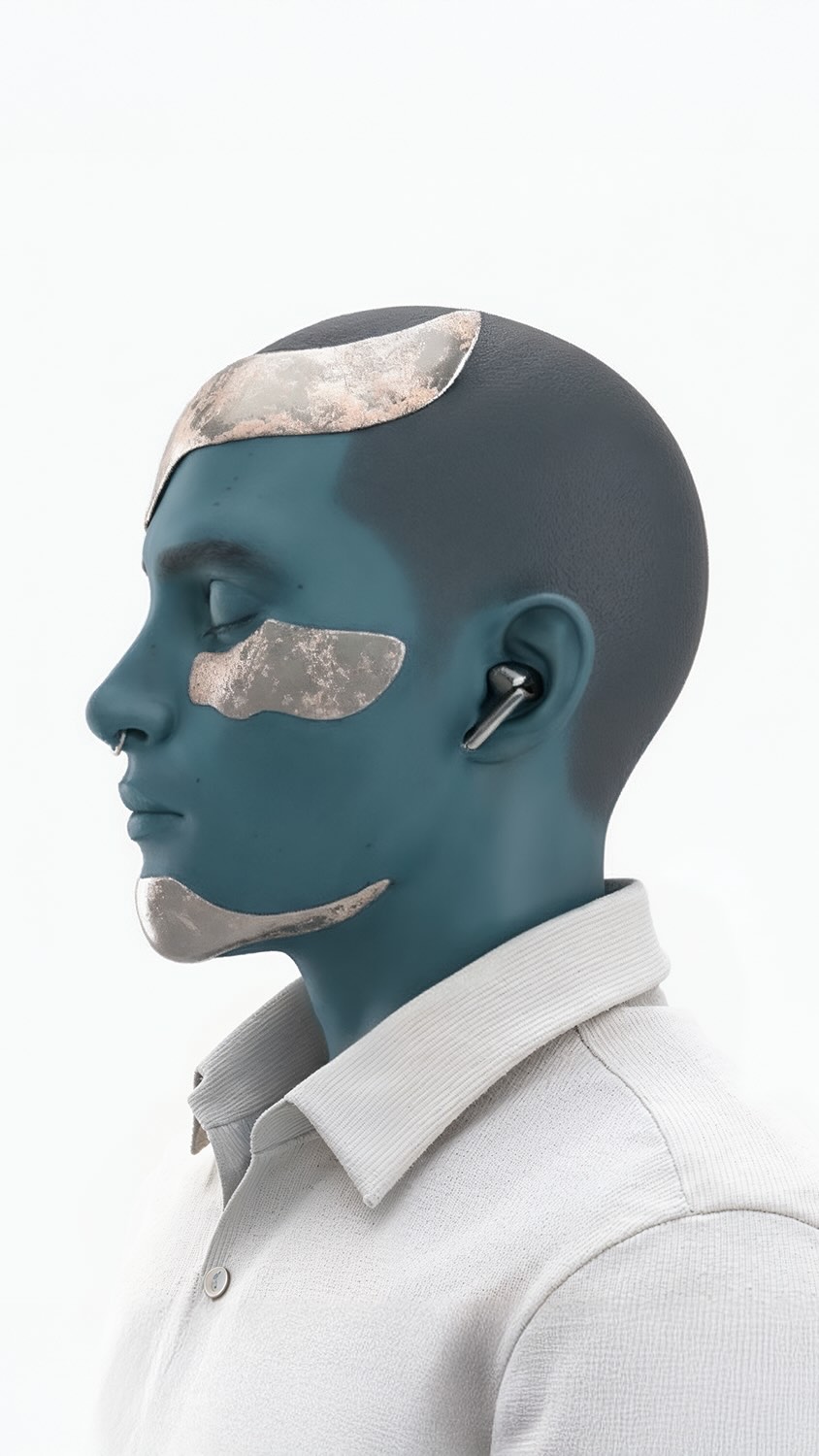
"cool skin tint", "subtle composited edge", "digital-grade skin tone" |
| Camera realism |
Believability as captured moment |
"smartphone vertical shot", "street-level perspective", "natural daylight exposure" |
Remix Playbook (Execution, Not Theory)
Baseline lock
- Lock one dominant object scale in center frame.
- Lock one human figure as reaction anchor near edge.
- Lock a concise problem headline with high legibility.
One-change rule
Only change one major variable per generation cycle: either object type, subject styling, or copy language. Keep everything else fixed to identify what actually improves engagement clarity.
4-step iteration sequence
- Run 1: Achieve layout accuracy (poster center + person corner).
- Run 2: Improve text readability and line spacing.
- Run 3: Tune object scale and reflectivity.
- Run 4: Add or reduce synthetic subject tint for best realism-bias balance.