This might be the craziest Nano Banana Pro feature!
Now you can generate image of any location by just putting the co-ordinates from Google maps.
I asked it for a cinematic photo with just the Gateway of India co-ordinates.
Unlike older models, Nano Banana Pro can represent specific details of a city and background buildings based directly on the latitude and longitude.
This feature leverages Google’s search and maps knowledge
If you did not know about this Nano Banana feature, don’t forget to give me a follow
How kyraonig Made This Google Maps Coordinates AI Portrait — and How to Recreate It
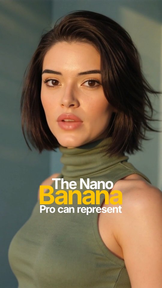
This post is an effective example of AI feature communication through visual packaging. The caption is long and technical, explaining coordinate-based generation and map-grounded scene fidelity. The image, however, is simple and bold: one clean portrait plus a headline lockup. That contrast between dense information and simple visual entry is exactly why people engage.
Instead of trying to explain everything in the image itself, the creator uses the cover to trigger curiosity. The yellow-highlighted word "Banana" acts as a memory hook, while the portrait quality signals credibility and modernity. Users click, read caption details, and then follow for more tools insight.
Signal Table
Signal
Evidence (from this image)
Mechanism
Replication Action
Single-focus cover design
One portrait, one headline, clean background
Fast comprehension increases scroll-stop rate
Use one visual anchor and one headline phrase only
Keyword highlighting
"Banana" in bold yellow while other words are white
Color contrast improves recall of product name
Highlight one strategic keyword with a single accent color
Caption-depth pairing
Image is simple but caption contains technical breakdown
Cover attracts, caption converts interest into trust
Keep cover minimal; move complexity into caption body
Humanized tech framing
Warm portrait instead of abstract UI screenshot
Human face softens technical topic and broadens reach
Pair AI feature claims with lifestyle-grade portrait assets
Use Cases and Transfers
AI tool feature launches: ideal for announcing one specific capability with high clarity.
Creator education content: strong fit when caption carries step-by-step instructions.
SaaS social proof campaigns: effective for naming one differentiator and prompting saves.
Newsletter lead magnets: useful as cover for technical threads translated into plain language.
Not Ideal
Multi-feature product updates: single-headline format may oversimplify complex releases.
UI-specific tutorials: portrait cover may hide interface relevance.
Meme-first channels: polished promo style can feel too formal.
Three Transfer Recipes
Keep: portrait + three-line headline stack. Change: feature keyword. Slot template: "The {ToolName} {FeatureWord} can {core_promise}".
Keep: neutral background and warm light. Change: wardrobe color to brand accent. Slot template: "{subject_style} with {brand_palette} and {single_highlight_word}".
Keep: simple cover, deep caption. Change: proof type. Slot template: "Hook image + caption with {test_result}/{workflow}/{before-after evidence}".
Aesthetic Read: Observed to Recreate
The composition is text-aware. Subject placement leaves a clean lower-left zone where typography can sit without blocking face or outfit. This is a practical design discipline many creators miss: planning the photo around copy placement before posting.
Color strategy is also efficient. Olive clothing and soft gray-green background keep the frame calm, letting yellow headline text become the only high-energy element. That hierarchy directs attention exactly where the creator wants it.
Observed
How to Recreate
Negative space for text
Compose subject to one side and protect a clean copy-safe area
Single accent keyword color
Highlight only one word to avoid visual noise
Warm portrait realism
Use directional sunlight and natural skin texture
Minimal backdrop
Remove environmental clutter to strengthen message clarity