Comment 'Call' to talk to me
Comment 'Call' to talk to me
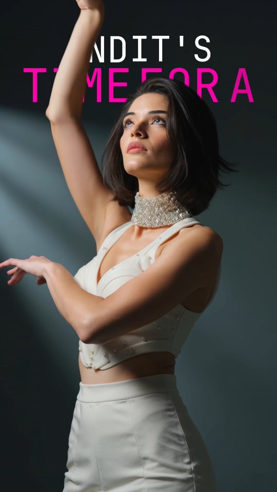
This image works because it combines movement language with headline structure. The pose already suggests transition and anticipation, and the top text layer reinforces that emotional direction. Together they create a “next moment” feeling, which is excellent for announcements, launches, and teaser content.
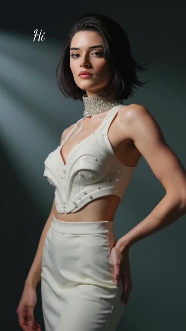
The styling strategy is equally strong: white wardrobe against a dark background. That high tonal contrast keeps the subject readable on small screens while preserving a premium editorial mood. For creators, this is a practical bridge between portrait content and poster content.
| Signal | Evidence (from this image) | Mechanism | Replication Action |
|---|---|---|---|
| Kinetic body line | Raised arm and upward gaze create directional flow | Implied motion increases pause time over static standing poses | Use one strong diagonal or vertical limb line as pose anchor |
| Headline integration | Large white/pink uppercase text at top | Converts portrait into campaign-ready communication asset | Reserve top 20-25% of frame as dedicated text-safe area |
| High contrast styling | White outfit on dark gradient backdrop | Improves readability and thumbnail performance | Pair light wardrobe with darker backgrounds for launch posts |
| Editorial minimalism | No clutter, one subject, clean light shaping | Keeps attention on message and identity | Remove secondary props unless they directly support the headline |
Best-fit scenarios: event teasers, episode drops, product reveal countdowns, dance/performance announcements, and creator-brand campaign covers. This format is ideal when a post must both express personality and carry a short message.
Not ideal for documentary BTS dumps, multi-person cast reveals, or dense educational cards with heavy text blocks. The strength here is clarity, not detail overload.
{subject_pose} portrait, top text “{headline}”, high-contrast editorial lighting, launch teaser style.{wardrobe_theme} movement portrait, one subject, poster-safe composition, campaign-grade clarity.{mood} performance poster, clean typography layer, vertical 9:16 social cover.The aesthetic center is upward energy. The raised arm and eye direction pull attention from middle frame toward the headline, creating natural visual sequencing: body first, text second, intent third. This is a strong compositional tactic for promotional content because it aligns human movement with communication hierarchy.
The color system stays disciplined. White clothing and skin highlights carry the subject, while dark background space provides negative room for typography. The pink text accent adds urgency without overpowering the portrait. Light placement is directional and flattering, giving depth to arms and face while preserving clean background separation. The overall feel is modern, performative, and highly reusable for creator campaigns.
| Prompt chunk | What it controls | Swap ideas (EN, 2-3 options) |
|---|---|---|
| single female subject in expressive dance pose | Motion energy and emotional narrative | reach-forward pose; spin-stop pose; hands-framed face pose |
| white structured outfit + silver neck statement | Editorial styling and tonal contrast | black monochrome suit; metallic stagewear; pastel avant-garde set |
| dark minimal gradient background | Focus control and text legibility | smoke stage backdrop; soft blue gradient; matte charcoal wall |
| top headline in white/pink uppercase | Campaign communication layer | all-white title; yellow accent title; split-line date + title lockup |
| directional upper-left key light | Sculpting and cinematic depth | front softbox; rim-lit silhouette; cross-light stage setup |
| vertical 9:16 poster crop | Reels/story distribution fit | 4:5 feed cover; square launch tile; 16:9 trailer card |
Baseline lock: (1) text-safe top area, (2) one motion-led pose, (3) high-contrast wardrobe/background pairing.
This one-variable approach builds a full announcement package without losing brand consistency.