This is the most realistic female robot in the world.
Xpeng Iron is a Chinese humanoid robot which went viral after its incredibly realistic human-like walk at a recent event.
Her motion was so realistic that XPENG had to cut off the fabric around the leg to prove it was not a woman under that robot suit.
It has a bionic "bone–muscle–skin" structure with a flexible spine, synthetic muscles, and soft full-body skin, enabling natural, fluid movements.
It is direct competition to Tesla’s Optimus. While tech giants are fighting over AI models, a new race is emerging on who will build the most realistic humanoid robot and China seems to be leading right now.
Is this the future of robots? Will we have robots in our home in the next five years?
How kyraonig Built This Xpeng Iron Humanoid Robot AI Art
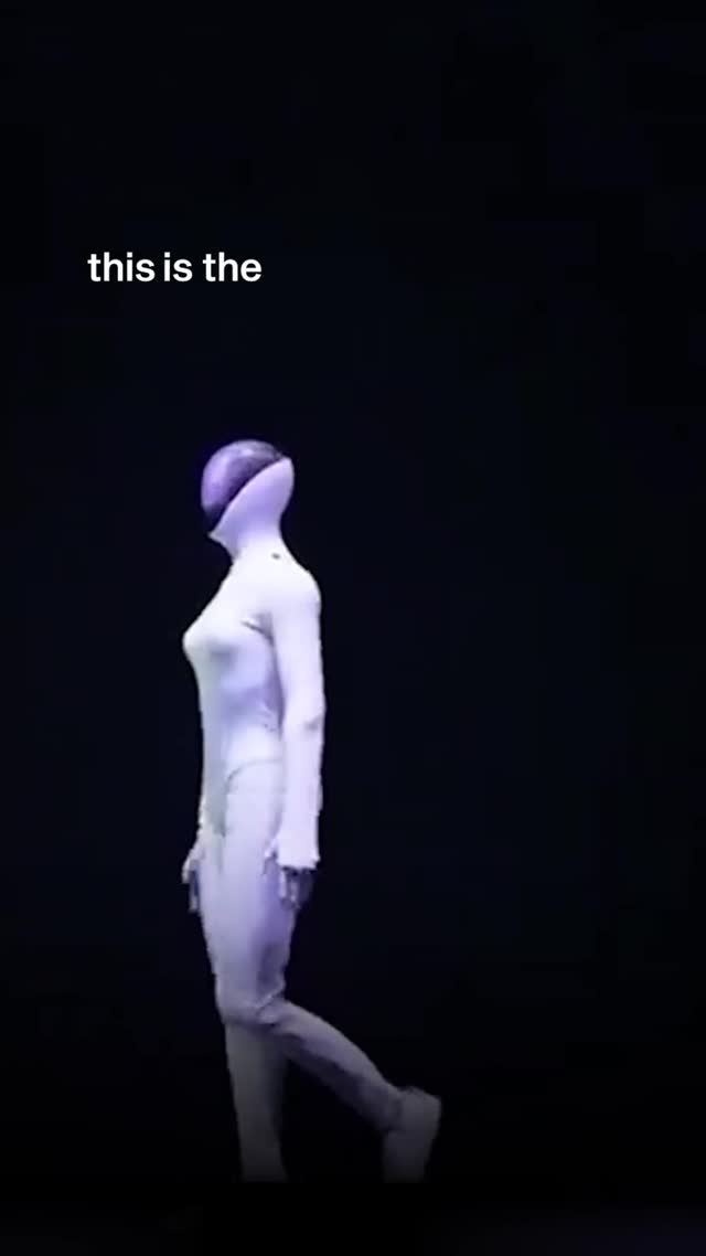
This image wins through subtraction. One figure, one direction of motion, one short text line, and almost total darkness. In a feed full of visual overload, radical simplicity becomes the hook.
For creators, this is a useful strategy when launching a futuristic concept, campaign chapter, or character reveal. You do not need to show everything. You need to show one strong symbol with controlled mystery.
Why It Can Go Viral
The first mechanism is negative-space dominance. Most of the frame is dark, which forces immediate attention to the white android silhouette. High contrast plus emptiness creates visual pause.
The second mechanism is incomplete language. The text “this is the” feels unfinished, inviting the audience to anticipate the next frame or caption. Incomplete statements can increase replay and swipe intent.
The third mechanism is directionality. The walking side profile implies narrative progression, as if a story is about to begin. Motion cues in static images improve curiosity.
Signal
Evidence (from this image)
Mechanism
Replication Action
Extreme minimalism
Single white figure in black void
Pattern interrupt against crowded feeds
Reduce scene to one subject and one dominant contrast axis
Open loop text
Partial phrase “this is the”
Creates cognitive tension and anticipation
Use short unfinished text as teaser rather than full statement
Kinetic silhouette
Side-walk pose with forward step
Suggests story momentum
Capture transitional body positions instead of static standing
Color austerity
White body + black background + small purple accent
Stronger memorability from restricted palette
Limit palette to 2 major tones + 1 accent
Use Cases and Adaptation
Product/character reveal teasers: Best fit for pre-launch campaigns. Why fit: mystery drives curiosity. What to change: rotate one clue per post (text, color accent, pose).
Music visual intros: Strong for futuristic or electronic genres. Why fit: minimalist aesthetic matches synthetic themes. What to change: sync text fragment with lyric progression.
Tech storytelling reels: Useful for AI/robotics narrative chapters. Why fit: clear symbolic subject. What to change: preserve silhouette, vary lighting angle.
Brand chapter transitions: Good for “next era” announcements. What to change: keep open-loop phrase format, adjust keywords.
Not ideal: educational explainers needing detail, product tutorials, and lifestyle posts requiring environmental warmth.
Transfer Recipe 1
Keep: one moving silhouette + black void. Change: subject archetype. Slot template (EN): {single_future_subject} + {profile_motion_pose} + {minimal_dark_stage} + {unfinished_text_hook}.
Transfer Recipe 2
Keep: large negative space and short overlay phrase. Change: accent color and message fragment. Slot template (EN): {high_contrast_palette} + {teaser_line_part1} + {directional_body_language} + {clean_void_background}.
Transfer Recipe 3
Keep: minimalist narrative grammar. Change: camera distance and subject scale. Slot template (EN): {full_body_or_half_body_choice} + {single_spotlight} + {symbolic_motion} + {chapter_launch_mood}.
Aesthetic Read: Observed Strengths
The frame uses isolation as branding. By refusing background detail, it prevents context drift and makes the character icon-like. This is especially effective for serialized posts.
Text placement is strategic. Upper-left text avoids blocking the figure while still catching the eye early. Spatial separation between text and subject gives both elements room to breathe.
The small purple head accent is a strong identity marker. Tiny controlled accents can do more for character memory than large multicolor effects.
Observed
Why it matters
How to recreate
Void-heavy composition
Focuses attention and builds mystery
Keep >60% of frame as clean dark negative space
Profile walking pose
Adds narrative movement
Use one-foot-forward silhouette in side view
Short teaser text
Drives continuation behavior
Insert 2-4 word incomplete phrase in upper area
Single accent color
Improves identity recall
Add one small signature color element only
Prompt Technique Breakdown
Prompt chunk
What it controls
Swap ideas (EN, 2-3 options)
Subject chunk
Core concept identity
“sleek white humanoid android”; “faceless chrome scout”; “minimal exosuit walker”