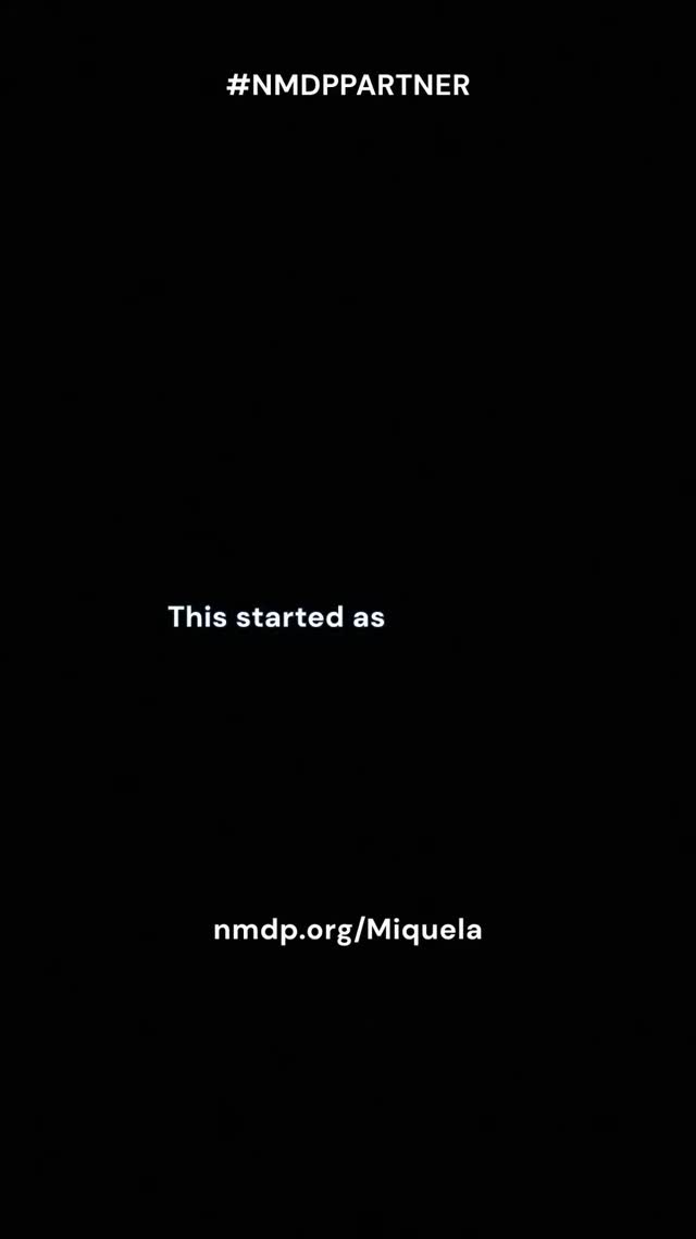
Why it works (and why it doesn’t need to be pretty)
Most creators lose conversions because the viewer doesn’t know what to do next. A clean end-card solves that. Black background forces focus, and the text is spaced like a breathing pause after the emotional content. It feels final, like credits—so the viewer is primed to take action.
The hashtag/partner label at the top is a trust cue. It signals legitimacy and transparency. The middle line (“This started as”) acts like a story bridge—reminding the viewer that the link is connected to something meaningful they just watched. And the URL at the bottom is the actual action.
If you’re running a campaign, this is the simplest reliable structure: trust cue → story cue → link.
Signal table
| Signal |
Evidence (from this image) |
Mechanism |
Replication action |
| Zero distraction |
Pure black background |
Focus stays on the URL |
Use a solid background and keep it text-only |
| Trust label |
Partner hashtag at top |
Reduces skepticism |
Include disclosure/partner tag in a consistent place |
| Story bridge |
Short middle line that implies context |
Maintains emotional continuity |
Add one short line that connects the link to the story |
Use cases & transfers
Best-fit scenarios
- Nonprofit campaigns: emotional story → clear action link.
- Partner activations: disclosure + link without clutter.
- Lead magnets: “download here” end-cards after tutorials.
- Event registrations: keep the frame clean so the URL is memorable.
Not ideal
- Cold audiences with no context: a blank end-card needs a strong story before it.
- Complex actions: if the viewer needs steps, you’ll need more than one line.
Transfers (exactly 3)
Transfer 1: “3-line conversion card”
- Keep: top trust cue, middle bridge, bottom URL
- Change: copy per campaign
- Slot template (EN): “{disclosure_or_tag} / {bridge_line} / {short_url}”
Transfer 2: “Color swap without losing focus”
- Keep: text-only, high contrast
- Change: background to brand color (deep navy, dark green)
- Slot template (EN): “solid {brand_dark_color} background, white text end-card”
Transfer 3: “QR variant”
- Keep: same spacing and typography
- Change: replace URL with a QR code + short URL
- Slot template (EN): “end-card with QR code centered low + short URL below”
Aesthetic read: negative space is persuasive
The empty space isn’t wasted. It’s what makes the action feel important. When you remove everything else, the viewer’s brain treats the link as the point of the story.
Prompt technique breakdown
| Prompt chunk |
What it controls |
Swap ideas (EN, 2–3 options) |
| “solid black background” |
Focus |
“solid navy”, “solid charcoal”, “solid dark green” |
| “top disclosure tag” |
Trust |
“#AD”, “#Partner”, “Sponsored” |
| “middle bridge line” |
Continuity |
“This started with…”, “Because of you…”, “If you want to help…” |
| “bottom short URL” |
Action |
“text-to-donate”, “signup link”, “download link” |
Remix steps
Baseline lock
- High contrast (white on black)
- Three-line spacing
- Exact URL spelling
One-change rule
Change only one knob per version: bridge line, disclosure tag, or background color. Keep the URL consistent so it becomes memorable across reposts.
Example 4-step iteration sequence
- Run 1: baseline black + 3-line layout.
- Run 2: keep layout, test a shorter bridge line.
- Run 3: keep copy, test dark navy background.
- Run 4: keep background, add QR code variant for Stories.