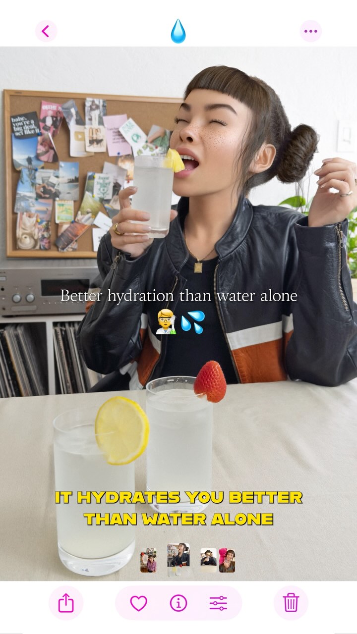
monthly recap 🗓️ kinda spiraled but giving myself points for staying hydrated 💅🏼🧃 it’s the little things!! @liquidiv #OwnYourRitual #LiquidIVPartner
monthly recap 🗓️ kinda spiraled but giving myself points for staying hydrated 💅🏼🧃 it’s the little things!! @liquidiv #OwnYourRitual #LiquidIVPartner
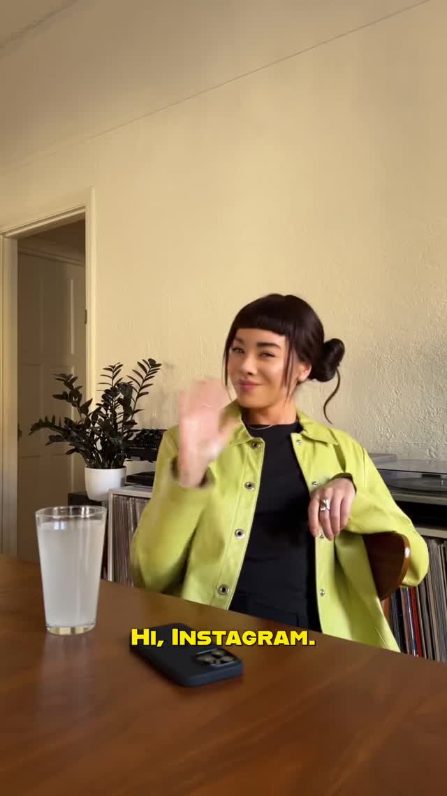
This frame is simple on purpose: one person, one wave, one line of text, one drink. That clarity is a strong growth choice. In crowded feeds, heavy concepts often lose speed, but a direct greeting like “HI, INSTAGRAM.” lowers interpretation cost to near zero. Viewers immediately understand tone and context, then stay for the personality beat.
The second performance lever is contrast placement. The lime jacket acts as the visual hook against neutral walls and wood tones, so the subject pops without looking overproduced. The scene keeps real-life anchors (phone, glass, records, plant), which makes sponsored messaging feel embedded in daily routine instead of forced ad staging.
Finally, this works as partnership storytelling because the product narrative (hydration ritual) is implied through behavior, not hard sell. The drink is present from frame one, but the emotional opening remains human and conversational. That balance between intimacy and brand clarity is exactly what keeps virtual-influencer content shareable and comment-friendly.
| Signal | Evidence (from this image) | Mechanism | Replication Action |
|---|---|---|---|
| Instant social entry | Bottom subtitle says “HI, INSTAGRAM.” with a wave gesture | Immediate conversational framing increases watch-start retention | Open with a direct 2-4 word greeting plus one clear hand gesture |
| Everyday credibility | Home table, phone, records, plant, plain interior | Domestic cues reduce ad resistance and improve trust | Place brand moment inside familiar room objects, avoid sterile set design |
| Single-color anchor | Lime jacket is the brightest object in frame | Color contrast guides eye to speaker before caption is read | Choose one high-chroma wardrobe element and mute everything else |
{greeting_line} from {room_type}, waving gesture, {product_glass_or_object} on table, casual chat tone{accent_jacket_color} subject in neutral interior, {mood_word} expression, short opener subtitleseated {creator_type} at {table_material}, {prop_set}, subtitle: {opener}, CTA: {comment_prompt}The visual language is intentionally feed-native: vertical framing, table-level perspective, and soft room light that feels unforced. The composition gives the subject enough headroom to breathe while keeping action in the lower half where hands, props, and subtitle live. That distribution improves mobile readability because viewers can parse identity, tone, and context in one glance.
Color design is minimal but strategic. The lime jacket works as a focal beacon, while black top and hair provide contrast structure, and the cream wall keeps visual noise low. The warm wood tabletop grounds the frame in domestic realism, preventing the scene from becoming synthetic.
Small imperfections, especially hand motion blur during the wave, add social proof that this is a moment, not a poster. For creators, this is the key lesson: polish should support intimacy, not erase it. When content looks approachable, brand integration becomes less defensive and more conversational.
| Prompt chunk | What it controls | Swap ideas (EN, 2-3 options) |
|---|---|---|
| "single seated creator waving to camera" | Human entry action and hook | small nod greeting; two-finger peace sign; cup raise |
| "lime jacket over black top in neutral room" | Focal color and style balance | cobalt cardigan over white tee; red hoodie over charcoal tank; mustard overshirt over navy tee |
| "wood table with cloudy drink and phone" | Daily-life credibility props | coffee mug + notebook; smoothie glass + tablet; tea cup + paperback |
| "soft left daylight, candid social reel still" | Lighting realism and platform-native mood | window backlight with bounce fill; overcast morning soft light; late-afternoon warm side light |
| "bold yellow subtitle at bottom" | Immediate message clarity | white subtitle with black stroke; all-caps sticker text; lower-third conversational caption |
Baseline Lock: 1) seated medium framing, 2) greeting gesture in first beat, 3) one bright wardrobe accent against neutral environment.
One-change rule: adjust only one to two knobs per version to keep performance attribution clear.