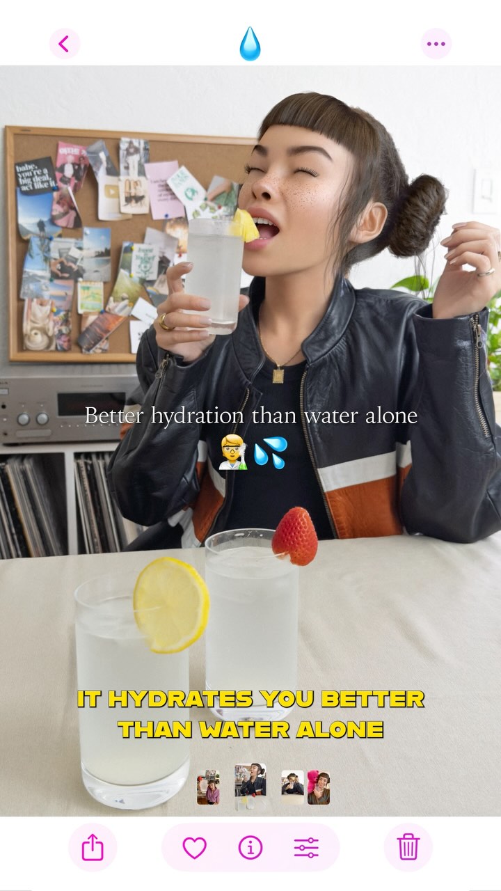
monthly recap 🗓️ kinda spiraled but giving myself points for staying hydrated 💅🏼🧃 it’s the little things!! @liquidiv #OwnYourRitual #LiquidIVPartner
monthly recap 🗓️ kinda spiraled but giving myself points for staying hydrated 💅🏼🧃 it’s the little things!! @liquidiv #OwnYourRitual #LiquidIVPartner
This visual blends three things effectively: a playful character expression, a clear product-use moment, and social-native screenshot framing. Instead of looking like a polished ad, it feels like a lived-in story capture with personality. The creator is mid-action, holding the drink close to the face, while the product claim is repeated in plain language on screen. That combination makes the message easy to remember without feeling overly corporate.
The caption context about a messy month and "points for staying hydrated" also matters. It positions hydration as a realistic routine, not a perfection narrative. For small creators, this is a useful model for sponsored content: tie brand benefit to an everyday behavior and keep tone conversational. Audience trust improves when product mention fits existing voice and lifestyle cues.
Keep: action-in-use pose, one repeated benefit statement, creator facial expressiveness.
Change: swap hydration drink for protein shake or tea ritual based on niche.
Slot template (EN): "{my routine was chaotic}, but this {habit/product} helps me {single benefit}."
Keep: story-native screenshot framing and conversational voice.
Change: replace tabletop fruit garnish with niche-relevant prop (journal, gym band, desk setup).
Slot template (EN): "small daily ritual: {action}. why? {benefit line}."
Keep: one creator-centered close-medium shot and two-point benefit reinforcement.
Change: shift setting from home desk to commute or studio prep moment.
Slot template (EN): "{scene} + {product action} + {repeatable claim} + {light CTA}."
The composition prioritizes person-product connection. The glass is near face level, so eye path runs from expression to object immediately. Background details are domestic and slightly busy, which supports authenticity over polished commercial styling. Foreground glass with lemon slice adds depth and doubles the hydration cue, reinforcing message continuity.
Color palette balances neutral interiors with small saturated accents: yellow lemon, red strawberry, and black-orange jacket stripe. These accents help anchor attention without stealing focus from the product action. The screenshot interface elements also function aesthetically, signaling immediacy and social-native context. For creator growth content, this is a practical lesson: conversion can improve when branded scenes look like real platform behavior, not detached studio ads.
| Observed | Recreate evidence |
|---|---|
| Close-medium action framing | Place product interaction near subject face for instant narrative linkage. |
| Foreground hydration cue | Add a second glass/fruit garnish in foreground to reinforce category signal. |
| Platform-native screenshot texture | Include story/reel UI rhythm or layout-inspired framing style. |
| Simple repeated claim text | Keep one benefit line repeated in short readable overlays. |
| Prompt chunk | What it controls | Swap ideas (EN, 2-3 options) |
|---|---|---|
| "creator holding and sipping hydration drink in close-medium frame" | Behavior proof and focal narrative | "mixing drink at desk" | "opening sachet into water" | "post-workout sip moment" |
| "story-style screenshot composition with subtle UI cues" | Platform-native authenticity | "reel frame aesthetic" | "story capture layout" | "casual app-interface inspired crop" |
| "one repeated hydration benefit phrase" | Message retention | "hydrates better" | "electrolyte support" | "daily hydration boost" |
| "home interior with everyday objects and bulletin background" | Relatable context | "kitchen counter scene" | "bedroom desk setup" | "studio prep corner" |
| "signature hairstyle + expressive face" | Creator identity continuity | "signature bangs" | "recognizable accessory" | "consistent expression style" |
Baseline Lock: lock action-in-use moment, lock one core claim line, lock creator identity cue.
One-change rule: change only one to two knobs per iteration, usually setting or copy tone, not both.