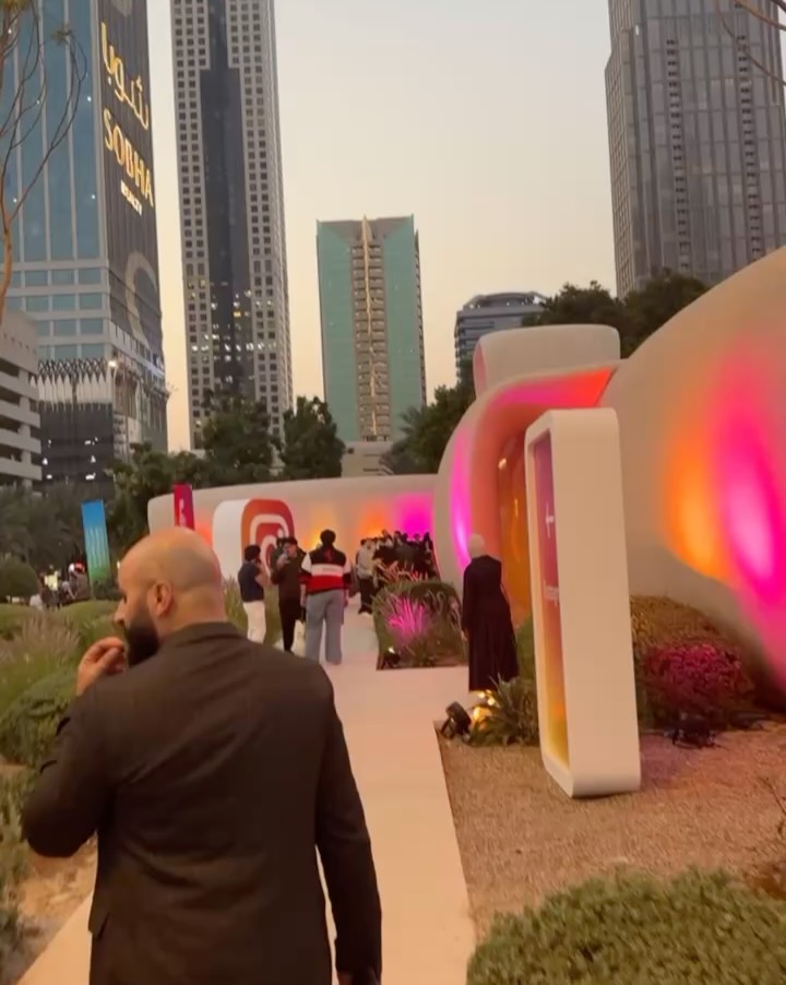
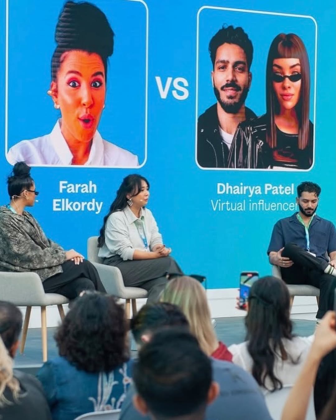
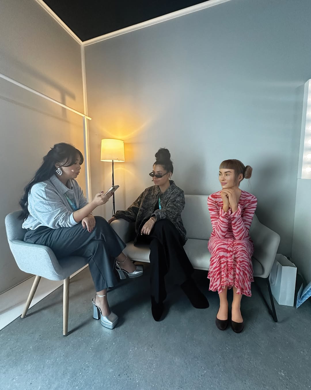
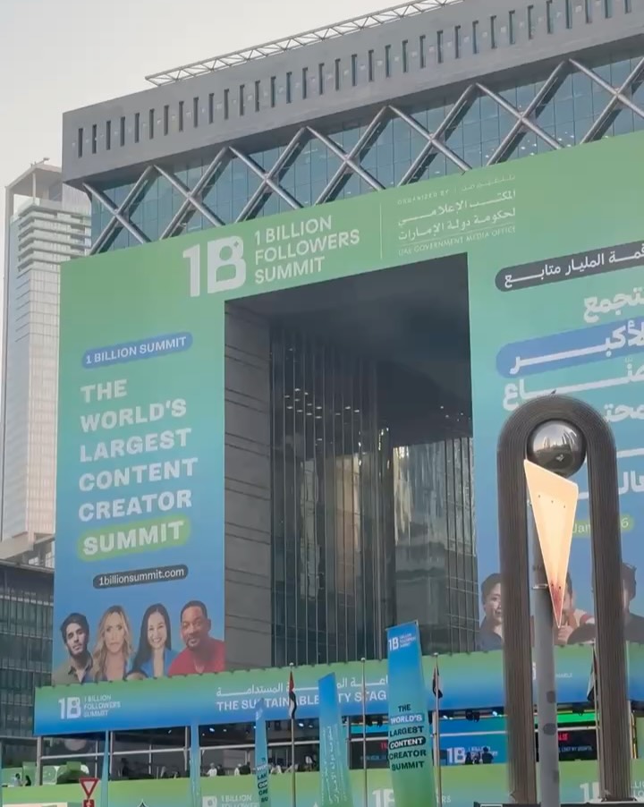
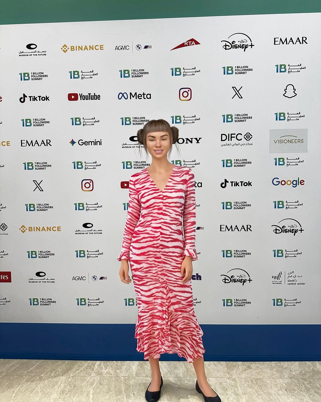
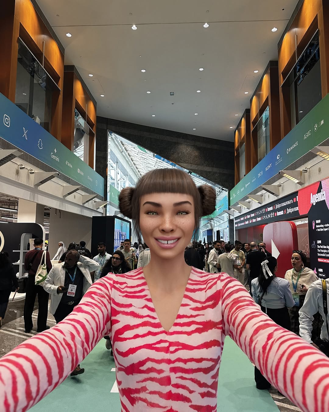
omg @1billionsummit was a blur 🫠 new besties, so many conversations that stuck with me, creators from all over the world, and yes… full-on dubai fever 🌍✨ still processing it all but feeling really grateful tbh
omg @1billionsummit was a blur 🫠 new besties, so many conversations that stuck with me, creators from all over the world, and yes… full-on dubai fever 🌍✨ still processing it all but feeling really grateful tbh
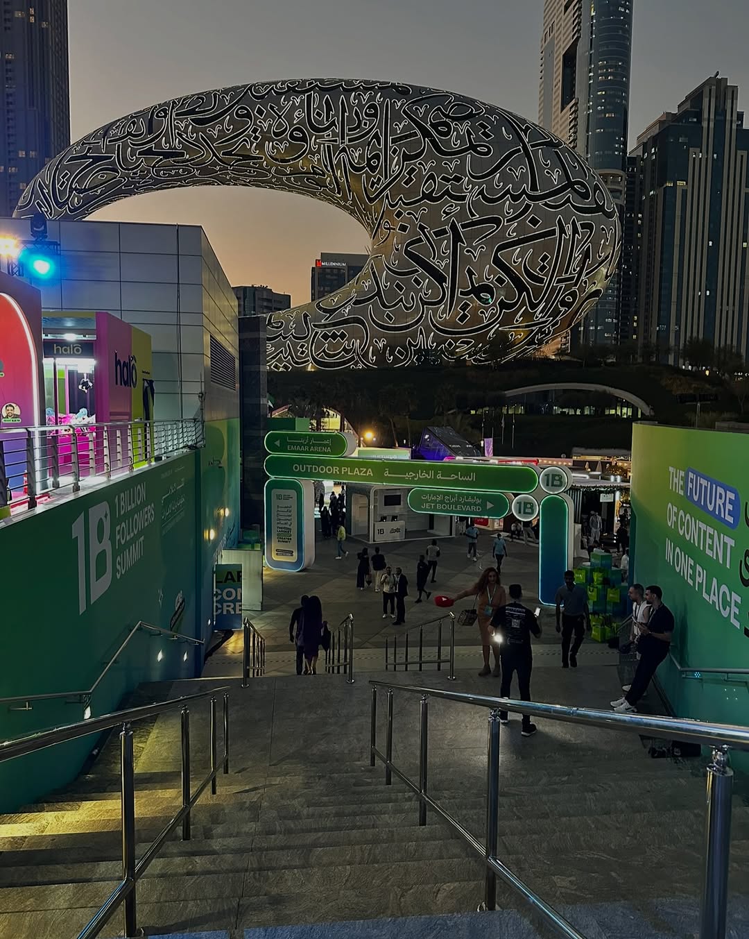
Some images go viral not because they’re loud, but because they quietly solve a viewer’s question: “What does it feel like to be there?” This frame does that in one glance. You’re not seeing a stage or a speaker—you’re seeing the moment right before the story begins: the walk-in, the anticipation, the crowd turning into a shared direction.
The staircase is doing most of the persuasion. It gives the viewer a path, not a puzzle. Your eyes slide down the rails, land on the entry signs, and then jump up to the futuristic landmark in the sky. That’s a complete narrative arc in a single scroll-stopper: arrival → context → destination. Add the dusk light (cool ambient + warm spots + a hit of neon) and it feels like “real life, but upgraded.”
Even if someone doesn’t know the event, the signals are universal: a branded corridor, a gateway, people moving with purpose, and a city icon that makes the whole thing feel globally relevant. Pair that with a caption about conversations and “new besties,” and the image becomes a social proof machine: it’s not just a place, it’s a network.
| Signal | Evidence (from this image) | Mechanism | Replication Action |
|---|---|---|---|
| “Big event” credibility | Clear branded walls + wayfinding gates + crowds entering | Institutional cues reduce skepticism and raise perceived importance | Lock in signage + gate + crowd in your prompt; keep text minimal and readable |
| Instant story direction | Handrails and stairs funnel the eye to the plaza | Leading lines create effortless comprehension in a fast scroll | Choose a top-of-stairs viewpoint and describe “symmetrical converging handrails” |
| “Real, but cinematic” mood | Twilight ambient + warm entrance lights + a cyan practical glow | Mixed color temperatures feel premium and emotionally charged | Explicitly set twilight + warm spotlights + cyan practical (don’t rely on “cinematic” alone) |
| Location flex without ego | Iconic futuristic building dominates the skyline | A landmark makes the story feel global and share-worthy | Swap in your own “icon” (landmark, set piece, sculpture) and keep it in the upper third |
Transfer 1: “Arrival at the drop”
Transfer 2: “Museum night opening”
Transfer 3: “Creator retreat check-in”
The first thing I notice is how the frame is engineered for clarity. The rails and stair edges create a clean geometric funnel, so even with people and signs everywhere, nothing feels chaotic. Second, the palette is disciplined: deep teal branding carries the midground, while the skyline stays in charcoal and steel. That contrast makes the copy-like signage feel intentional instead of cluttered.
Then there’s the light mix: cool twilight sets a calm base layer, warm spots add human warmth near the entrance, and one cyan practical glow adds “future” without turning the whole scene into neon. The result is a premium mood that still reads as believable: not a studio set, not a filter—just well-placed practicals doing the heavy lifting.
Finally, the textures are quietly helping. Concrete steps, brushed-steel rails, and slightly noisy shadows signal “captured” instead of “rendered,” which matters for trust on social. And because the landmark sits cleanly in the upper third, the composition leaves just enough breathing room for the eye to reset—so viewers linger a beat longer and are more likely to save.
| Prompt chunk | What it controls | Swap ideas (EN, 2–3 options) |
|---|---|---|
| Viewpoint + leading lines | Instant readability and “arrival” narrative | “from the top of a staircase”, “from a pedestrian bridge”, “from a parking ramp looking down” |
| Wayfinding + readable signage | Credibility and context without needing a caption | “check-in gate”, “entry arch”, “ticket scan lanes” |
| Landmark silhouette | Share-worthy identity and global scale | “iconic museum”, “stadium halo”, “giant sculpture” |
| Mixed color temperature | Cinematic realism (cool base + warm accents) | “twilight + warm tungsten”, “blue hour + sodium streetlights”, “overcast dusk + neon accent” |
| Crowd density | Energy level and social proof | “sparse”, “moderate”, “packed but orderly” |
photorealistic dusk event entrance, shot from the top of a long staircase looking down, symmetrical converging handrails, moderate crowd walking toward an outdoor plaza entry gate with readable wayfinding signs, deep teal branding walls, warm entrance spotlights plus a distinct cyan practical glow, iconic futuristic landmark silhouette in the upper third, wide-angle 24mm feel, medium depth of field, documentary travel photo lookChange only 1–2 knobs per run. If you change the crowd, the signage, and the landmark at the same time, you’ll never know what broke the look.