2024 in a nutshell: turned 21 🎉, gave my first keynote 🎤, travelled ✈️ , went green 🌱, got conned (oops 💀), made a new bestie ❤️. Survived? Thrived. ✨
2024 in a nutshell: turned 21 🎉, gave my first keynote 🎤, travelled ✈️ , went green 🌱, got conned (oops 💀), made a new bestie ❤️. Survived? Thrived. ✨
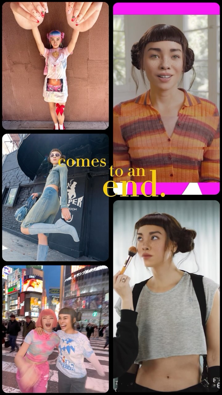
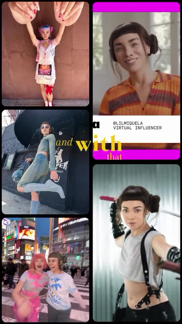
Recap posts often fail because they feel like random photo dumps. This one works because it behaves like a trailer: strong tile rhythm, recognizable character identity, and a clear closing phrase in the center. The viewer instantly understands that this is a "year in one glance" story.
The aesthetic strength comes from contrast between variety and structure. Variety appears through mixed scenes: intimate portrait, street motion, nightlife, and beauty prep. Structure appears through consistent rounded rectangles, thick black separators, and a dominant vertical rhythm. The headline text in warm yellow cuts across this grid and acts as a unifying voiceover. A magenta strip and other bright accents create pop points that guide the eye through the composition in seconds. This is important in feed behavior where users decide almost instantly whether a recap is worth opening. The design also avoids a common recap problem: equal visual weight for every memory. Here, panel sizes differ, so some memories feel like anchors while others work as quick beats. That hierarchy is the difference between a scrapbook and an effective social cover. If you want to replicate this look, think like an editor: choose moments that contrast in context, then force them into one strict geometry so the story feels intentional.
| Observed | Recreate | Why it matters |
|---|---|---|
| Five-panel asymmetric mosaic | Predefine panel map before selecting images | Prevents random collage clutter |
| Thick black rounded gutters | Use bold separators, not thin white lines | Improves readability and premium feel |
| Center narrative phrase over imagery | Add one concise emotional line (3-6 words) | Creates storyline, not just a memory stack |
| Mixed day/night panel content | Include at least one daylight and one nightlife panel | Boosts dynamic range and perceived life breadth |
| Prompt chunk | What it controls | Swap ideas (EN, 2-3 options) |
|---|---|---|
| tile layout map | Narrative pacing and information density | 3+2 mosaic / 2x3 equal grid / hero tile + four minis |
| identity continuity | Whether montage feels like one creator story | same face every panel / same hair anchor / same accessory cue |
| overlay text phrase | Emotional framing of the recap | comes to an end / what a year / chapter closed |
| gutter and corner styling | Visual cleanliness under high content density | thick rounded black / thin white / soft shadow cards |
| scene diversity balance | Perceived richness of creator life | portrait + street + event / studio + travel + friends / work + play + reset |
[Subject] same creator across {N} recap tiles
[Environment] mixed contexts: {scene1}, {scene2}, {scene3}
[Composition/Camera] vertical mosaic with rounded gutters and center play icon
[Lighting] preserve per-tile authenticity (day, indoor, night)
[Style/Rendering] social reel cover, high readability, emotional headline overlayBaseline lock: (1) collage geometry, (2) identity continuity, (3) one central phrase.
One-change rule: change just one variable each version so performance insights remain clear.