2024 in a nutshell: turned 21 🎉, gave my first keynote 🎤, travelled ✈️ , went green 🌱, got conned (oops 💀), made a new bestie ❤️. Survived? Thrived. ✨
2024 in a nutshell: turned 21 🎉, gave my first keynote 🎤, travelled ✈️ , went green 🌱, got conned (oops 💀), made a new bestie ❤️. Survived? Thrived. ✨
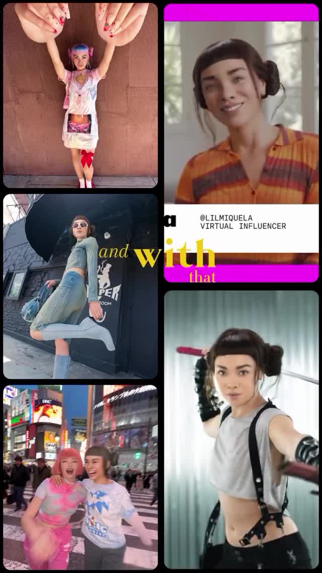
Collages like this perform because they compress a whole personality arc into a single frame: a tiny weird moment, a fashion flex, a city memory, a friendly selfie, and an action persona. It’s a highlight reel you can understand before you even read the caption.
Recap formats are inherently shareable because they’re templates. People don’t just like them—they copy them. This collage gives viewers a clear blueprint: stack a few distinct “moods,” add one bold text strip, and let the audience fill in the year.
The second reason is rhythm. The left column is outward-facing (street + city), the right column is personal (selfie + persona). That back-and-forth feels like a real life: public moments and private rituals. The banner (“VIRTUAL INFLUENCER”) adds context without breaking the vibe, and the yellow word fragments create motion across the grid so your eye keeps traveling.
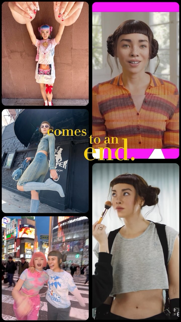
And importantly, nothing is too long. It’s the social equivalent of a trailer: fast, legible, and emotionally varied.
| Signal | Evidence (from this image) | Mechanism | Replication Action |
|---|---|---|---|
| Template energy | 5-tile recap layout | Makes viewers want to create their own | Use a fixed grid (3-left/2-right) and repeat it monthly or yearly |
| Public vs private rhythm | City/fashion tiles vs indoor selfie tiles | Feels like a full life, not a single aesthetic | Mix one “outside” tile, one “inside” tile, one “friends” tile |
| Cross-tile motion | Yellow words and magenta bars bridging panels | Guides the eye; increases dwell time | Add 1–2 graphic elements that span across tiles (words, bars, tape) |
{win_1} | {win_2} | {ritual} | {friend_moment} | {wildcard}outside moment + inside moment + process + friends + result{self_care} {movement} {work} {people} {treat}The collage works because each tile has a distinct job: one “odd” moment (tiny doll energy) to spark curiosity, one fashion/action moment to signal confidence, one city memory to signal lifestyle, and one friendly face to keep it warm. The magenta bars and bold banner give the whole grid a branded frame—like a show package—so it feels intentional rather than random screenshots.
| Prompt chunk | What it controls | Swap ideas (EN, 2–3 options) |
|---|---|---|
| Grid layout | Repeatability | “3-left/2-right”, “2x3 grid”, “polaroid collage” |
| Bridging graphics | Flow | “magenta bars”, “tape strips”, “handwritten words” |
| Banner strip | Context | “handle + title”, “date + location”, “series name” |
| Tile variety | Story depth | “friends”, “work”, “travel”, “ritual prop” |
Vertical social recap collage with 5 rounded-corner tiles and black gutters: three stacked tiles on the left and two stacked tiles on the right. Include a white banner on the right column with readable text “@LILMIQUELA” and “VIRTUAL INFLUENCER”, magenta bars at top and bottom of the right column, and yellow serif word fragments spanning tiles. Mix: a tiny doll moment, a street fashion jump, a Times Square friend photo, an indoor smiling selfie, and an action-pose portrait. Clean modern high-contrast social-feed style.