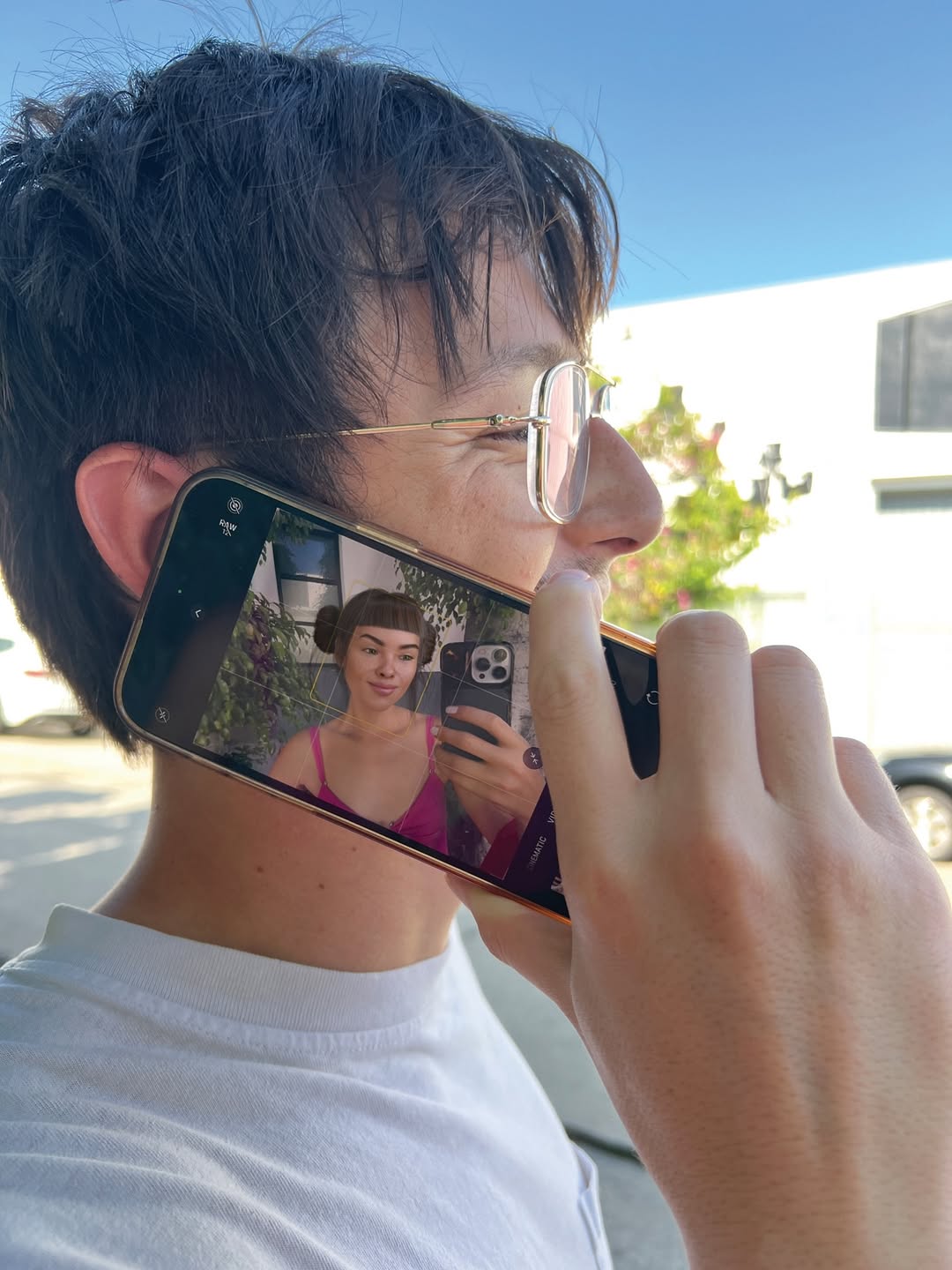
🫶 but make it life size last slide is…close enough 🤡
🫶 but make it life size last slide is…close enough 🤡
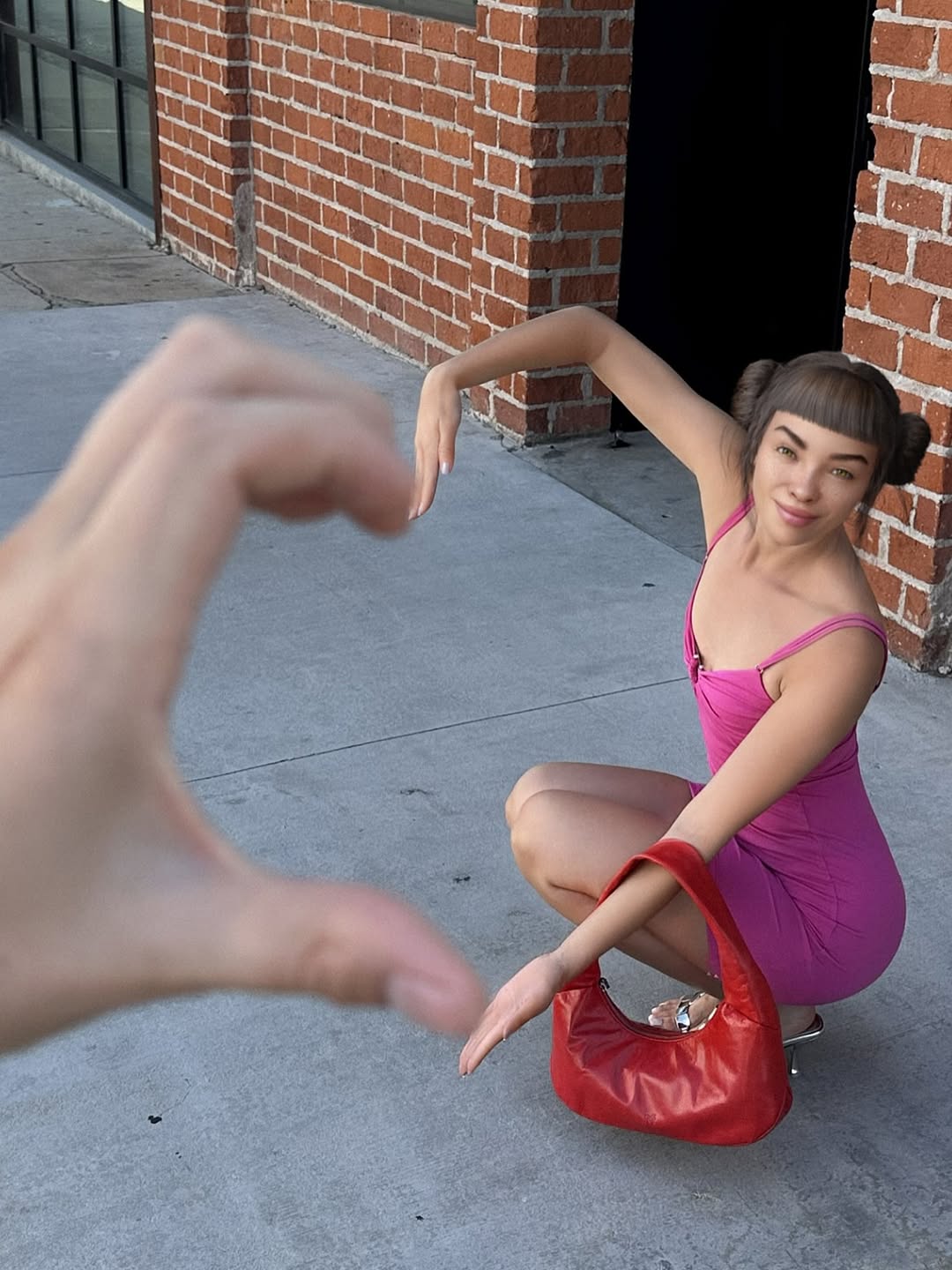
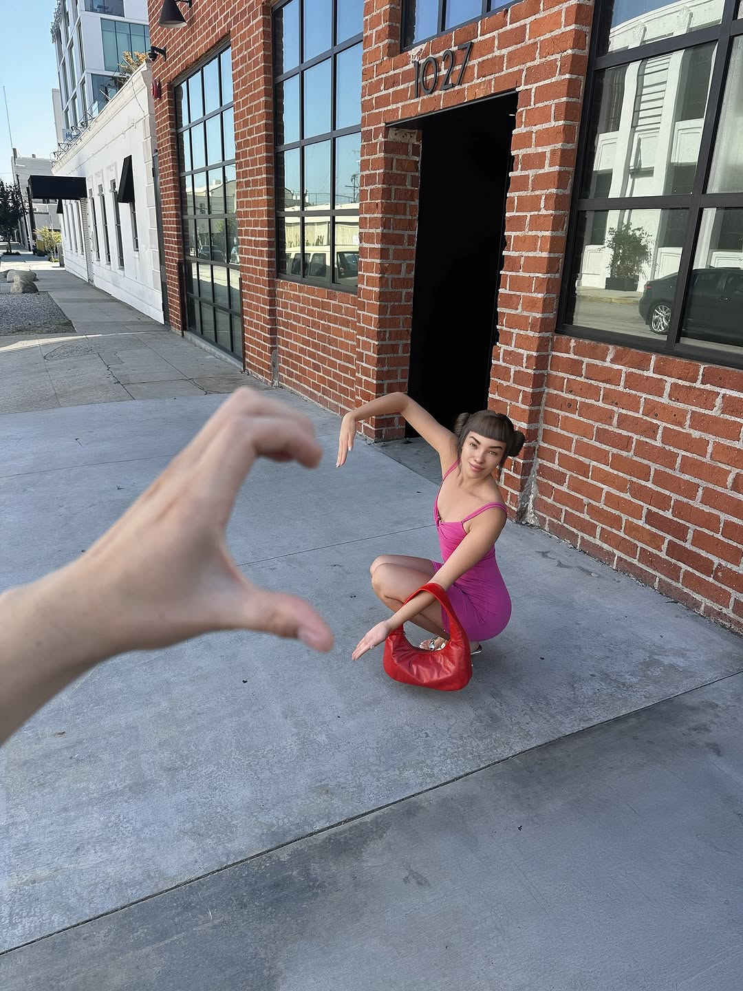
This image is not complicated, and that is the point. It uses one playful camera trick to turn an everyday sidewalk into a moment people want to show their friends. The giant blurred hand in the foreground tells your brain, "there is a joke here," before you even notice the outfit.
For creators, this is a repeatable growth move: build a clear visual gag with one foreground element, then keep everything else clean and readable.
The mechanism is forced perspective plus a strong color story. Pink and red read loudly on mobile. The brick corner and doorway give structure, and the subject pose feels like a freeze-frame from a playful scene. Most importantly, the viewer understands the trick instantly, which makes it easy to share.
| Signal | Evidence (from this image) | Mechanism | Replication Action |
|---|---|---|---|
| Instant visual trick | Oversized blurred hand framing the subject | Fast comprehension increases share probability | Add one extreme-foreground element and blur it aggressively |
| Color punch | Bright pink dress + red handbag | High contrast improves thumbnail performance | Pick two hero colors and keep the rest neutral |
| Structured background | Brick corner and doorway create clean geometry | Simple shapes keep the joke readable | Use one strong architectural line as the scene anchor |
The aesthetic is built on depth and restraint. The foreground hand is intentionally blurry, which immediately signals depth and makes the photo feel "real" rather than staged. The background is simple and textural: brick, concrete, and a clean dark doorway shape. That simplicity lets the subject styling carry the color energy. Composition is asymmetric but balanced: the hand occupies the left, while the subject and bag sit on the right. This creates a clear visual path across the frame. Lighting stays natural and unromantic, which helps the trick feel casual and shareable. The result is a photo that looks effortless, but is actually a controlled setup with one strong idea.
| Prompt chunk | What it controls | Swap ideas (EN, 2-3 options) |
|---|---|---|
| foreground element + blur | The hook and depth cue | hand gesture / flower close-up / product close-up |
| subject pose | Playfulness and readability | crouch / lean against wall / sit on steps |
| two-color wardrobe | Thumbnail contrast | pink+red / blue+yellow / black+silver |
| brick-and-concrete scene | Structure without clutter | brick corner / parking lot wall / storefront doorway |
| lens depth behavior | Forced perspective clarity | strong blur foreground / moderate blur / subtle blur |
Baseline Lock: lock the foreground blur strength, lock the subject position right-of-center, lock the simple brick background.
One-change rule: change only 1-2 knobs per run.