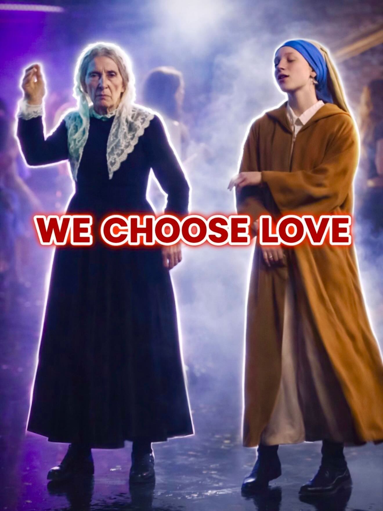
This image works because it understands that internet poster culture is built on collision. It does not try to keep period costume, stage atmosphere, and meme typography neatly separated. Instead, it forces those worlds together in a way that feels deliberate, theatrical, and highly shareable. Two women stand in a dramatic tableau that could have come from a costume drama, but the purple haze, glossy lighting, and oversized slogan push the image out of historical staging and into the language of digital remix culture. That friction is exactly why the composition feels alive.
The visual is not merely a scene from a narrative. It behaves like a declaration poster. The text “WE CHOOSE LOVE” is not a caption added after the fact. It is integrated as a central device that reframes everything the viewer sees. Once the phrase lands, the clothing, expressions, and colors stop reading as neutral costume choices and start functioning as symbolic elements inside a larger statement. The viewer is invited to interpret the piece as commentary, fan edit, performance still, meme poster, or emotionally heightened social graphic all at once.
The image is built on contrast between the two figures. One is older, severe, and sharply dressed in a long black garment with a striking white lace collar. The other is younger, softer in silhouette, wrapped in a looser brown cloak and anchored by a bright blue headscarf. Their wardrobe difference makes them readable immediately, even before the viewer processes expression, lighting, or text. This matters because meme posters need instant visual hierarchy. If the viewer cannot understand the relationship between the subjects at a glance, the slogan loses force.
What makes the pair effective is not just that they are visually different, but that they also feel emotionally different. The older figure communicates rigidity and formality. The younger figure introduces warmth and pliability. That tension gives the poster narrative charge. Even without explicit story context, the audience senses that these two people represent different energies occupying the same frame. The slogan then binds them into a shared statement, which creates a productive contradiction. The image feels both oppositional and unified at the same time.
The phrase across the lower center is the visual hinge of the entire composition. If the text were small, placed in a corner, or styled as a subtitle, the image would still be attractive but far less memorable. By making the slogan large, centered, and physically intrusive, the design turns language into structure. The text crosses the bodies instead of politely sitting underneath them. That decision tells the viewer that the message is not secondary. It is the reason the image exists.
The white letters with a red outline feel intentionally loud. They introduce a layer of pop directness that clashes with the more refined costume styling and smoky theatrical atmosphere. That clash is useful. It drags the image out of tasteful still-photography territory and places it inside meme circulation logic, where boldness and legibility matter more than subtle typographic restraint. Because of the red outline, the words punch through the purple haze and dark garments, keeping the composition readable even at small sizes on social feeds.
The lighting is one of the reasons the image does not remain a straightforward costume portrait. Purple edge glow, bluish haze, and reflective floor values turn the space into a performance environment rather than a historical room. This is important because the audience immediately understands that realism is not the only goal here. The poster is stylized. It wants to be interpreted through atmosphere as much as through subject matter. The neon-inflected smoke signals that the piece belongs to modern social aesthetics even though the clothing references older eras.
This kind of lighting also helps the image travel across different interpretation modes. A viewer can read it as camp, as sincere fan tribute, as ironic meme, or as flamboyant promotional art. Good internet-native posters often leave room for more than one emotional reading. The purple haze and glowing rim light contribute to that openness. They make the frame feel heightened, which means the viewer is more willing to accept the oversized text and the exaggerated conceptual fusion.
Historical clothing in digital culture can sometimes feel overly precious, especially when photographed in rigid, museum-like ways. This image avoids that trap by refusing to isolate costume from energy. The lace collar stays sharp and readable, the black garment remains structured, and the brown robe still drapes heavily, but the surrounding treatment tells us that we are not supposed to admire the wardrobe only as historical craft. We are supposed to read it as part of a current visual argument. That is what makes the costume language feel renewed rather than nostalgic.
The blue headscarf is especially effective because it introduces a modern color intensity inside an otherwise period-coded arrangement. It becomes an anchor point that keeps the composition from sinking into monochrome solemnity. Against the purple fog and the red-outlined text, the blue cloth helps the younger figure maintain visual presence. The image therefore preserves a strong two-character balance even though the older figure’s black silhouette and white collar are already highly dramatic.
The hazy performance-space environment is another strong choice. A literal historical interior would have narrowed the reading too much. By placing the figures in a more ambiguous theatrical zone, the image stays open. It can be read as a performance still, a costume concept poster, or a meme intervention layered over a scene. That ambiguity is useful because it allows the slogan to operate symbolically rather than descriptively. The phrase does not need to explain the room. It only needs to dominate the frame.
The reflective floor adds polish and helps the composition feel complete rather than cut out. Reflections anchor the figures in space and reinforce the sense that they are standing on a stage or dramatic set. This grounds the poster just enough to keep it from becoming pure collage. Good remix-style visuals often need that balance: one foot in tangible staging, one foot in heightened graphic language. This image achieves that balance through haze, reflections, and controlled lighting rather than through complex scenic detail.
Shareability comes from compression. A strong internet image compresses multiple readings into a quick and emotionally legible format. Here, the viewer receives costume contrast, expressive posture, a dramatic slogan, and a neon theatrical environment all in a single glance. There is enough information to feel rich, but not so much that the image becomes hard to summarize. People can share it because they instantly know what to say about it: it is theatrical, funny, dramatic, emphatic, and visually weird in a satisfying way.
The image also invites captioning, reaction, and reinterpretation. Posters that become part of online conversation usually have at least one strong replaceable element, and here that element is the slogan band. Because the typography is so central, viewers can imagine alternative phrases, remixes, political jokes, fandom references, or ironic slogans in the same template. That adaptability makes the image feel alive in social circulation. It is not a closed artwork. It is a format waiting to be re-used.
There are several lessons in this composition for anyone designing social posters, meme visuals, or stylized campaign graphics. First, contrast in silhouette matters more than detail overload. Second, atmospheric lighting can bridge old and new visual languages. Third, typography becomes much more powerful when it interrupts the image rather than decorating the margins. Fourth, shareability often increases when a poster feels emotionally overcommitted in a controlled way. This image does not hesitate; it declares its mood loudly.
It also shows that “meme” and “crafted” do not have to be opposites. The costumes are carefully rendered, the spacing is deliberate, and the stage atmosphere is visually coherent. Yet the final result is still playful, remix-friendly, and culturally fluid. That combination is increasingly important for creator-led communication. A poster can be polished without being stiff. It can be ironic without being careless. It can be dramatic without becoming unreadable. This image demonstrates all three.
If you break the image into pieces, none of them alone explains its strength. Two people in costume are not enough. Purple fog alone is not enough. A loud slogan alone is not enough. The power comes from the way each part amplifies the others. The costumes create contrast, the haze creates mood, the text creates intention, and the overall staging creates a sense of event. Together they transform a simple two-person tableau into something that feels culturally charged and immediately discussable.
That is why the poster remains interesting after the first read. It can be admired as visual camp, referenced as a meme format, studied as text-image integration, or discussed as a piece of fan-edit design. It offers more than one use and more than one audience. For a creator asset, that flexibility is extremely valuable. It means the image can move across platforms and interpretation contexts without losing its core impact.
Ultimately, this composition succeeds because it treats costume, atmosphere, and slogan as equal partners. No one layer is merely decorative. The result is a poster that feels staged, stylized, and emotionally immediate. It knows how to perform on a feed, how to hold attention, and how to leave behind a memorable graphic identity. That is exactly what a strong remix-era visual should do.