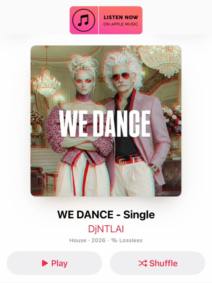
This image succeeds because it combines three different visual systems into one coherent object: fashion portraiture, luxury interior staging, and a believable streaming-platform interface. If it were only a glamorous duo standing in a chandelier-filled room, it would still look polished, but it would remain just an editorial portrait. If it were only a music app interface, it might feel generic and disposable. By merging the two, the composition becomes something more specific and more memorable: a faux single-release page that feels stylish enough to be shared and structured enough to be instantly understood.
The cover image itself presents a sharply styled duo. The woman’s sculptural updo, pink off-shoulder top, and crossed-arm stance create a bold high-fashion silhouette, while the older man’s white hair, tinted sunglasses, pale blazer, and controlled posture introduce a contrasting type of charisma. Together they look like a deliberately branded act rather than two unrelated models in the same frame. That matters, because the success of this artwork depends on the viewer believing, at least for a moment, that this could really be the cover for a luxury pop release.
The most important design move in the image is not the clothing or the ballroom. It is the decision to place the visual inside a music-platform product frame. That instantly changes the job of the artwork. Instead of asking the viewer to interpret the duo as generic fashion subjects, the layout tells them to read the pair as artists, performers, or a fictional act. The platform badge, metadata area, and playback controls complete that fiction.
This is a strong lesson for prompt-driven design. Context containers often matter as much as the subject itself. If you want an image to feel like media packaging, you must package it. A streaming interface, poster border, playlist card, or vinyl sleeve can transform an otherwise ordinary portrait into a designed object with a clear story. The interface here functions like a narrative frame around the fashion scene.
The interior environment is also carefully chosen. Chandeliers, cream walls, floral details, curved architectural lines, and salon-like furniture all contribute to a luxury atmosphere. This matters because music artwork often depends on what the setting implies about the artist’s identity. A nightclub suggests one kind of sound. A rehearsal room suggests another. A ballroom suggests glamour, polish, heritage, and theatrical performance.
That visual prestige supports the duo concept well. The room does not feel accidental. It feels curated. This raises the perceived value of the fictional release. Even before the title is read, the environment tells the viewer that this is meant to be premium pop branding rather than lo-fi indie material. That kind of environmental storytelling is often what makes mock promotional art feel convincing instead of playful but empty.
The two figures are styled in a way that makes the pairing feel intentional. The woman’s look carries sculptural glamour and attitude. The man’s look carries age, coolness, and controlled theatricality. Because the two archetypes are different but visually coordinated, the image gains internal tension. Strong duos often work because each person gives the viewer a different kind of energy while still belonging to the same world.
This is particularly effective in music-cover design because it hints at chemistry. The viewer does not need to know a song or a backstory to feel that these two people belong together as a visual act. That is exactly the kind of shorthand good cover design needs. It creates a suggestive identity fast enough to function inside a feed, a streaming card, or a recommendation surface.
The large “WE DANCE” title is one of the most important pieces of the composition. It acts as the central organizing device of the cover. Without it, the image would still be stylish, but it would feel more like a fashion spread than a music release. The title changes that immediately. It gives the duo a product name, a campaign focus, and a memorable hook.
Good music-cover typography has to do more than sit on top of an image. It has to survive scale reduction and give the cover its identity. Here, the title is bold enough to remain legible in smaller formats, which is essential for streaming-era design. It also visually cuts across the two figures, helping unify them into one shared brand object instead of two separate portrait subjects.
The subtle red-cyan color split effect is another smart detail. Without it, the image could feel too clean and corporate. With it, the cover gains a slightly retro, pop-cultural, almost stereoscopic mood. It suggests album-art stylization rather than plain commercial photography. This small visual treatment is enough to give the piece a little friction and personality without overwhelming the luxury mood.
This is a good reminder that one controlled visual accent can do more than many scattered effects. The chromatic split is not dominating the image. It is simply reminding the viewer that this is stylized media, not literal documentation. In prompt work, this kind of light-touch treatment often produces stronger results than stacking multiple filters or forcing exaggerated texture everywhere.
Shareability comes from clarity plus novelty. This mock streaming cover has both. The clarity comes from the obvious app shell, bold title, and centered artwork. The novelty comes from the strange but compelling combination of luxury ballroom editorial styling and streaming-platform mockup logic. That mix creates enough surprise to catch attention while remaining easy to understand.
The design is also modular enough to be repurposed into multiple formats. It could work as an Instagram post, a fake music release announcement, a creator-case-study graphic, or a prompt demo about interface-plus-fashion compositions. That utility makes the image stronger. It is not locked into a single use case. Broad usability often signals that a visual system has been built thoughtfully.
If someone wanted to replicate the same effect, the key would be to specify not just the image content but the content category. “Fashion duo in a ballroom” and “faux music-platform single cover featuring a fashion duo in a ballroom” are not the same prompt. The second one gives the model a design problem to solve rather than just a scene to illustrate. That difference is what produces the interface shell, metadata logic, and typographic hierarchy.
It also helps to define what each layer is supposed to do. The duo should carry the visual identity. The room should carry prestige. The app shell should carry product context. The title should carry recognition. The color split should carry pop stylization. When you describe the purpose of each element, the resulting image usually feels far more intentional.
| Element | Role | Why it matters |
|---|---|---|
| Streaming-app frame | Contextual packaging layer | Turns the image into a believable single-release object |
| Luxury ballroom background | Prestige environment | Signals glamour, performance, and brand value |
| Fashion duo styling | Identity contrast system | Creates chemistry and gives the fictional act visual personality |
| Large “WE DANCE” title | Primary branding element | Makes the cover readable and memorable at a glance |
| Red-cyan split effect | Stylization accent | Adds retro-pop energy without breaking realism |
This composition could easily become a repeatable series. New fictional singles could keep the same app-shell format while changing wardrobe, setting, and title. One release could shift into black-and-gold nightclub glam. Another could use monochrome art deco styling. Another could move into rooftop fashion-pop territory. The key is that the system already works: centered cover, strong title, metadata area, and a duo with attitude.
The image could also evolve by changing the platform frame. A vinyl sleeve version would feel more analog and nostalgic. A playlist card would feel more contemporary and digital. A stage-tour poster adaptation would shift the emphasis toward performance rather than listening. Because the design bones are already strong, the concept can expand without losing readability.
Many fake media mockups fail because they focus too heavily on UI mimicry and not enough on artistic identity. Others fail because they create a stylish image but forget to give it a convincing product frame. This composition sits in the middle, which is exactly where it should be. The interface is believable but not obsessive. The cover art is stylish but still readable. The title is prominent without crushing the people. That balance is difficult to achieve, and it is what makes the result feel polished.
The image also avoids overcomplication. There are enough details to make the environment rich, but not so many that the cover becomes hard to decode. That is critical in social contexts where most people encounter the image at reduced size. Good mockups must survive quick viewing, and this one does.
This luxury faux-single artwork works because it understands that media identity is built from layers. The fashion styling creates intrigue, the ballroom creates status, the title creates recognition, and the streaming interface creates context. Together they form a cohesive branded object rather than a random fashionable screenshot. That is why the image feels both playful and credible.
For creators, the bigger lesson is simple: when building a visual mock release, do not only design the image, design the container around it. The container tells the viewer how to interpret what they are seeing. Once that frame is in place, styling, typography, and atmosphere can work together much more effectively. This image is a strong example of that principle done well.