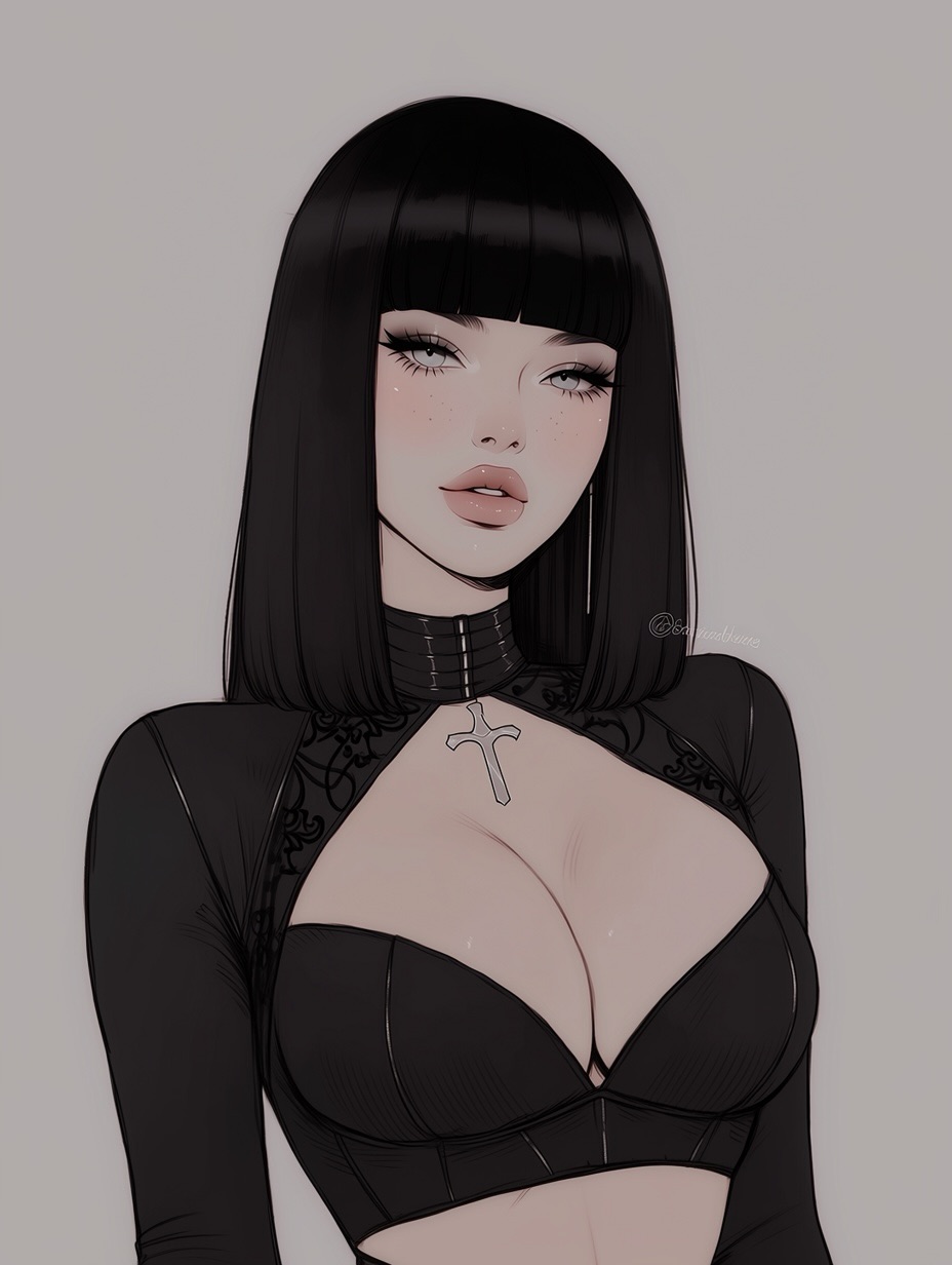
This portrait works because it understands subtraction. Instead of throwing gothic symbols, elaborate backgrounds, and layered accessories into the frame, it chooses a cleaner route: one striking haircut, one silver cross, one sharply defined neckline, and a blank soft-gray background that lets the face do the rest. For small creators, that is an important growth lesson. Minimal images often travel better when the silhouette is memorable and the emotional read is immediate.
The first thing viewers notice is not the necklace or even the top. It is the shape language. The blunt black bob creates a dark, smooth frame around a pale face, and that high-contrast outline gives the image its scroll-stopping power. From there, the soft lashes, muted blush, and neutral pout push the portrait away from aggressive goth cliché and closer to beauty-led character design. That blend is why the image feels widely shareable. It is gothic, but still polished enough for beauty boards, character inspiration posts, and style remix content.
The second reason this type of image performs is clarity. Nothing fights for attention. There are no hands, no environment, no extra props, and no competing textures behind the character. Every visual decision strengthens the same message: sleek, dark, composed, feminine, slightly distant. When creators ask why one portrait gets reposted while another disappears, the answer is often this simple. A clear visual thesis beats a crowded one.
| Signal | Evidence (from this image) | Mechanism | Replication Action |
|---|---|---|---|
| High-contrast silhouette | Solid black bob and black clothing sit against a plain pale background | The clean separation makes the subject readable in a fraction of a second | Use one dark silhouette shape against a light, uncluttered backdrop |
| Beauty-led softness | Half-lidded eyes, glossy lips, and diffused skin shading soften the goth styling | Soft beauty cues broaden appeal beyond niche dark-fashion audiences | Lower texture noise, soften shadows, and keep the makeup elegant rather than theatrical |
| Controlled symbolism | A single silver cross pendant provides identity without crowding the image | One symbolic accessory gives flavor while preserving the minimalist read | Choose one signature accessory and keep everything else visually quiet |
This is a good example of how creators can make a character image feel premium without making it complicated. The background is almost featureless, yet the portrait does not feel empty because the value structure is doing the work. The darkest parts of the frame are the hair and top. The brightest large shape is the face and upper chest. That simple light-dark map gives the eye a clear route to follow. The more complicated the subject styling becomes, the more important that route becomes.
The garment choice is also smart. It has enough design detail to feel intentional, but not so much that the viewer starts reading fabric before reading expression. That balance matters when creating images for social reach. If every element is equally loud, nothing becomes memorable. Here, the artist chooses one main read, one supporting read, and one accent. Main read: black bob and pale face. Supporting read: fitted black neckline. Accent: silver cross pendant.
| Observed | Why it matters for the look |
|---|---|
| Blunt shoulder-length black bob with even bangs | Creates a strong graphic frame and instantly recognizable character silhouette |
| Muted taupe-gray seamless background | Removes distraction and makes the figure feel clean and editorial |
| Low-contrast beauty lighting | Keeps the portrait elegant and avoids turning the goth styling harsh |
| Single silver pendant as the main accessory | Adds identity without cluttering the chest and neckline area |
| Chest-up crop with no visible hands | Focuses attention on face, hair, neckline, and mood instead of gesture |
This approach is less ideal for action scenes, worldbuilding posters, or story-heavy fantasy art. It depends on poise, restraint, and clean negative space. If you need motion, environment, or drama through narrative, this template will feel too still.
Three transfer recipes work well here. Keep the plain background, the high-contrast haircut, and the soft beauty lighting. Change the hairstyle, accessory, or neckline shape. Slot template one: {hair silhouette} + {single signature accessory} + {clean neckline top} + {plain studio background}. Slot template two: {dark fashion mood}, chest-up portrait, soft diffused lighting, {accent metal} jewelry, minimal backdrop. Slot template three: {character archetype} beauty portrait, blunt silhouette hair, muted palette, no props, editorial anime finish.
Creators often miss this style by overdescribing goth fashion and underdescribing composition discipline. The trick is to write the prompt like a beauty portrait with dark styling, not like a costume dump.
| Prompt chunk | What it controls | Swap ideas (EN, 2–3 options) |
|---|---|---|
| straight jet-black blunt bob with full bangs | Silhouette recognition and overall graphic strength | sleek white bob; deep auburn lob; long raven curtain hair |
| plain taupe-gray seamless background | Negative space and clean editorial focus | soft warm beige studio wall; cool light-gray backdrop; pale cream gradient |
| soft beauty lighting, low contrast | Skin rendering mood and softness of the final image | diffused window light; clouded daylight; softbox portrait light |
| black fitted cropped bustier with high collar | Fashion identity and chest/neckline structure | velvet high-neck dress; satin corset top; matte black mock-neck bodysuit |
| silver cross pendant | Symbolic accent and focal detail | silver dagger charm; pearl drop pendant; black ribbon choker |
| anime beauty illustration with polished linework | Rendering family and finish level | shoujo-inspired soft render; editorial manga portrait; glossy digital character art |
Lock three things first: the haircut silhouette, the plain background, and the low-contrast beauty lighting. Those are the structural choices that make this portrait feel expensive. After that, follow a one-change rule. Change only one or two knobs at a time so you can see what actually improves the image instead of muddying the style.
The big takeaway is that minimal portraits do not succeed by being empty. They succeed by being selective. If you want this kind of image to perform, make every visible element count, remove everything that does not strengthen the silhouette, and let one or two signature details carry the identity.