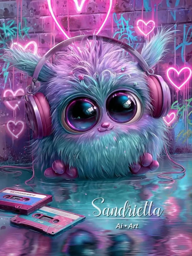
There are images that perform because they explain something useful, and there are images that perform because they deliver a mood so quickly that the brain accepts them before logic catches up. This tiny headphone-wearing fluff creature belongs to the second category. It is a pure hit of color, softness, nostalgia, and glow. You do not need backstory to understand it. The image creates an emotional shortcut: cute face, giant reflective eyes, candy neon palette, music props, and a retro wall full of hearts. That is enough to create an instant stop-scroll moment.
What makes this especially useful for small creators is that it is not random cute content. It is built from a stack of deliberate signals that work together. The creature is adorable, but the background is not generic. The cassettes, the graffiti brick wall, the pink headphones, and the wet reflective floor all push the post toward a specific retro-electronic fantasy. That gives the image identity. Cute alone is forgettable. Cute plus a clear world is much harder to ignore.
The other smart move is the clarity of the center composition. The creature sits right in the middle like a mascot, while everything else supports it: the heart halo behind the head, the cassette tapes in the corner, the reflected glow below, the neon scatter around the wall. It feels full without being messy. That balance is exactly why this kind of AI art often spreads well on social platforms. It reads instantly on a phone, but still rewards a longer look.
The strongest hook here is emotional compression. In one frame, the image combines baby-like proportions, oversized eyes, plush softness, sentimental retro music cues, and sugary nightlife color. Each of those elements works on its own, but together they build a very portable aesthetic. A viewer can imagine it as a profile theme, sticker concept, poster print, playlist cover, or niche account mascot. The more use cases an image implies, the easier it is for people to save or share it.
The glow treatment matters too. Pink and cyan neon are not just decorative. They create a high-energy outline around the fluffy textures, making the subject feel both soft and electric. That contrast is strong creator fuel. Softness makes the image comforting. Neon makes it attention-grabbing. When creators can combine those two impulses in one frame, the content tends to travel because it feels emotionally rich without becoming visually confusing.
There is also a nostalgia mechanic at work. The cassette tapes are small, but they completely change the reading of the post. Without them, it is just a cute fantasy creature. With them, it becomes a memory object linked to music culture, bedroom remix energy, and retro-tech affection. Tiny props can add an entire second layer of audience connection, and this image uses that trick very well.
| Signal | Evidence (from this image) | Mechanism | Replication Action |
|---|---|---|---|
| Instant cuteness hit | Huge glossy eyes, tiny paws, rounded plush body | Baby-schema features create immediate emotional attachment | Increase eye scale, shrink mouth and limbs, and keep the body compact |
| World-building through props | Pink headphones, cassette tapes, neon brick wall | Specific props turn generic cute art into a memorable niche scene | Add 1-2 era-defining objects that imply culture, not just decoration |
| High saveability | Poster-like symmetry with strong center focus and glowing reflections | Clean composition makes the image easy to reuse as wallpaper or reference | Center the mascot and keep side details secondary but readable |
| Color-led identity | Turquoise fur against pink and purple lighting | Strong complementary color contrast raises memorability | Choose one dominant fur hue and one dominant neon counter-color, then repeat them across the scene |
Many cute AI posts fail because they overload the frame with random sweetness. This one is more disciplined. The shape language is very simple: a fluffy square body, two pointed ears, two giant eyes, and round headphones. That simplicity is what lets the texture and color do the extra work. The artist did not chase complexity in silhouette. They chased recognizability, which is usually the smarter move for social media.
The texture treatment is another reason it lands. The fur is detailed enough to feel plush, but not so realistic that it becomes uncanny. The eyes are glossy like polished marbles, which gives the subject a toy-like finish. Then the wet floor reflects the same palette back upward, making the whole image feel unified. None of this is accidental. Reflection is helping the post look premium without asking for more objects or a more complicated background.
Even the background wall is handled correctly. It has enough information to establish a vibe, but it does not compete with the face. The hearts and graffiti sit behind the creature like a music-stage aura. For creators studying visual hierarchy, this is a good reminder that background detail should reinforce the subject’s mood, not ask for equal attention.
| Observed | Why it matters | How to recreate it |
|---|---|---|
| Heart-shaped neon glow directly behind the head | Acts like a halo and doubles the central focus | Place one bright shape behind the subject’s face to anchor the composition |
| Two-color nostalgia props in the foreground | Adds story and era without crowding the frame | Use one small prop cluster in a corner instead of scattering many items around |
| Turquoise-lavender fur against magenta light | Creates a memorable candy-electric contrast | Build the palette around one cool body color and one warm neon accent |
| Glossy eye reflections | Makes the creature feel alive and collectible | Request strong catchlights and deep glassy eye rendering |
| Reflective floor with soft blur | Gives the poster a finished premium feel | Specify wet reflective ground with diffused color bounce |
This approach works best for creators building mascots, sticker brands, playlist visuals, kawaii vaporwave pages, bedroom-pop aesthetics, or AI art accounts that want a signature creature universe. It can also be a strong hook image for digital product covers, moodboards, and collectible-style carousel posts. The reason is simple: the character is specific enough to remember, but broad enough to remix.
It is less ideal for serious cinematic world-building, luxury branding, or educational content that needs a restrained tone. The image is deliberately sentimental and hyper-sweet. If the goal is authority, realism, or neutral professionalism, this visual language is probably too emotionally loud.
{creature type} {fur color blend} {wearable tech} {retro prop} {neon wall motif}{cute mascot} {main accessory} {background icon} {surface reflection} {emotional tone}{compact fluffy body} {eye style} {accent object} {light color pair} {background world cue}The easiest way to miss this look is to over-prompt for “cute neon creature” and hope the model fills the gaps. Better results come from separating the image into control blocks. One block defines creature proportions. One defines material feel. One defines era props. One defines lighting. One defines composition. Once you write in blocks, you can swap themes without losing the structure that made the post work.
| Prompt chunk | What it controls | Swap ideas (EN, 2-3 options) |
|---|---|---|
| tiny square fluffy creature with giant glossy eyes | Base mascot proportions and emotional read | round fluff sprite; plush cube pet; chubby fantasy puffball |
| pink metallic over-ear headphones | Music identity and scale framing around the head | transparent jelly headphones; chrome DJ headset; pastel cat-ear headphones |
| turquoise and lavender fur with soft pink highlights | Color harmony and material charm | mint-and-peach fur; lavender-and-cream fluff; aqua-and-silver plush coat |
| brick wall with neon heart signs and graffiti | Subculture setting and background mood | neon star wall; glowing cloud graffiti; retro arcade light wall |
| two cassette tapes on wet reflective floor | Nostalgia cue and depth in the foreground | mini CDs; handheld game cartridges; glow sticks and ticket stubs |
| candy neon vaporwave lighting with soft bloom | Overall atmosphere and share-worthy polish | dreamy synthwave glow; bubblegum cyberpop lighting; pastel club-night bloom |
Start by locking the mascot proportions, the headphone scale, and the color pair. Those are the non-negotiables. If you lose them, the image stops feeling collectible. After that, add the neon backdrop. Only once the character is stable should you introduce nostalgia props like tapes, consoles, or wires. This order keeps the image from becoming a prop collage with a weak center.
A practical four-step iteration path would be: first generate the creature on a simple reflective floor with no wall details. Second, tune the eyes and fur until the subject feels emotionally strong. Third, add the headphones and one heart halo light. Fourth, bring in the cassette tapes and graffiti wall once the composition is already working. By sequencing the prompt this way, you preserve cuteness first and decoration second.
That is the deeper lesson in this post. The image wins because it feels lovable before it feels complicated. Small creators can use that principle in many niches. Start with one emotionally clear subject, then build the surrounding culture signals around it. When the center is strong enough, every extra detail becomes a multiplier instead of a distraction.