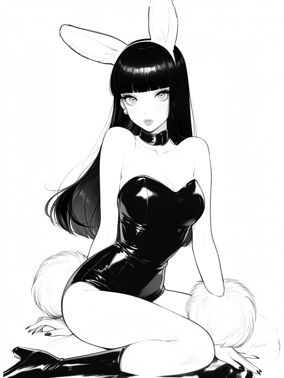
There are some images that work because they are overloaded with references, and there are others that work because they strip a familiar trope down to its strongest signals. This bunny-girl illustration belongs to the second category. It keeps only the elements that matter most: white ears, glossy black bodysuit, black hair, white cuffs, white tail, and a clean seated pose against a blank background. That kind of visual reduction is exactly why the image feels so sharp.
The bunny-girl concept is not new, which is why execution matters more than novelty here. What makes this version stand out is the discipline. The palette is almost purely black and white. The pose is elegant rather than exaggerated. The background does nothing except amplify the silhouette. Instead of trying to reinvent the trope, the image perfects its readability, and readability is often what gives familiar content new life on social feeds.
For creators, this is useful because it shows how a highly recognizable archetype can still feel premium. The trick is not to add more symbols. The trick is to choose the correct symbols and present them with polish. That is what this image does well from the first glance.
The first reason is silhouette clarity. Bunny ears plus long black hair plus the strapless black bodysuit create a shape that is understood instantly, even when the image is small. There is no confusion about the archetype. That immediate recognition is a huge advantage in platform environments where users decide in a split second whether something is worth stopping for.
The second reason is material contrast. The image uses shiny latex-like black surfaces and fluffy white fur accents in the same frame. That creates a tactile push-pull that feels pleasing to the eye. Smooth gloss and soft fluff are a classic pairing because they create variety without requiring more colors or props. It is a material story, not just a costume story.
The third reason is softness of attitude. Even though the outfit is bold, the expression stays calm and the pose stays neat. That balance keeps the image from feeling loud or cheap. It lands as elegant fan-service rather than noisy spectacle, which makes it easier for a broader range of viewers to save it as reference or inspiration.
| Signal | Evidence (from this image) | Mechanism | Replication Action |
|---|---|---|---|
| Instant archetype recognition | White bunny ears, black bodysuit, fluffy cuffs, bunny tail | Familiar motif stack makes the image readable in less than a second | Keep the iconic costume signals obvious before refining pose or face |
| Tactile contrast | Glossy black latex paired with soft white fur accents | Material difference creates visual interest without adding complexity | Pair one reflective material with one soft-texture material in the same palette |
| Minimal background discipline | Pure white backdrop with no props or scenery | Isolation makes the character feel cleaner and more reusable | Remove environmental detail when the costume silhouette is already doing the work |
| Elegant fan-service balance | Seated pin-up pose with a calm face and controlled body language | Composure keeps the image stylish instead of chaotic | Use relaxed pose geometry and a neutral expression to keep the tone premium |
The strongest decision is the restraint in color. If this image had red bows, nightclub lighting, playing-card props, or a decorated set, the effect would be much cheaper. By refusing those obvious additions, the illustration keeps the archetype elegant. Black, white, and skin tone are enough. That is a strong lesson for creators who tend to solve weak images by adding more things instead of making cleaner choices.
The hair is another major structural element. It is not just a hairstyle; it acts like a framing device. The heavy black fall of hair balances the exposed shoulders and legs, giving the composition weight in the upper half. Without that long hair shape, the white background would feel emptier and the outfit would lose some of its graphic force.
The seated pose is also well chosen. It is soft, inward, and slightly doll-like, which matches the clean anime rendering. A more aggressive pose might have made the image feel louder, but the current posture lets the materials and costume read first. That is usually the better choice when the design itself already carries enough interest.
| Observed | Why it matters | How to recreate it |
|---|---|---|
| Very long black hair against white background | Creates a bold framing shape and enhances contrast | Use a strong dark hair mass as part of the composition, not just character styling |
| White fur cuffs and tail | Softens the outfit and adds material variety | Repeat one soft accent material at two or three points in the silhouette |
| Glossy strapless bodysuit | Gives the outfit enough visual richness while staying minimal | Choose one clean reflective garment instead of layering many clothing pieces |
| Pure white seamless background | Turns the character into the entire visual event | Use a blank field when the costume trope is already universally recognizable |
| Seated composed pose | Keeps the image elegant and highly saveable | Favor relaxed pin-up geometry over loud theatrical gestures |
This visual strategy works well for anime fashion prompts, clean character archetype studies, monochrome pin-up boards, merch-ready illustration concepts, and feeds built around polished fan-favorite motifs. It is especially effective for creators who want an image that can be repurposed easily as wallpaper, poster art, or model-sheet inspiration.
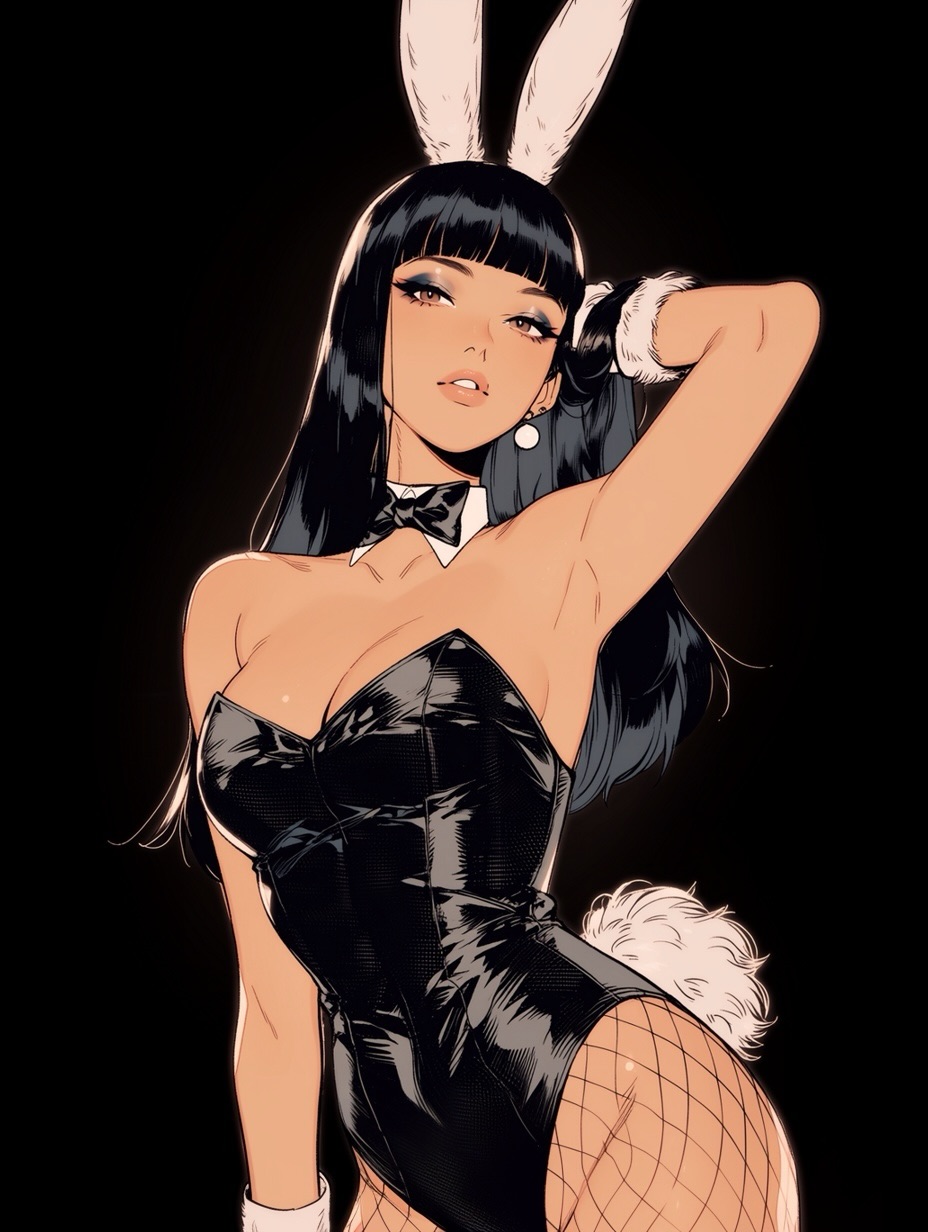
It is less ideal for narrative fantasy scenes, comedic cosplay posts, or hyper-decorated casino aesthetics. Those directions would add noise to a concept that succeeds precisely because it is so controlled.
{archetype ears} {hair length} {main garment finish} {soft accent material} {pose}{head accessory} {body silhouette} {contrast material pair} {background simplicity} {expression}{single archetype signal} {reflective garment} {hair framing} {accent texture} {mood}If you want this style to work, avoid prompting the entire trope as a generic label and hoping the model fills in the best version. Instead, define the archetype in visible blocks: ears, hair, bodysuit finish, fur accents, pose, and background. Once those are stable, the image becomes much more repeatable and much less likely to drift into cliché overload.
| Prompt chunk | What it controls | Swap ideas (EN, 2-3 options) |
|---|---|---|
| long straight black hair with blunt bangs | Primary silhouette and facial framing | jet-black sheet hair; sleek raven hair; waist-length dark hair with blunt fringe |
| white bunny ears and fluffy white cuffs | Trope recognition and soft accent repetition | clean white rabbit ears; plush fur cuffs; soft white tail details |
| glossy black strapless bodysuit | Main garment identity and material shine | latex bunny suit; patent one-piece; reflective monochrome corset bodysuit |
| seated pin-up pose with one leg folded and one extended | Body language and elegance level | soft seated pose; composed floor pin-up; relaxed showroom posture |
| pure white seamless background | Isolation and graphic clarity | blank studio white; empty character-sheet backdrop; clean fashion void |
| high-key studio lighting with gentle shading | Refined finish and premium readability | soft beauty lighting; gentle cel-soft illumination; even editorial light |
Start by solving the icon stack first. If the ears, hair, and bodysuit silhouette are not immediately readable, stop there and fix them. After that, tune the material contrast between gloss and fluff. Only once those two layers are working should you refine pose and expression. This matters because familiar archetypes do not need more ingredients; they need cleaner execution.
A practical four-step iteration path would be: first generate the character in a plain black bodysuit with white ears on a white background. Second, refine hair length, bangs, and seated pose until the silhouette feels elegant. Third, add the fluffy cuffs, tail, and boot reflections. Fourth, polish facial expression and soft shading. That order keeps the image premium instead of letting it drift into over-accessorized cosplay clutter.
The larger lesson is simple. When a trope is already culturally recognizable, your job is not to explain it harder. Your job is to present it more cleanly than everyone else. This image succeeds because it understands that precision beats excess.