How rioaigc Made This Street Fighter Chun-Li Ken Warehouse AI Art -- and How to Recreate It
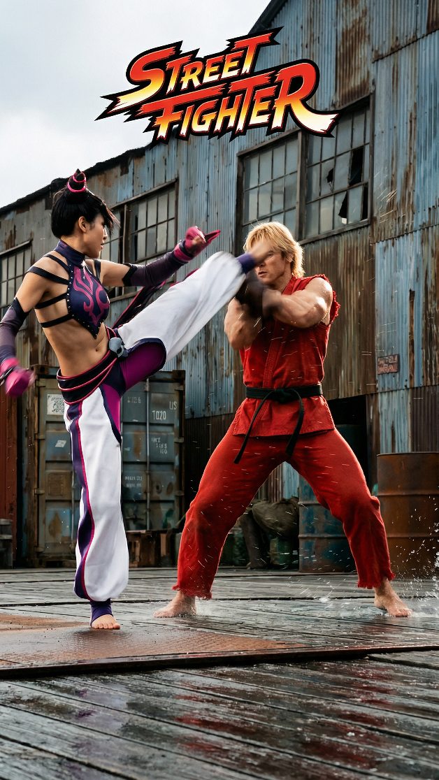
This image works because it captures the essence of a fighting game in a single readable moment. Two recognizable archetypes face off, one attack is fully committed, one defense is actively absorbing it, and the environment reinforces the drama without distracting from the central action. That is exactly what strong fighting-game key art needs to do. It must present conflict instantly, clearly, and with enough attitude that the viewer feels the larger world behind the frame.
The high kick is the image’s main structural force. It creates a diagonal line across the composition, linking the left fighter to the right fighter and giving the poster immediate kinetic clarity. This matters because action images often fail when too many limbs or gestures compete at once. Here, the pose is easy to read even from a distance. The viewer understands the conflict immediately: one fighter attacks, the other blocks. That clean visual logic gives the scene power.
The female fighter’s design succeeds because it references Chun-Li without becoming a costume copy. The hairstyle, the poised kicking stance, and the athletic elegance all evoke the source inspiration, but the outfit feels adapted to a more grounded cinematic world. This is important in crossover-style poster art. It allows fans to recognize the homage while still believing in the reality of the scene. The magenta, black, and white palette also helps her stand out strongly against the muted industrial background.
The male fighter works for a similar reason. The red gi, blond hair, and blocking pose clearly signal a Ken-inspired reading, but the details feel physically plausible rather than exaggerated into cosplay. His stance is heavy, reactive, and believable. The image gains tension because he is not merely posing. He looks like he is actually bracing for impact. That small amount of strain in the body language adds a lot to the realism of the confrontation.
The warehouse setting is a strong environmental choice because it supports both franchise nostalgia and cinematic credibility. Fighting games have long drawn energy from urban, industrial, and improvised battlegrounds, and this rusted warehouse background translates that tradition well into a live-action-feeling image. The broken windows, metal siding, and shipping-container textures suggest a harsh, practical arena. The environment feels old, tough, and unromantic, which gives the fighters something solid to push against.
The wet ground is another valuable detail. Reflections and small splashes make the action feel more physical and immediate. Water on the surface also adds visual polish by catching light and creating contrast beneath the fighters. This turns the floor into more than a base plane. It becomes an active part of the scene’s texture and momentum. In poster imagery, those grounding details often make the difference between staged action and believable impact.
The Street Fighter logo at the top does important framing work. It instantly shifts the image from generic warehouse fight scene into game adaptation territory. Without the logo, the image would still read as solid action artwork, but the title treatment makes the reference explicit and gives the composition a classic poster hierarchy. It also adds color energy in the upper frame, balancing the red gi below and helping the image feel top-to-bottom complete.
Another reason the poster lands is tonal consistency. Every element belongs to the same visual register: grounded costumes, industrial decay, wet realism, and game-derived iconography translated into cinematic form. There is no clash between silly stylization and serious environment. The image commits to a world where arcade energy has been physically embodied. That coherence helps the viewer accept the homage and engage with it as if it were a real action film frame.
From a design perspective, the image demonstrates how effective suspended-impact composition can be. We are not seeing the aftermath of the kick or the wind-up before it. We are seeing the exact moment that contains maximum tension. That choice is ideal for poster art because it compresses anticipation and resolution into one charged instant. The viewer mentally completes the action, which keeps the image feeling active even though it is static.
The poster also benefits from role clarity. One fighter expresses speed, flexibility, and offensive precision. The other expresses resistance, force, and defensive grit. These roles are visually encoded in costume color, pose, and body line. That makes the fight dynamic feel archetypal in the best way. It taps into the readability that made fighting games iconic in the first place.
For creators working on adaptation art, this image offers a practical lesson: the strongest homage is not literal duplication, but faithful translation. Keep the silhouette, the combat attitude, and the emotional contrast, then re-stage them in a world that feels physically real. This poster does that well. It understands what needs to be recognizable and what can be updated.
That is why this warehouse fight poster holds attention. It feels nostalgic without being trapped in nostalgia, and cinematic without losing the arcade immediacy of the source. The image gives the viewer a complete fighting-game promise in one frame: iconic rivals, dramatic motion, harsh arena, and a split-second of impact that feels worthy of the name above it.