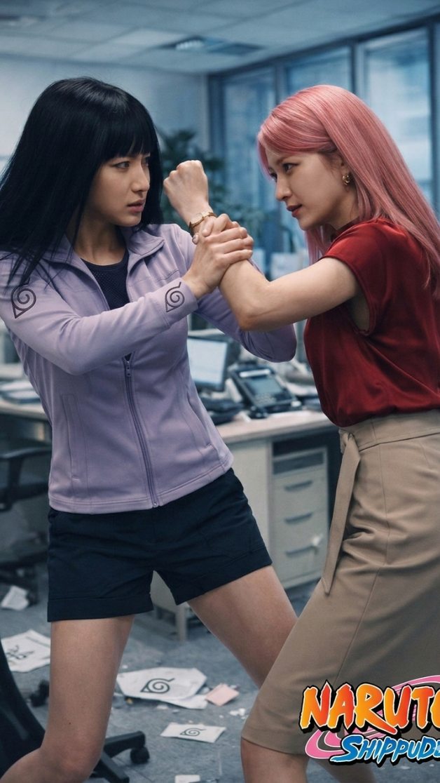
This image works because it places anime identity inside a setting that normally has no business containing it. Hinata and Sakura are not posed in a battlefield, a training arena, or a stylized fan-art void. They are locked in a tense struggle inside an office. That one decision does most of the heavy lifting. It creates immediate novelty, because the viewer recognizes the characters and simultaneously registers the friction of the environment. The result feels like an alternate-universe live-action adaptation frame rather than ordinary cosplay documentation.
The strongest viral mechanism is contrast through context. The outfits are character-coded enough to preserve recognition, but the office around them is completely mundane: desks, chairs, paperwork, monitors, gray carpet, cool daylight. This makes the confrontation more watchable because it feels wrong in a compelling way. When creators are trying to make familiar characters feel fresh again, one of the best tools is relocation. You do not always need to redesign the character. Sometimes you just need to move them into a world that changes how their energy reads.
The pose helps a lot too. This is not a generic “fight scene” freeze-frame with huge kicks or impossible motion. It is a wrist-lock, forearm-to-forearm, face-to-face physical contest. That grounded closeness gives the image dramatic plausibility. It feels like a believable moment from a streaming adaptation rather than a fan edit chasing maximum spectacle. For creators, this is useful because realism often becomes stronger when you lower the action scale. Smaller conflict can feel more immediate than larger choreography.
| Signal | Evidence (from this image) | Mechanism | Replication Action |
|---|---|---|---|
| Contextual surprise | Naruto-coded characters grappling inside a modern office | Unexpected setting creates instant novelty without needing heavy redesign | Move recognizable characters into a sharply contrasting real-world environment |
| Grounded tension | Wrist-lock and close-range arm struggle rather than flashy martial arts motion | Small-scale physical conflict feels believable and cinematic | Use restrained contact poses instead of explosive action when aiming for live-action realism |
| Identity clarity | Lavender Hinata styling on the left and pink-haired Sakura styling on the right | Color-coded wardrobe anchors fandom recognition in a realistic frame | Keep 2–3 iconic character cues even when the world becomes realistic |
| Muted environment palette | Gray office tones let the character colors stand out immediately | Neutral surroundings strengthen subject readability | Keep the environment subdued when character styling is the main hook |
Another strength is that the office itself is not overdesigned. It does not scream “set dressing.” It feels like a normal corporate room disrupted by a sudden confrontation. That matters. If the room were packed with obvious ninja symbols or exaggerated theme props, the realism would collapse. Instead, the Naruto branding is handled mostly through the characters and the logo in the corner. This keeps the frame hovering in a very useful middle zone: recognizable enough for fans, grounded enough for casual viewers to accept it as a live-action still.
How rioaigc Made This Naruto Hinata Sakura Office Fight AI Art -- and How to Recreate It
- Live-action anime adaptation mock posters, because the image shows how to translate character recognition into realistic environments.
- Alternate-universe fandom concepts, because the office setting immediately signals a fresh reinterpretation.
- Character matchup covers, because the left-versus-right body arrangement reads fast and clearly.
- Social content about recasting or reboot aesthetics, because the frame invites “what if this were real?” discussion.
This look is less ideal for magical power showcases, maximal anime spectacle, or comedic meme edits that need broad exaggeration. The value of the image comes from restraint. If you flood it with chakra effects or impossible motion, you lose the grounded adaptation quality that makes it distinct.
Three Transfer Recipes
- Police-station adaptation
Keep: two-character wrist-lock confrontation, realistic wardrobe coding, grounded indoor lighting.
Change: office desks to police precinct desks and bulletin boards.{character A} and {character B} in {real-world workplace} during a {close-range struggle}, styled as {live-action adaptation} - School hallway rivalry
Keep: face-to-face tension, realistic costume translation, no power effects.
Change: office to school corridor, adult wardrobe to contemporary student clothing with color-coded references.{duo rivalry} in {hallway setting}, {forearm lock pose}, {realistic adaptation styling} - Corporate spy remake
Keep: restrained grapple, muted background palette, identity through color and hair cues.
Change: anime franchise coding to sleek espionage wardrobe and high-end office interiors.{two rivals} confronting each other in {modern office}, {close-contact struggle}, {grounded cinematic realism}
Aesthetically, the image succeeds by balancing realism with just enough symbolic color. Hinata's lavender jacket is doing important work here. So is Sakura's pink hair and red top. Those accents carry almost all of the fandom signal. The office itself stays cool, gray, and slightly desaturated, which means the human drama and costume identity remain in front. This is a good reminder that when adapting anime into realism, color should be strategic rather than loud.
| Observed Style Choice | Why It Works Here | How To Recreate It |
|---|---|---|
| Real office background | Makes the scene feel like a plausible live-action still | Use recognizable workplace furniture and keep it ordinary |
| Close-crop vertical framing | Focuses attention on faces, arms, and relational tension | Crop tightly enough that the grapple becomes the center of the poster |
| Muted gray environment | Lets the costume colors carry identity without noise | Desaturate the setting slightly while keeping character colors intact |
| No visual effects | Preserves adaptation realism and prevents genre drift | Remove magic, particles, and speed lines when aiming for grounded reimagining |
| Color-coded wardrobe cues | Keeps fandom recognition strong in a realistic frame | Retain one signature garment color per character |
Prompt-wise, this image is a good demonstration of why “live-action anime scene” is too broad. To get something like this, you need to define exactly how much realism you want, what setting tension you are creating, and how the characters are physically interacting. The pose matters as much as the costume. The environment matters as much as the hair color. Without that specificity, the output drifts either into plain cosplay photography or over-stylized fan art.
| Prompt chunk | What it controls | Swap ideas (EN, 2–3 options) |
|---|---|---|
| Hinata-inspired woman in lavender jacket | Left-side identity anchor and visual softness | quiet fighter archetype, office-ninja remix, lavender-coded rival |
| Sakura-inspired woman with pink hair and red top | Right-side energy and aggression signal | pink-haired rival lead, live-action kunoichi reinterpretation, red-top confrontation partner |
| forearm-and-wrist grapple | Physical tension and realism | push-block pose, collar-grab standoff, two-hand restraint clash |
| modern office with scattered papers | Setting novelty and realism layer | open-plan office, conference room, after-hours workstation zone |
| grounded live-action adaptation style | Overall visual discipline and genre translation | streaming-series realism, cinematic cosplay editorial, realistic franchise reboot frame |
Execution Playbook
Lock three things first: the environment type, the close-range grapple, and the character-coded color split. Those three elements define the entire image. After that, use a one-change rule so you can tell what is actually improving the shot.
- Run 1: lock the office room, the wrist-lock pose, and the left-versus-right character placement.
- Run 2: refine only hair color, jacket color, and top color so the character coding is unmistakable.
- Run 3: tune only the desk clutter, paper scatter, and background blur amount.
- Run 4: adjust facial intensity and hand positioning without changing the overall stance.
The larger lesson here is that strong adaptation art often comes from reduction, not escalation. You do not need glowing chakra, crumbling walls, or giant attacks to make Naruto-inspired imagery compelling. Sometimes the better move is to ask what happens when those personalities enter a believable modern room and bring all of their rivalry with them. That tension between the familiar and the unexpected is exactly what gives this image its replay value.