How rioaigc Made This Kerrigan Queen Of Blades — and How to Recreate It
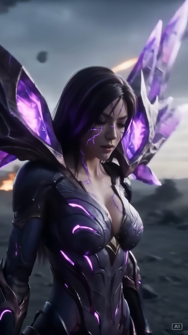
This image works because it treats the subject less like a chaotic action villain and more like a sovereign figure in a science-fantasy mythology. The character does not need to leap, scream, or dominate the frame through explosive motion. Instead, the portrait builds authority through stillness, silhouette, controlled lighting, and a highly disciplined color system. That is why it feels premium rather than noisy.
The most effective aspect of the image is the combination of restraint and threat. The downward gaze keeps the face composed, but the biomechanical armor, glowing fissures, and crystalline wings imply extraordinary danger. This contrast creates tension. The subject is calm, but the design is volatile. That tension is what makes the portrait memorable.
For prompt writers, this is an important principle. You do not always want the subject’s emotion to match the destructive environment literally. Sometimes a quiet expression against a violent world creates a much stronger result than visible rage. In character key art, control often reads as power more effectively than aggression.
Why the Silhouette Matters So Much
The silhouette is carrying a huge share of the image’s impact. The crystalline blade-wings expand behind the subject like a hostile crown, framing the head and shoulders while adding visual hierarchy. They make the character instantly recognizable even at thumbnail size. This is one of the clearest signs of a strong character concept: the silhouette communicates status before detail is even read.
In prompt construction, a useful way to think about this is to separate the body silhouette from the back silhouette. The body itself can remain elegant and narrow, while wings, blades, fins, or appendages create the larger iconic outline. This makes the character feel more mythic without sacrificing facial clarity.
If those back shapes are too small, the figure can become generic. If they are too chaotic, the image can become unreadable. What works here is that the wing forms are large, sharp, and directional, but not random. They are dramatic enough to matter and controlled enough to frame the portrait rather than swallow it.
How Color Discipline Creates a Premium Feel
The purple glow is not just an accent color. It is the logic of the design. It appears in the armor seams, the facial fissure marks, and the wing structure. That repetition turns the purple into a unifying system rather than a decorative effect. Because the same light behavior appears across multiple surfaces, the subject feels like one coherent organism or power source.
This is a very effective prompt strategy. Pick one dominant energy color and repeat it across the most important design zones. If the color only appears in one place, it can feel ornamental. If it appears everywhere without control, it can become overwhelming. Here, the light is distributed selectively, which keeps the image intense but readable.
The supporting palette is equally important. Black, graphite, steel gray, smoke, ash, and muted battlefield tones create a dark neutral base. That lets the violet glow remain luminous without needing extreme saturation. Good sci-fi fantasy prompts often work this way: one strong chromatic accent carried by a large field of restrained neutrals.
Why the Face Stays Powerful Without Overacting
The face is one of the smartest parts of the portrait because it avoids melodrama. The lowered gaze does not feel weak. It feels deliberate. The character appears to be thinking, remembering, or judging rather than reacting. That stillness elevates the portrait from battle art to character study.
Prompt builders often make the mistake of defaulting to rage expressions for villain or antihero figures. While that can work in action compositions, it often weakens a character poster. A scream tells the viewer what the character is doing in one instant. A restrained expression suggests a larger interior world. That is why quiet faces often feel more cinematic.
The facial fissures also help. They create a visible sign of power and transformation without requiring exaggerated expression. In other words, the face can stay calm because the design itself is already carrying intensity. This is a useful principle for any supernatural portrait: let the body language and visual system do some of the emotional work.
How the Armor Avoids Generic Sci-Fi
The armor is effective because it is neither purely mechanical nor purely fantasy ceremonial. It sits in a hybrid zone: layered plating, organic segmentation, reflective surfaces, and glowing seams all suggest a creature or queen who has fused with a larger alien system. That hybrid identity is much more compelling than generic black battle armor.
When writing prompts in this style, it is helpful to define material behavior clearly. Terms like segmented plating, biomechanical seam structure, glowing internal fractures, or translucent crystal edges tell the model how different surfaces should interact with light. Without those material distinctions, many outputs collapse into flat dark costume design.
Another strong choice is the relative cleanliness of the armor silhouette. Even though the design is intricate, it still reads in large shapes. That is important. Good fantasy armor is not just detailed; it is organized. The viewer needs to understand the character’s structure before appreciating the micro-detail.
Why the Battlefield Background Stays Subdued
The devastated alien battlefield supports the subject without competing with her. Smoke, embers, soft explosions, and rocky ground imply scale and conflict, but they remain pushed back. That is exactly right for a portrait-first composition. The environment tells the viewer there has been war, but it does not demand equal narrative attention.
This is an important distinction in prompt writing. There is a big difference between worldbuilding background and action background. In a character key art image, the background should deepen the myth, not distract from the face and silhouette. Here, the world is visible enough to feel real, but blurred enough to stay subordinate.
Muted battlefield design also reinforces emotional tone. Because the horizon is softened and smoky, the portrait feels aftermath-oriented rather than mid-combat. That puts the subject in a more reflective and sovereign emotional space. It suggests the violence has already happened and she remains standing beyond it.
How Lighting Establishes Mood and Hierarchy
The lighting works because it comes from multiple controlled sources. The stormy environment provides cool ambient shadow. Horizon fire gives the subject a faint rim separation. Most importantly, the body itself emits violet internal light. That layered lighting logic makes the portrait feel much richer than a single-source setup.
Internal light is especially effective in sci-fi fantasy because it turns the costume into part of the character’s physiology or power. It stops the glow from feeling like an effect added on top. Instead, the viewer reads it as something that belongs to the subject. That is the difference between costume light and identity light.
Prompt writers can reuse this trick in many variants. A single internally consistent glow color can tie together eyes, skin markings, armor seams, wing edges, weapons, and environmental reflections. Once those relationships are present, the character feels integrated into their own power system.
Prompt Structure You Can Reuse
To recreate this kind of portrait, begin with the emotional stance: solemn, controlled, downward gaze, elegant but threatening presence. Then define the hybrid armor and its glowing seam logic. Next, establish the back silhouette with large crystalline or blade-like wings. Then place the subject in a subdued battlefield or ash-covered alien landscape. Finally, define the lighting hierarchy: cool storm ambient, violet internal glow, faint warm rim from distant destruction.
This structure works because it prioritizes narrative identity first. If you start by over-describing explosions and smoke, the model may drift toward action poster logic. If you start with the face and silhouette, the output is more likely to remain a portrait with worldbuilding, which is the stronger direction for this concept.
Another useful technique is to think in layers of reading. At thumbnail size, the viewer should register queen silhouette and purple glow. At medium distance, they should read armor structure and solemn face. Up close, they should find crystal texture, seam detail, and battlefield atmosphere. Good prompts support all three scales.
How to Vary the Concept Without Losing Its Core
The easiest way to vary the image is to preserve the visual grammar while changing one major component. You can keep the same queen posture and replace violet with teal, crimson, or icy white. You can keep the same glow and change the wing material from crystal to metal, organic blades, insect limbs, or translucent energy fins. You can keep the same silhouette and shift the environment from battlefield to throne chamber, ruined hangar, or hive cathedral.
These variations work because the core concept is not just one character. It is a pattern: a composed ruler, a strong back silhouette, a disciplined glow system, and a muted world of destruction or power behind her. As long as that pattern remains intact, the image can evolve without losing its premium identity.
Expression is another good variable. Direct eye contact would make the portrait more confrontational. Eyes closed would make it more mystical. A side glance would introduce calculation. But the calmness should remain. The core strength of this concept is not emotional explosion. It is controlled pressure.
Common Mistakes to Avoid
One common failure is making the background too loud. If the explosions, debris, and smoke become the star, the image stops functioning as a character portrait. Another mistake is over-saturating the purple until it overwhelms the neutrals. That can make the image feel cheaper and more synthetic. Controlled glow is more powerful than constant glow.
Another issue is turning the face into a generic game-villain snarl. That weakens the concept because the design is already carrying enough aggression. The face should contribute authority, not redundancy. Calmness is what keeps the portrait elevated.
Finally, avoid vague wing language. Wings are the signature shape here. They should be described as crystalline, blade-like, luminous, angular, and large enough to frame the subject. Generic fantasy wings would miss the point.
Why This Image Feels Premium
Premium character art usually depends on hierarchy and control. This image has both. The viewer knows where to look first, second, and third. Face first, silhouette second, glow system third, battlefield last. Nothing feels accidental. That clarity is what makes the image feel expensive and intentional.
The portrait also feels premium because it trusts stillness. It does not apologize for being quiet. That confidence is rare. Many fantasy prompts become noisy because they fear simplicity. But simplicity, when paired with strong design, often creates more impact than visual overload.
This is a good final lesson for prompt writers: spectacle should support character, not replace character. When the design already has strong silhouette, mood, and material logic, you can lower the volume of everything else and end up with a more memorable result.
Final Takeaway
This sci-fi queen portrait works because it builds power through containment. The wings are large, but controlled. The armor glows, but selectively. The battlefield is vast, but subdued. The face is quiet, but loaded with authority. Every piece of the image reinforces the same emotional reading: this is not just a fighter, but a ruler shaped by conflict.
If you want to recreate this effect, choose one strong silhouette, one disciplined energy color, one calm emotional stance, and one environment that suggests scale without stealing focus. Then let those four systems reinforce each other. That is how you get a science-fantasy portrait that feels cinematic, elegant, and dangerous all at once.