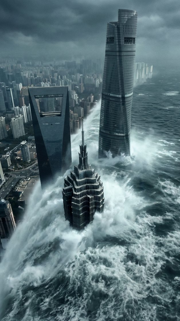
How rioaigc Made This Shanghai Tsunami Three Towers Disaster Breakdown — and How to Recreate It
This image works because it takes one of the most recognizable skyline clusters in Asia and subjects it to a single overwhelming force: water. The result is immediate, readable, and cinematic. Even before viewers identify the three towers, they understand the scale mismatch between engineered vertical order and uncontrolled oceanic violence.
Why the Image Grabs Attention Fast
The frame is built around recognition plus destruction. The Shanghai Tower, the Shanghai World Financial Center, and the Jin Mao Tower are already iconic forms. That means the image does not waste time explaining itself. The viewer gets location, scale, and stakes almost instantly, which allows the disaster premise to land harder.
The other key reason it works is that the water is not placed in the background. It has already entered the city core. The wave mass wraps the towers from below, making the buildings feel less like observers and more like fragile objects trapped inside a force field of moving water.
Signal Table
| Signal | Evidence (from this image) | Mechanism | Replication Action |
|---|---|---|---|
| Instant location recognition | The Shanghai “three-piece set” skyline cluster is clearly identifiable | Real-world landmark recognition creates immediate engagement | Use famous landmark geometry rather than generic skyscrapers |
| Epic scale | High aerial view with dense city grid fading into mist | Bird's-eye perspective lets the disaster feel regional, not local | Show the environment beyond the main subject to widen the scale read |
| Violence in motion | White foam and rotational currents crash around tower bases | Water texture creates energy and urgency | Specify thick foam, directional surge, and wrapped flow around structures |
| Clear hierarchy | Three main towers form a triangular composition | Readable structure prevents the image from becoming visual noise | Organize major forms into a stable compositional pattern |
| Cold atmosphere | Storm-gray sky, desaturated city, silver-blue water | Palette reinforces dread without needing fire or explosions | Keep tones cool and restrained for a premium disaster-film look |
Aesthetic Read
This image does not chase chaos through debris, explosions, or collapsing buildings. Instead, it relies on environmental force. That choice makes it feel more serious and more expensive. The architecture remains upright, which preserves recognizability, while the floodwater becomes the true antagonist.
The cool color palette also matters. Blue-gray storm light, dark steel towers, and white ocean foam create a visual language closer to prestige disaster cinema than pulp destruction art. That gives the image a broad audience appeal: it can circulate as spectacle, concept art, and urban nightmare all at once.
Prompt Technique Breakdown
| Prompt chunk | What it controls | Swap ideas (EN, 2–3 options) |
|---|---|---|
| “Three iconic skyscrapers from the Shanghai Lujiazui skyline engulfed by a colossal tsunami” | Main concept, subject identity, and scale of threat | “Hong Kong skyline under superstorm waves”, “Dubai towers overtaken by desert flood”, “Tokyo waterfront swallowed by ocean surge” |
| “high oblique bird's-eye view” | Spatial scale and disaster readability | “satellite-like aerial angle”, “helicopter view”, “tower-height overhead perspective” |
| “waves wrapping around the tower bases” | Water interaction with architecture | “spiraling flood currents”, “foam-choked urban channels”, “surge colliding with tower foundations” |
| “storm-heavy overcast daylight” | Mood, palette, and realism | “pre-typhoon gray light”, “cold monsoon sky”, “foggy post-storm daylight” |
| “premium disaster-film poster aesthetic” | Finish quality and audience expectation | “blockbuster catastrophe concept art”, “cinematic urban destruction key art”, “high-end apocalyptic skyline poster” |
Why This Formula Is Reusable
This image structure is repeatable because it uses a durable visual equation:
1. Start with a highly recognizable place.
2. Introduce one dominant natural force.
3. Keep the landmark silhouettes readable.
4. Use aerial scale to make the threat feel systemic.
5. Avoid clutter that competes with the main premise.
That framework works for floods, storms, ice events, sandstorms, volcanic ash, and even surreal weather anomalies. The key is to let one environmental force dominate the image logic.
Remix Playbook
City remix: swap Shanghai for New York, Dubai, Hong Kong, Singapore, or Shenzhen.
Force remix: replace tsunami water with glacial ice, burning dust storm, black rain, volcanic ash cloud, or giant rolling fog wall.
Time remix: run the same scene at dawn, blue hour, midnight storm, or lightning-lit twilight.
Scale remix: tighten into a single landmark or widen into an entire district panorama.
Tone remix: move from blockbuster disaster to museum-grade climate warning visual, dystopian travel poster, or speculative editorial cover.
Execution Advice
The most common mistake with city-disaster images is adding too many secondary events. Helicopters, fire, collapsing bridges, glowing skies, and random debris all compete with the core idea. This frame avoids that problem by letting water do nearly all the storytelling.
If you want this type of image to feel premium, preserve silhouette clarity and landmark accuracy. The viewer should first recognize the place, then feel the threat. When that order is reversed, the image becomes generic. When that order is right, the concept becomes instantly shareable.