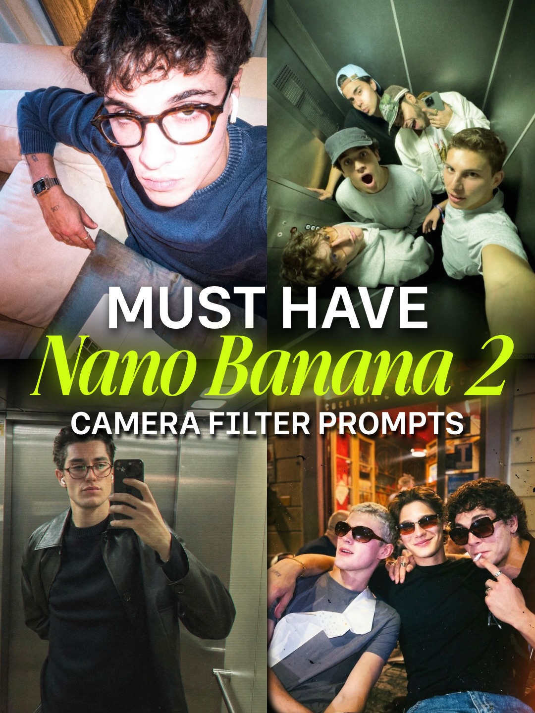
This image works because it sells a style system instead of a single photograph. The viewer is not being shown one “perfect” image. They are being shown a cluster of internet-native moments that all belong to the same aesthetic family: flash, youth, spontaneity, and cool-without-trying-too-hard energy. That is exactly what makes it effective as a prompt-pack cover.
The strongest hook is the collage format. One panel alone would communicate a vibe, but four panels create proof of range. The viewer immediately understands that this is not about one lucky shot. It is about a repeatable visual language that can be applied across mirrors, parties, elevators, and casual interiors.
The second hook is typography placement. Large central title text turns the collage into a product instantly. Without that structure, the image might just read as a social dump. With it, the whole composition becomes a tutorial asset, a visual promise that the viewer can get this look too.
| Signal | Evidence from the image | Mechanism | Replication action |
|---|---|---|---|
| Proof of style range | Multiple panels show the same flash aesthetic in different social contexts | Variation builds confidence that the look is transferable | Use collage format when selling a visual recipe rather than one image |
| Youth-culture credibility | Casual friends, mirror selfies, nightlife snapshots, and relaxed styling | Cultural context makes the aesthetic feel current | Choose settings that already belong to the target audience’s lived image language |
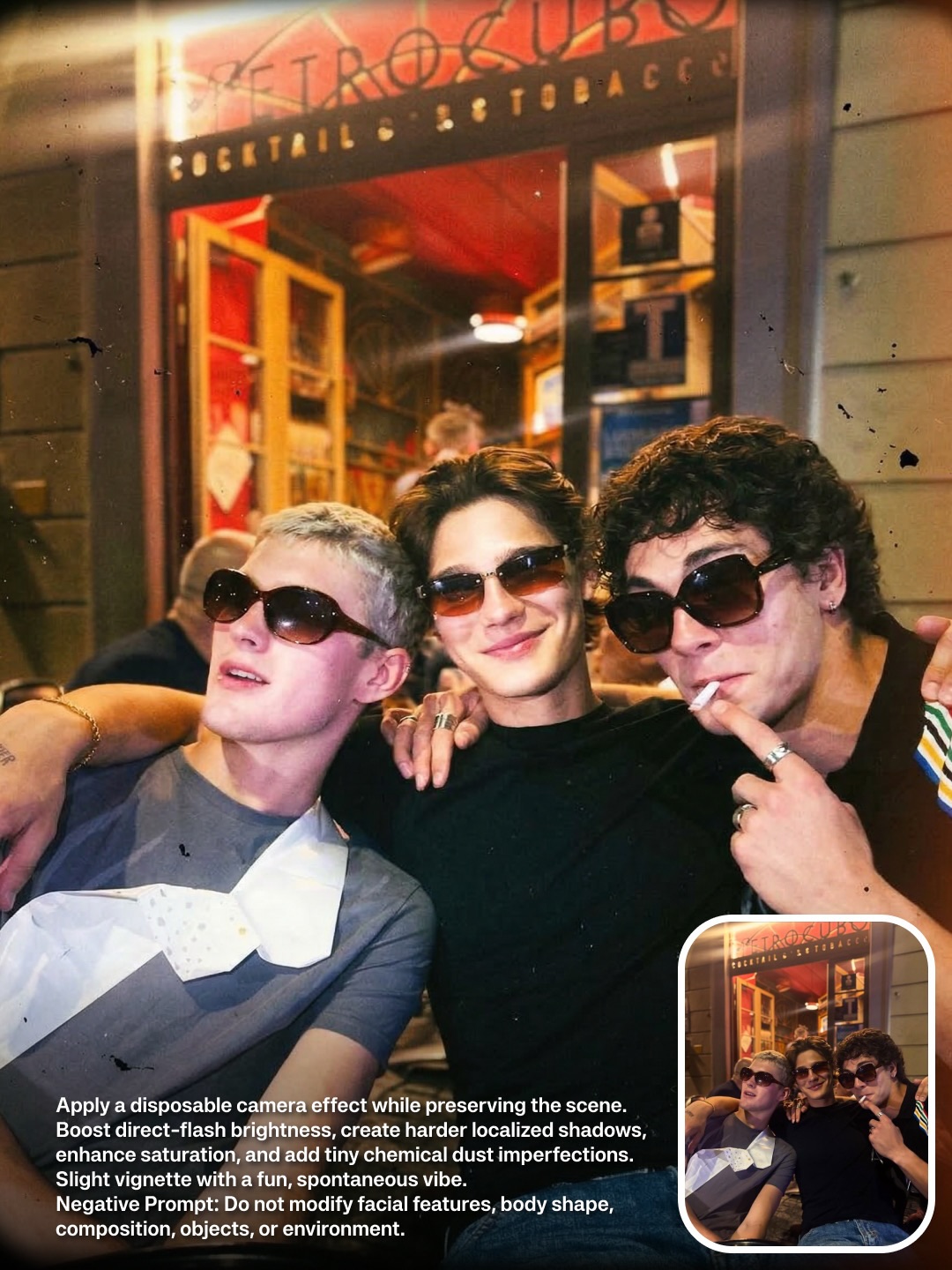
| Flash realism | Harsh direct light, imperfect exposure, and candid body language | Technical roughness reads as authenticity | Keep the flash look intentionally visible instead of smoothing it away |
| Tutorial packaging | Large text over collage structure signals a how-to or pack format | Clear packaging turns aesthetic inspiration into a product | Add explicit cover hierarchy when the image is meant to function as an educational asset |
| Thumbnail strength | Big faces, high contrast, and centered text | Compressed visual hierarchy survives small-screen viewing | Prioritize legibility before nuance when designing prompt-pack covers |
The image sits between creator-course marketing, internet fashion editorial, and social-photo moodboarding. It deliberately avoids perfection. The photos feel immediate, a little messy, and direct-flash bright. That is the point. The appeal comes from captured coolness, not polished luxury.
The panel differences are important too. One image suggests introspection, another group energy, another mirror self-presentation, another after-dark charisma. Together, they show that the style is not tied to one personality type. It is a toolkit for mood and social presence.
| Prompt chunk | What it controls | Swap ideas |
|---|---|---|
| Four-panel collage of candid male portraits | Main cover structure and content density | Swap to six-panel grid, before-after stack, or carousel-preview collage |
| Direct flash youth-culture photography | Core image language | Try disposable-camera flash, party-cam softness, security-cam harshness, or nightlife flash glamour |
| Mirror selfie, elevator selfie, couch close-up, night-out group shot | Range of use cases | Replace with stairwell shot, bathroom mirror, club queue, kitchen hangout, or subway window reflection |
| Large creator-pack headline | Product framing and thumbnail read | Swap to “must try,” “viral look,” “filter pack,” or “camera style prompts” depending on tone |
| Casual stylish male-coded fashion cues | Audience positioning | Shift toward feminine nightlife glam, art-school cool, indie band energy, or luxury streetwear depending on target market |
This structure is reusable because prompt packs and aesthetic guides need evidence more than explanation. A collage gives instant proof that one style can produce multiple outputs. It also helps viewers self-insert: they can imagine using the same prompts in their own room, elevator, party, or night-out context.
It is especially effective for prompt libraries because it turns a visual taste cluster into a marketable product surface. The cover becomes both inspiration and packaging, which is exactly what a social-first educational asset needs.
You can remix this concept by changing the social tribe. A feminine version could use bathroom mirror flash, girls-night table shots, and sidewalk fashion candids. A music-scene version could use rehearsal spaces, venue hallways, and backstage flash. A luxury version could move the same structure into hotel mirrors and car interiors.
You can also remix the technical filter language. Softer flash creates a sweeter mood. Harder flash and lower ambient light create more edge. Heavier blur or motion introduces chaos. The current version lands in a strong “viral cool” middle ground that is especially useful for creator-audience packaging.
When building a cover like this, choose images that feel related but not repetitive. If all four panels say exactly the same thing, the collage loses value. If they are too different, the style system breaks. The sweet spot is consistent flash logic plus different social contexts.
Keep the title large, central, and easy to parse. Covers like this succeed because they work in a fraction of a second. The aesthetic can be nuanced, but the packaging must remain obvious.