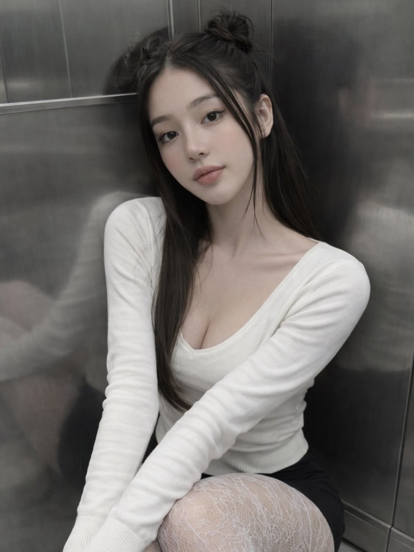
This portrait works because it sharpens the urban-metallic concept introduced in the previous indoor image while giving the subject more compositional presence. The viewer now sees more of the seated posture, which makes the relationship between clothing, body line, and reflective environment more explicit. Instead of functioning purely as a face-and-mood portrait, the image becomes a stronger statement about styling inside a tightly controlled interior setting. That expansion gives it more editorial range.
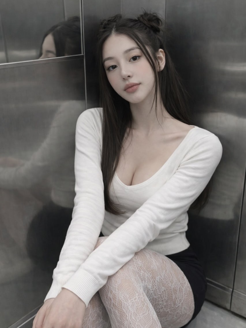
The corner placement is particularly effective. By seating the subject in the angle where two metal walls meet, the image gains built-in structure. The lines of the background frame the body almost like a geometric shell, which strengthens the portrait’s urban character. Corners can sometimes feel confining in a negative way, but here the enclosure adds intimacy rather than discomfort. It makes the portrait feel quiet, private, and self-contained.
The white knit top remains central to the portrait’s softness. In a metallic environment, clothing that carries tactile warmth becomes especially important. The scoop neckline and close fit give the look femininity and shape, while the fabric itself helps soften the severity of the background. This is one of the reasons the portrait does not become cold. The top acts almost like a visual buffer between skin and steel, humanizing the frame.
The black skirt continues to function as a grounding element. It anchors the lower half of the outfit and provides a strong tonal separation from both the white top and the pale tights. Because the portrait is now wider and more body-inclusive, that grounding role becomes even more important. It helps organize the outfit into readable sections and gives the composition more visual stability.
The white patterned tights are especially effective in this version because more of them is visible. Their fine lace-like texture adds complexity without adding color, which is exactly the right decision for such a controlled palette. They prevent the lower half of the image from feeling visually empty and add a subtle fashion note that pushes the portrait further toward editorial styling. This kind of detail is often what makes a restrained image feel truly complete.
The subject’s pose is soft but deliberate. One knee is raised, the body is angled inward, and the hands rest lightly in a way that avoids stiffness. The result is a compact, elegant seated silhouette. This posture helps the portrait feel intimate while still looking composed. It does not suggest casual collapse into the space. Instead, the subject appears intentionally arranged within it, which is important for maintaining the image’s fashion-aware tone.
The facial expression remains calm and subtle, which continues to be the correct approach for this setting. The background already introduces enough edge and atmosphere. A stronger emotional expression could have pushed the image into melodrama. By staying composed, the subject lets the viewer focus on the overall harmony of pose, outfit, and environment. This emotional control is part of what makes the portrait feel mature and visually credible.
The hairstyle adds character in a way that is particularly important here. The small top buns introduce playful asymmetry and prevent the image from becoming overly austere, while the long straight sections maintain softness and line. In an environment this industrial, a touch of whimsy in the hair helps keep the portrait from feeling too severe. It is a smart styling choice because it balances the coolness of the setting with personality.
The metallic background continues to be one of the image’s most distinctive features. Its reflective quality creates depth and tonal variation without demanding direct attention. You can sense the space around the subject even though the frame remains tight. This contributes to a subtle psychological effect: the portrait feels enclosed, but not flat. There is dimension in the surfaces, which helps the image feel more immersive and sophisticated.
Lighting is well handled again. Diffused light prevents harsh glare on the metal while keeping skin smooth and the white top luminous. This balance is essential. Too much contrast would have made the environment overpowering; too little would have made the portrait dull. Instead, the light preserves the reflective atmosphere of the setting while maintaining softness on the subject. That dual success is part of what makes the image work so well.
The palette remains disciplined and elegant. White, black, gray metal, and natural skin tones create a narrow but highly effective visual range. Limited palettes often feel more luxurious because they force attention onto proportion, texture, and tone rather than relying on color variety. In this portrait, that discipline increases the sense of cohesion. Everything belongs to the same visual world.
At thumbnail size, the image still reads clearly because the face remains dominant, the white top separates from the darker metallic background, and the seated pose is still understandable. The tights and reflective surfaces may not be fully legible in reduced form, but they contribute to the overall textural impression. This means the portrait retains both clarity and mood even in smaller digital formats.
From a branding perspective, this image suggests urban softness, private elegance, and a slightly introspective style identity. It would support captions about quiet confidence, minimal dressing, late-night city feelings, thoughtful beauty, or monochrome styling. Because the environment is so distinctive yet still neutral, the image is usable across many tones of writing. That makes it especially valuable for varied content needs.
Another strength is how the portrait balances vulnerability and control. The enclosed pose and soft styling introduce fragility, but the direct gaze and careful outfit structure preserve confidence. This makes the image emotionally layered. It is not simply cute, nor simply fashionable. It carries a more nuanced appeal, which often helps portraits feel richer and less disposable.
Overall, this image succeeds by using a minimal monochrome wardrobe, a reflective industrial setting, and a compact seated pose to create a portrait that feels intimate and modern at once. The white knit top softens the frame, the black skirt and tights add styling depth, the metal walls create atmosphere, and the calm expression keeps the mood composed. Together, these elements produce a strong urban lifestyle portrait with quiet editorial strength.