🎬💕 Este mes de Septiembre me centraré más en hacer videos con inteligencia artificial Cualquier sugerencia o duda es siempre bienvenida ☺️ Que foto te gusta más??
🎬💕 Este mes de Septiembre me centraré más en hacer videos con inteligencia artificial Cualquier sugerencia o duda es siempre bienvenida ☺️ Que foto te gusta más??
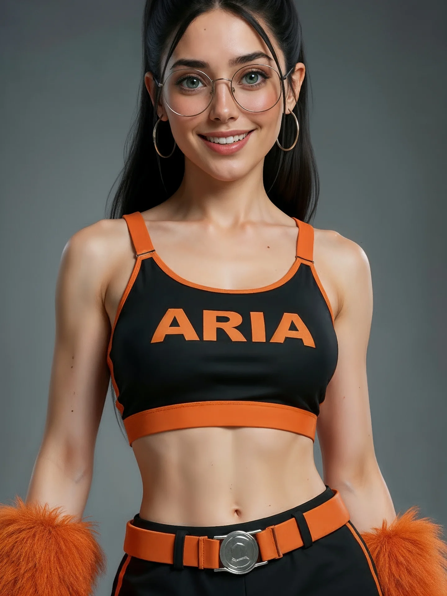
This image works because it behaves like a visual identity system. The orange trim, the bold chest text, the matching belt, and the furry wrist accents all reinforce the same team-like color story. Nothing is accidental. For creator content, that kind of clarity matters because viewers do not have to guess what the image is trying to be. It reads as a stylized performance or squad portrait immediately.
The strongest part is the discipline of the palette. Black creates structure, orange creates memorability, and the plain gray background removes competition. That makes the subject feel like the product. If you are building branded character looks, team uniforms, or comparison-ready costume concepts, this is exactly the kind of image architecture worth studying.
The portrait is easy to process because the design language is blunt and clean. The chest text is large, the trim is high-contrast, and the accessories repeat the same orange cue already present in the top and belt. This repetition is what makes the frame feel cohesive rather than random. It is a good example of how branding can live inside wardrobe construction, not only in logos pasted onto an image.
| Signal | Evidence (from this image) | Mechanism | Replication Action |
|---|---|---|---|
| Palette lock | Black base with orange text, trim, belt, and wrist accents | Makes the look recognizable in one glance | Repeat one accent color across multiple wardrobe zones |
| Clear naming cue | ARIA text printed across the chest | Turns the outfit into a branded identity instead of generic sportswear | Place the key word or identity marker in the highest-visibility garment area |
| Accessory reinforcement | Orange furry cuffs echo the outfit color story | Adds personality without breaking cohesion | Use one unusual accessory that still matches the main palette |
| Clean isolation | Seamless gray background with no distractions | Keeps attention on the outfit architecture | Remove all environment noise when the wardrobe itself is the hook |
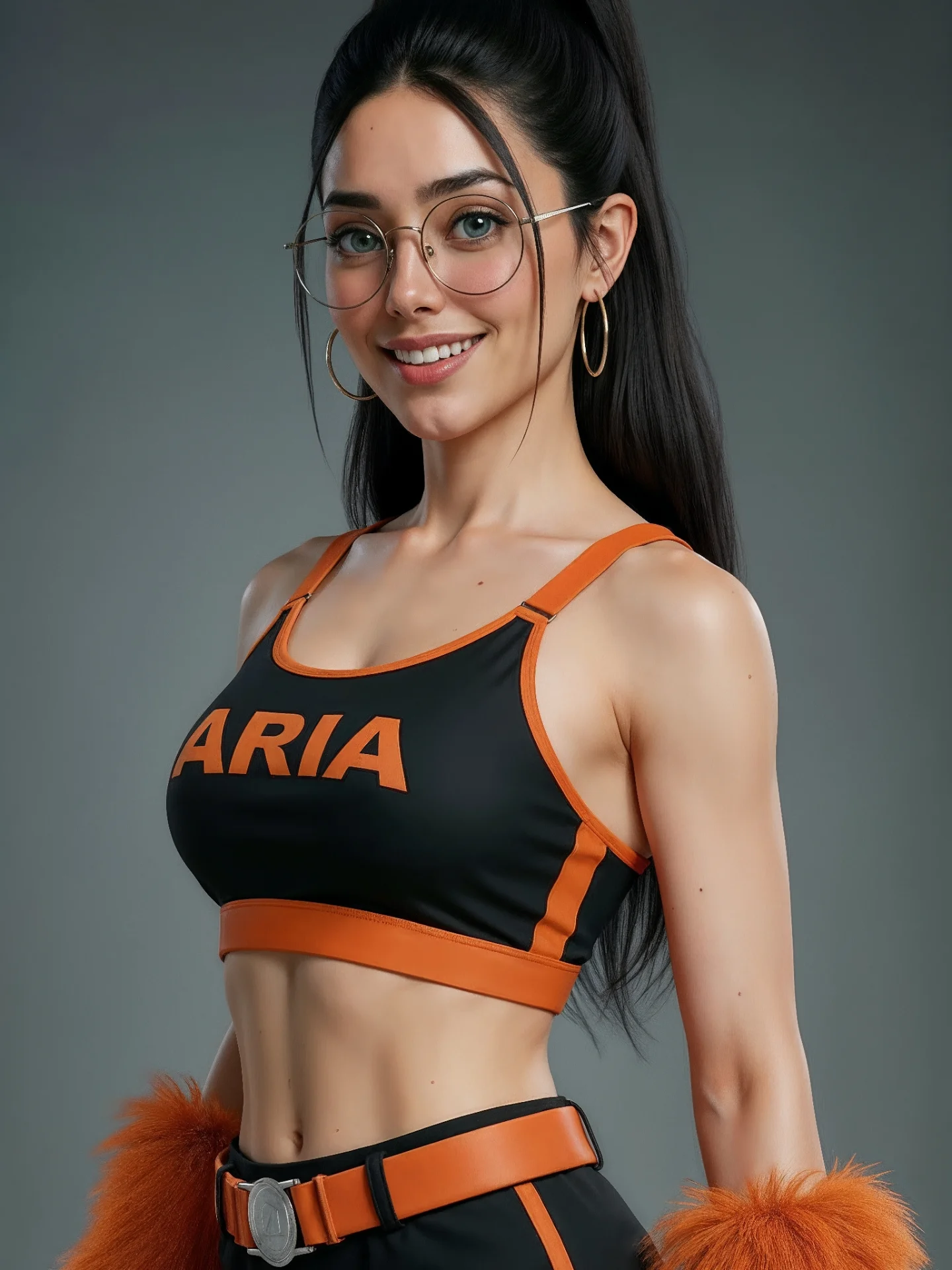
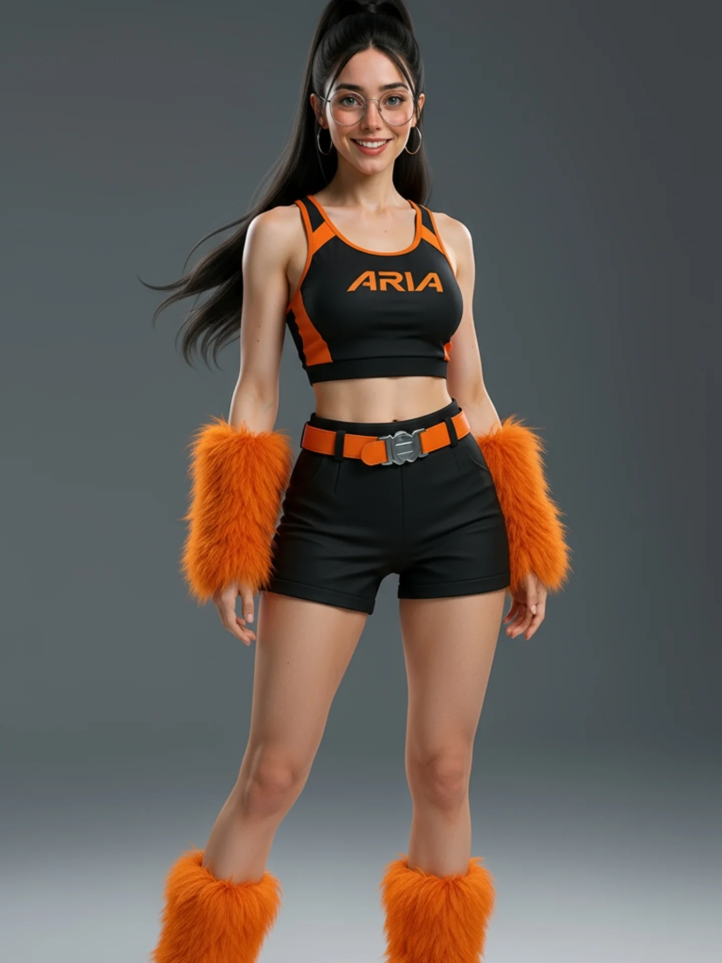
The image feels controlled because the silhouette, color, and crop all cooperate. The medium portrait framing shows enough of the outfit to reveal the chest text, belt, and wrist details at once. That is important. If the image were cropped tighter, the lower styling cues would disappear. If it were wider, the impact of the branding would weaken.
The gray background also deserves attention. It gives the image neutrality without making it feel flat. Bright white might have made the orange harsher, while a dark background could have made the whole look too aggressive. Gray keeps the palette balanced and commercially readable.
| Observed | Why It Matters | How To Recreate |
|---|---|---|
| Black-and-orange palette repeated across top, belt, and cuffs | Creates visual unity and brand memory | Choose one accent color and apply it to at least three key outfit elements |
| Centered medium crop | Shows the important styling layers without clutter | Frame wide enough to include chest text, waist detail, and accessory cues |
| Large readable chest typography | Strengthens identity at thumbnail size | Use short bold wording instead of long decorative text |
| Neutral gray studio background | Lets the wardrobe carry the image | Use a simple backdrop when the styling system is already doing enough work |
| Prompt chunk | What it controls | Swap ideas (EN, 2-3 options) |
|---|---|---|
| young woman in a black-and-orange performance uniform portrait | Main concept and styling genre | 'team uniform portrait', 'cheer-inspired cover image', 'sports-branded character portrait' |
| ARIA text across the crop top with matching orange trim | Identity and palette lock | 'team wordmark across chest', 'bold racing logo', 'single-name uniform branding' |
| orange furry wrist cuffs and orange belt with silver buckle | Accessory personality and styling reinforcement | 'matching arm bands', 'color-accent gloves', 'metallic belt detail' |
| soft even studio lighting on a gray seamless background | Commercial cleanliness | 'neutral campaign light', 'clean studio portrait light', 'low-contrast fashion lighting' |
| centered medium portrait showing torso and waist details | Outfit readability | 'waist-up crop', 'full-body lineup shot', 'three-quarter uniform portrait' |
Lock three things first: the black-and-orange palette, the chest wordmark, and the belt-plus-cuff accessory system. Those are the branding anchors. Then iterate one variable at a time. First version: establish the top lettering and trim. Second version: refine the wrist accessories and belt scale. Third version: tune the crop so all the major styling cues stay visible together. Fourth version: only then adjust expression or background tone. That sequence keeps the image functioning as a recognizable uniform portrait instead of a generic athletic shot.