🎬💕 Este mes de Septiembre me centraré más en hacer videos con inteligencia artificial Cualquier sugerencia o duda es siempre bienvenida ☺️ Que foto te gusta más??
🎬💕 Este mes de Septiembre me centraré más en hacer videos con inteligencia artificial Cualquier sugerencia o duda es siempre bienvenida ☺️ Que foto te gusta más??
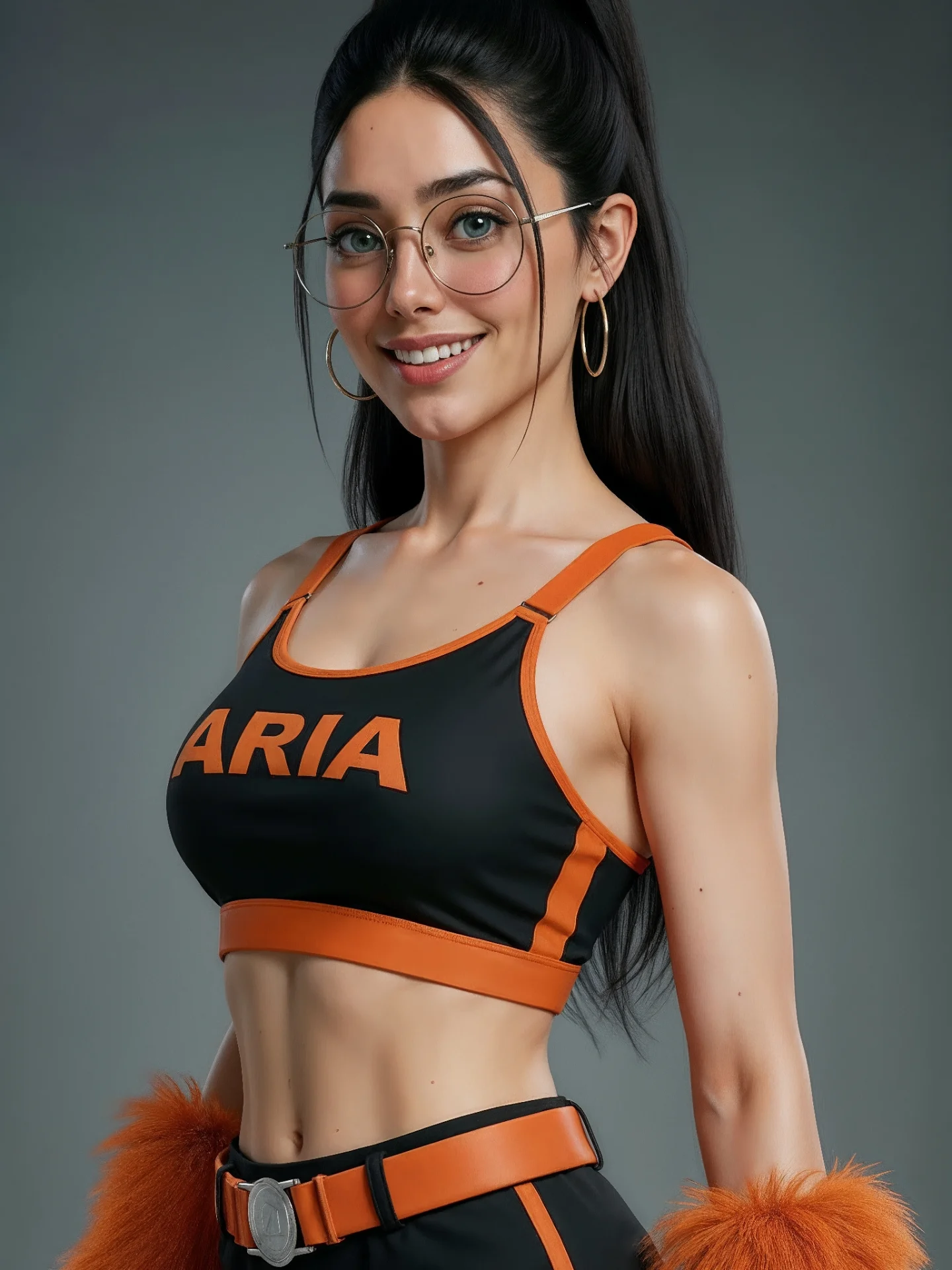
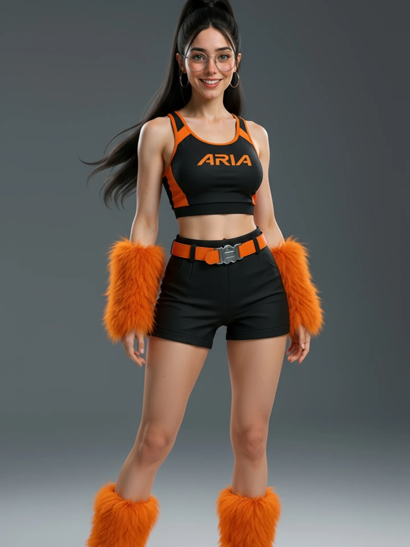
This image works because it knows exactly what it is trying to communicate: character identity through color, styling, and a clear front-facing pose. There is no need for a complex set or extra props because the branding language is already strong. Black and orange carry the whole frame, the “ARIA” text anchors the theme instantly, and the subject’s recognizable face keeps it from turning into a generic mascot render.
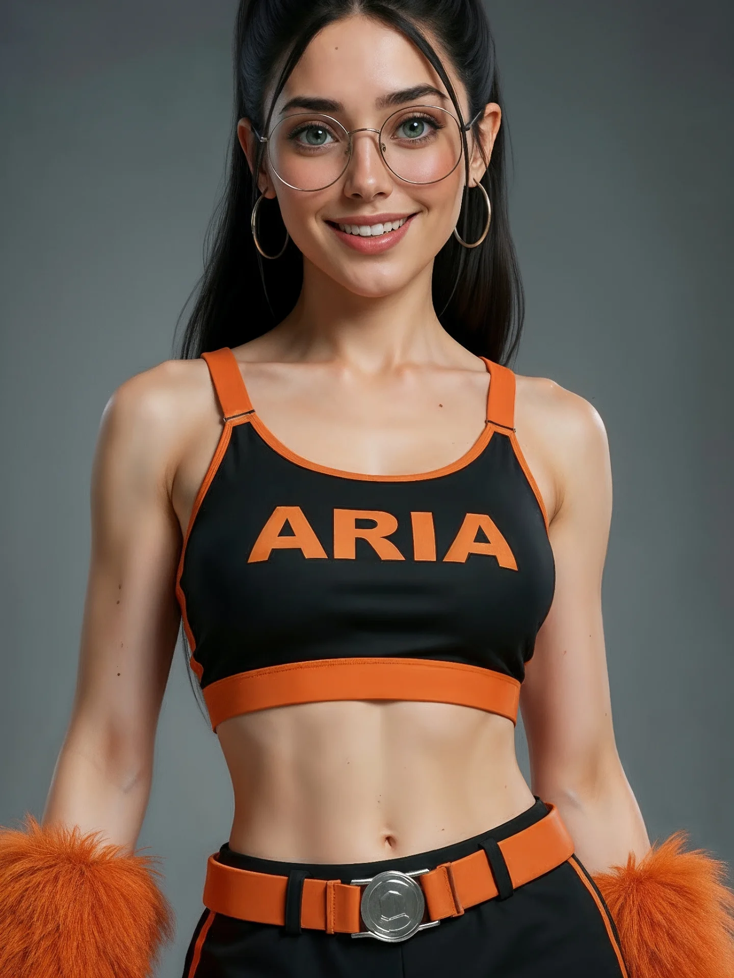
For creators, this is a useful lesson in visual identity design. A strong personal brand image often performs better when the scene gets simpler and the costume system gets clearer. Here, the neutral gray background removes distraction so the viewer reads three things immediately: who the character is, what the color system is, and what kind of visual world the brand belongs to.
The image also benefits from the balance between polish and recognizability. The outfit is stylized, but the face stays familiar. The glasses and ponytail keep the person identifiable, while the orange-black palette turns the image into something more than a normal portrait. That combination is exactly what good creator branding needs: not just a person, and not just a costume, but a repeatable visual signature.
| Signal | Evidence (from this image) | Mechanism | Replication Action |
|---|---|---|---|
| Strong color system | Black base with bold orange trim, belt, and text | Creates instant brand recognition and high visual recall | Choose one dominant contrast pair and repeat it across the whole outfit |
| Minimal background | Plain gray studio backdrop with no extra elements | Forces attention onto the identity system instead of environment noise | Remove set complexity when testing or presenting a branded character look |
| Recognizable face anchors | Glasses, ponytail, and direct smile remain consistent | Keeps the brand image attached to a person rather than just a costume | Retain 2 to 3 signature face or accessory markers in every branding render |
Less ideal: narrative storytelling, travel content, or location-driven fashion content. This image is designed to present a brand language, not a scene.
To adapt it, keep the clean studio background, keep one dominant color system, and keep the subject’s identity markers stable. Then vary the brand shell around it. A blue tech persona, a red performance identity, or a green wellness identity could all use the same logic. Slot template: {recognizable person} wearing a {single-color branding system} in a {minimal studio portrait}.
The strongest thing here is clarity. The silhouette is clean, the background is quiet, and the typography on the outfit is large enough to become part of the visual structure. Nothing in the frame is uncertain. That makes the image useful for creator branding, where hesitation usually weakens recall. If a viewer only sees this image for one second, they still leave with a strong color and name memory.
The orange details also do something smart: they create rhythm. The trim at the neckline, the side panel, the belt, and the wrist accents repeat the same color note across the frame. That repetition makes the outfit feel designed rather than random. For branding images, repetition is often what turns styling into identity.
| Observed | Why it matters |
|---|---|
| Large “ARIA” text across the top | Turns the outfit into a direct brand marker |
| Orange-black repeated color accents | Create strong recall and visual cohesion |
| Gray seamless studio background | Protects the branding system from distraction |
| Glasses and ponytail retained | Keep the subject recognizable as a continuing creator identity |
| Front-facing smile and clean pose | Make the image approachable rather than costume-heavy |
| Prompt chunk | What it controls | Swap ideas (EN, 2–3 options) |
|---|---|---|
| same woman identity with glasses, hoop earrings, and high ponytail | Recognizability across branding assets | same face with braid, same identity with clear frames, same smile with sleek bun |
| black-and-orange sporty branded outfit with bold chest text | Visual identity and immediate theme recognition | blue tech uniform, red performance wear, green wellness active set |
| minimal gray studio backdrop | Focus and brand clarity | white seamless, dark charcoal backdrop, subtle gradient background |
| front-facing commercial portrait with medium framing | Readability and profile-asset friendliness | waist-up brand portrait, tighter head-and-shoulders crop, three-quarter stance |
| soft even studio light | Polish and commercial cleanliness | beauty light, slightly harder editorial light, flatter e-commerce lighting |
Lock these three things first: the color system, the identity anchors, and the minimal backdrop. Those are the brand anchors. Then change only one or two variables per run.
If the image starts losing impact, the first thing to inspect is usually not the face. It is whether the color repetition and logo placement still read clearly enough to function as branding rather than just styling.