How spicyflowerhands Made This Sylus Merman Shanghai Night — and How to Recreate It
This image works because it merges two kinds of visual grandeur that usually operate separately. On one side, it offers the elegance and romantic scale of a fantasy character poster. On the other, it uses one of the most recognizable city skylines in Asia as a luminous real-world anchor. Instead of choosing between a mythic sea prince and an urban skyline spectacle, the composition allows both to coexist in the same frame. That fusion is the source of the image’s appeal. It feels like fantasy illustration, city branding, cinematic key art, and fan-poster drama all at once.
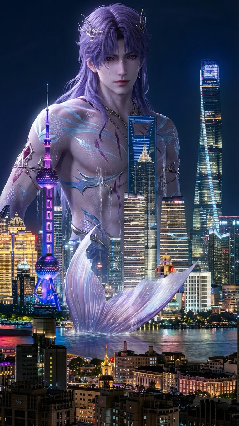
The viewer immediately understands the image because the city is recognizable before the fantasy premise is fully processed. Shanghai’s skyline, especially the Oriental Pearl Tower and the clustered high-rise silhouettes, provides an instant geographic and cultural anchor. Once the eye recognizes the city, the giant merman becomes more than a decorative fantasy figure. He becomes an event happening to a known place. That shift is critical. Myth becomes more powerful when it interrupts reality rather than floating in an abstract invented world.
Why the Scale Feels Convincing
One of the strongest achievements in the piece is scale control. The merman is enormous, but the composition does not flatten the skyline into a meaningless strip of lights. The towers remain readable, and the layered cityscape still occupies enough space to define the location. This is important because giant-character imagery can fail when scale becomes vague. If the environment is too small or too blurred, the figure only feels generically large. Here, the recognizable landmarks do the opposite: they prove the enormity of the subject.
The placement of the figure behind and above the skyline also helps. The head, shoulders, and upper torso dominate the upper part of the composition, while the shimmering tail or cresting fin relationship lower in the frame supports the fantasy premise without overloading the structure. This creates a complete sense of body presence while still allowing the city to remain legible. The viewer does not just see a large face behind buildings. The viewer understands that a colossal aquatic being is inhabiting the riverfront space as part of the city’s visual field.
Why the Character Design Feels Regal Instead of Monstrous
The image is smart to present the subject as elegant rather than aggressive. The long lavender hair, pale luminous skin, delicate gold ornaments, and calm expression all position the merman as a mythic prince rather than a creature attack scenario. That distinction matters because it changes the emotional genre of the image. This is not disaster fantasy. It is romantic spectacle. The character feels ancient, noble, and strangely serene, which makes the city-fantasy fusion feel beautiful instead of threatening.
The bioluminescent markings also help define the tone. They suggest magical biology rather than armor, violence, or brute force. This gives the figure a more refined and dreamlike quality. In practical design terms, the glowing accents also break up the large torso shape and tie the character visually to the city lights. The body is therefore not only a character design surface; it becomes a luminous extension of the nighttime skyline palette.
How the Color Palette Unifies Fantasy and City
Color harmony is doing a significant amount of work in this piece. The cool blue-violet illumination shared between the figure, the water, and the skyline helps unify fantasy and architecture into one believable visual system. If the merman were rendered in completely unrelated warm tones, he would feel pasted over the city. Instead, the lavender, blue, and silver values allow the viewer to accept the coexistence of glowing skin, river shimmer, and neon-lit towers as part of one atmospheric reality.
The night setting is particularly useful because it naturally accommodates spectacle. Cities already glow at night, and mythic beings already look plausible under moonlit or magical lighting. By choosing nighttime Shanghai, the image creates a natural bridge between the real and the impossible. Skyscraper highlights, water reflections, and bioluminescent markings all feel compatible in darkness. That is one reason the image feels so polished: it does not ask two visual systems to fight each other. It asks them to resonate.
Why Shanghai Is the Right City for This Fantasy Blend
Shanghai is an especially effective choice because its skyline already has a slightly futuristic rhythm. The Pearl Tower, the sleek glass supertalls, and the density of the waterfront architecture make the city feel visually dramatic even before any fantasy element is introduced. That means the merman does not have to manufacture spectacle from nothing. He enters an environment that already understands verticality, light, and theatrical urban identity. The city is a willing partner in the illusion.
There is also an important symbolic layer here. Water and Shanghai belong together visually because the waterfront is part of the city’s international image. By placing a mythic aquatic ruler in front of a riverbound skyline, the composition creates thematic fit. The fantasy subject does not feel random. He feels like a sea-born sovereign appearing in a place where trade, light, river, and skyline already define public perception. That conceptual fit strengthens the image beyond pure visual novelty.
Why the Image Feels Like Poster Art
The vertical framing helps the picture read as premium key art rather than a loose environmental matte painting. It centers the character, stacks the skyline in a controlled way, and gives the head enough room to dominate the top half without collapsing the city below. This is a poster logic: identify the icon, preserve the landmark, and make the relationship between them instantly legible. The composition is not accidental. It is built to be memorable at thumbnail size and impressive at full size.
Poster logic also appears in the way the figure is posed. The calm gaze and upright, frontal presence are not action-scene choices. They are icon-building choices. The character is introduced as an emblematic presence, someone the audience should remember, not a fleeting cinematic frame from a chaotic battle. That stillness is exactly what allows the scale and elegance to register. The image is not trying to tell ten things at once. It is trying to establish one unforgettable mythic encounter.
Fantasy, Romance, and Megacity Spectacle
Another reason the image works is that it chooses romance over aggression. The merman prince archetype is presented with beauty, softness, and quiet grandeur rather than monstrous threat. That opens the image to audiences who enjoy fantasy character design, romantic myth, urban wonder, and dramatic world-building without requiring combat or destruction. The result is emotionally expansive. The viewer can imagine a story of hidden rulers, enchanted waterways, city legends, or impossible meetings between modern skylines and ancient beings.
This is important for creators and designers because it shows how to generate spectacle without defaulting to violence. Scale alone is enough to create awe. Color harmony is enough to create immersion. Character poise is enough to generate fascination. The image proves that fantasy-city fusion can be majestic and elegant instead of catastrophic. That gives it wider usability across posters, covers, fandom edits, social graphics, and concept-art discussions.
Design Lessons from the Image
There are several practical lessons here. First, if you want a fantasy subject to feel enormous, use a real-world landmark system that viewers already understand. Second, if you want the fusion to feel polished, keep the color logic shared between character and environment. Third, if you want the image to feel premium rather than messy, reduce narrative clutter and let one strong impossible idea dominate the page. And fourth, if you want a city to remain important inside a fantasy poster, preserve recognizable geometry instead of burying it in atmospheric effects.
The image also demonstrates that elegant character styling can elevate spectacle. The long hair, ornaments, luminous skin, and controlled expression all make the merman feel like a sovereign figure rather than a creature effect. That decision changes how viewers emotionally file the image. They are less likely to read it as generic fantasy action and more likely to read it as curated mythic iconography. That shift makes the poster more memorable and more visually upscale.
Why the Piece Stays in Memory
Memorable images usually combine immediate readability with delayed richness. This one does exactly that. On first glance, the audience sees a giant merman over Shanghai. On second glance, they begin noticing the ornaments, the glow patterns, the way the skyline intersects the torso, the specific landmark cues, and the controlled color balance between water, architecture, and skin. Each additional layer rewards attention without disrupting the overall clarity of the concept.
That is the hallmark of strong visual world-building. The image does not simply present an attractive character. It proposes a universe in one frame. It suggests that a modern megacity and an ancient aquatic myth might overlap in the same nocturnal space. Because that proposal is both beautiful and easy to understand, the viewer is likely to remember it long after seeing it. The poster lingers not because it is chaotic, but because it is elegantly decisive.
Ultimately, this image works because it respects both halves of its premise. It does not reduce Shanghai to a generic skyline, and it does not reduce the merman to a generic fantasy pin-up. It gives the city identity, gives the character nobility, and then unites them through light, scale, and atmosphere. That balance is what transforms the image from an interesting concept into a truly effective mythic urban poster.