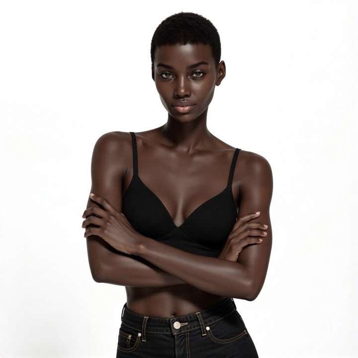
Updated Digitals 📸 @cameron.gram / @thediigitals #modellife #virtualinfluencer
Updated Digitals 📸 @cameron.gram / @thediigitals #modellife #virtualinfluencer
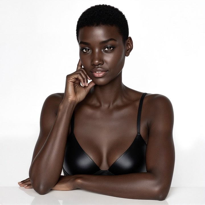
You’ve seen this kind of image everywhere: a clean, high-key studio portrait on a white seamless, nothing to distract, everything to admire. It looks “easy” at first glance, but it’s engineered for attention. When a creator posts updated digitals, the audience reads it as proof of progress—sharper craft, cleaner identity, better taste. The photo doesn’t have to shout. It just has to feel expensive, controlled, and repeatable.
There’s a quiet hook in images like this: your brain gets instant clarity. One subject, one pose, one background. No decoding. That speed matters on scroll-heavy platforms. Clean white space also behaves like a “visual amplifier”—it makes skin highlights, facial symmetry, and wardrobe silhouette read faster than busy scenes ever could.
But the real reason this works is restraint. The lighting is soft and directional enough to sculpt cheekbones and shoulders, yet filled enough to keep everything friendly. That balance signals professional studio craft without feeling like a dramatic campaign. It’s the same reason casting digitals feel trustworthy: they look like evidence, not advertising.
And then there’s the brand story embedded in the caption: updated digitals. That phrase frames the image as a milestone. The audience isn’t just “liking a pretty photo”—they’re reacting to a narrative of refinement. If you’re building an AI image style, this is a powerful template: a repeatable baseline shot you can remix across looks while keeping the same premium signature.
| Signal | Evidence (from this image) | Mechanism | Replication Action |
|---|---|---|---|
| Instant readability | Pure white seamless background, single subject, centered crop | Reduces cognitive load; the viewer understands the “story” in under a second | Lock a clean background and remove all props; keep one subject and one gesture per frame |
| “Studio proof” aesthetic | Soft beauty key + fill; crisp eyes; controlled specular highlights | Signals professional process and quality; feels like a portfolio deliverable | Prompt for high-key beauty lighting and “eyes tack sharp”; lower drama, increase polish |
| Progress narrative | Digitals-style wardrobe and pose; minimal styling | Frames the post as an update/milestone, not a random upload | Caption and series design: publish as an “update” set (baseline + 2 controlled variations) |
Recipe 1: The same lighting, different persona
Recipe 2: Turn it into a campaign without losing the baseline
Recipe 3: Make it cinematic while staying high-key
The image is built on a strict two-to-three tone logic: bright white background, deep skin values, and a single black wardrobe anchor. That limited palette is why the portrait feels instantly premium—there’s nowhere for the quality to hide. Notice how the highlights are placed: forehead, nose bridge, cheekbones, shoulder tops. They’re not random shine; they’re “guided” specular hits from a large soft source, giving the skin a smooth, dimensional roll-off.
The pose also does a lot of work. The hand-to-cheek gesture creates a quiet intimacy, while the forearm across the bottom stabilizes the frame like a baseplate. The eyes are the sharpest point, and everything else gently softens, which is classic editorial portrait control. Finally, the background is aggressively clean. No set cues, no texture—just negative space that makes the subject read like a product shot, but for identity.
| Observed | How to recreate |
|---|---|
| Pure white seamless, evenly lit | Prompt “pure white seamless background, evenly lit, no texture, no gradient” and avoid environmental nouns |
| Soft directional key from camera-left | Prompt “large soft key light from upper left, soft fill, high-key beauty lighting” |
| Eyes tack sharp, gentle falloff | Prompt “85mm portrait, shallow depth of field, eyes tack sharp” and keep the crop as bust portrait |
| Limited palette (white / deep skin / black) | Lock wardrobe as black and keep background pure white; avoid colorful props and patterns |
| Faint tabletop reflection | Prompt “glossy white tabletop with subtle reflection” and keep the lower frame clean |
| Prompt chunk | What it controls | Swap ideas (EN, 2–3 options) |
|---|---|---|
| Subject + identity | Face readability, age feel, expression, “digitals” authenticity | “calm neutral expression” / “soft confident smile” / “serious casting look” |
| Pose/gesture | Intimacy, elegance, frame structure | “hand touching cheek” / “hands clasped under chin” / “one hand on collarbone” |
| Wardrobe simplicity | Premium signal via minimalism; keeps focus on face/skin | “black minimal bra” / “neutral tank top” / “strapless bodysuit” |
| Background cleanliness | Scroll readability and editorial polish | “pure white seamless” / “off-white seamless” / “light gray seamless” |
| Lighting direction + softness | Cheekbone sculpt, skin highlights, perceived quality | “soft key from left” / “soft key from front” / “clamshell beauty lighting” |
| Lens/DOF feel | Facial proportions, intimacy, realism | “85mm portrait” / “70mm medium telephoto” / “105mm beauty” |
| Retouching realism | Skin texture vs plastic look; editorial credibility | “clean retouching, subtle pores” / “natural skin sheen” / “minimal makeup, realistic texture” |
Change only one or two knobs per run. You’re trying to converge on a stable “digitals baseline,” not reinvent the scene every generation.