Comment with „Prompt“ & I will send you the exact Guide to create this Video 🎬 The easiest way to do it with @invideo.io 🚀 ______________________________________ Ad #edit #videoedit #reels #invideo #aivideo
Comment with „Prompt“ & I will send you the exact Guide to create this Video 🎬 The easiest way to do it with @invideo.io 🚀 ______________________________________ Ad #edit #videoedit #reels #invideo #aivideo
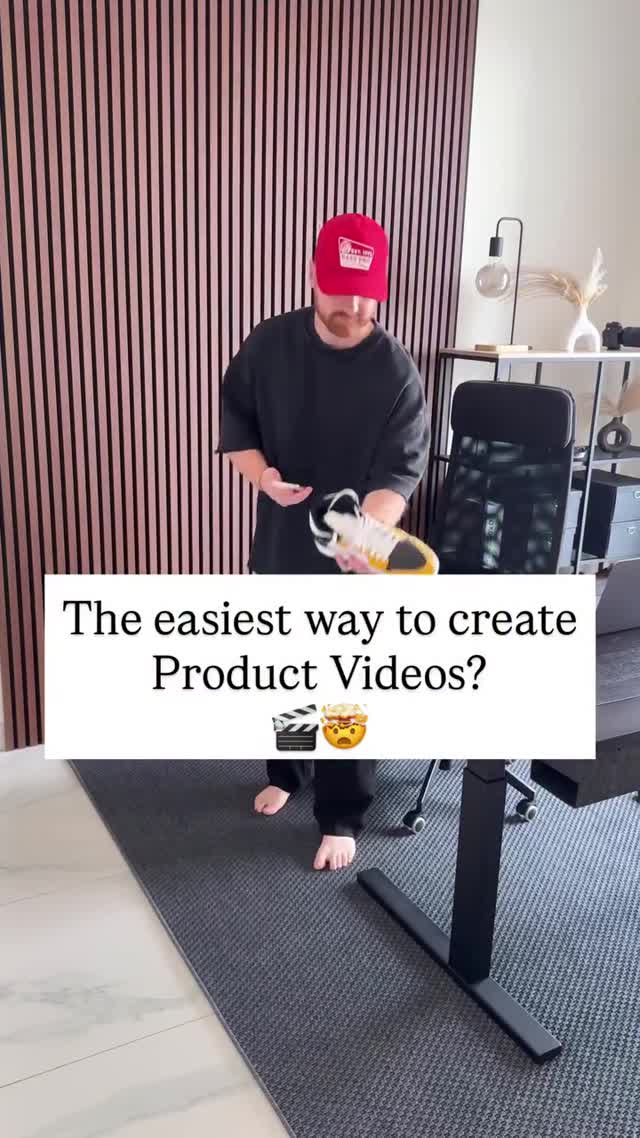
This thumbnail is a textbook example of tool/teaching content that converts: a clear question headline, a visible product in-hand, and a clean room backdrop that makes the message impossible to miss.
The headline is doing the heavy lifting. It’s framed as a question, which invites an answer and triggers curiosity. “Easiest way” is a promise of efficiency—exactly what creators and small businesses want. Then the visual proof is right there: a product held up like a demo.
The room choice matters too. A minimal studio/office background signals “creator workflow” without distracting props. The wood slat wall gives texture, the rug grounds the scene, and the desk leg hints at a setup. It feels like you’re about to learn something practical.
Finally, the growth loop is built into the CTA style: asking viewers to comment a keyword to receive a guide. That one action creates distribution (comments) and capture (DM/link delivery). It’s a simple funnel that scales.
| Signal | Evidence (from this image) | Mechanism | Replication action |
|---|---|---|---|
| Question headline | Big centered text: “The easiest way…” | Curiosity increases watch-starts | Use a question that promises a shortcut (fast, easiest, no-code) |
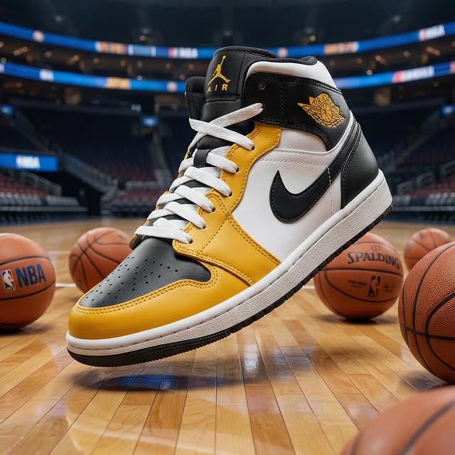
| Proof-in-frame | Product is held in hands | Reduces skepticism | Always show the product on the first frame |
| Creator setting | Office/studio environment with desk and chair | Signals “this is a workflow” | Choose a clean setup background with one texture element (slat wall, bookshelf) |
This isn’t trying to be cinematic. It’s trying to be readable. The centered white card is basically a billboard that works in silent autoplay. The outfit is neutral so it doesn’t fight the headline. The background is tidy so the viewer trusts the workflow.
| Prompt chunk | What it controls | Swap ideas (EN, 2–3 options) |
|---|---|---|
| “white centered text card” | Readability and hook delivery | “top banner”, “lower-third bar”, “outlined text only” |
| “holding product in hands” | Proof and specificity | “product on table”, “product spinning on turntable”, “before/after split screen” |
| “minimal office studio background” | Trust and professionalism | “warehouse shelf”, “kitchen counter”, “white seamless backdrop” |
| “neutral outfit + accent cap” | Visual identity | “brand color hoodie”, “apron”, “button-up shirt” |
Change one knob per run: headline wording, product category, or text card placement. Keep the room and lighting consistent for clean testing.