MrBeast-Style YouTube Thumbnail Templates: 2+ Designs Inspired by MrBeast [2026] | Alici.AI
MrBeast's thumbnails are instantly recognizable because they compress extreme stakes into a single frame through three visual systems: color-coded subject contrast, symmetrical dual-frame compositions, and environmental text that feels carved rather than overlaid. These techniques have driven billions of views across survival challenges, philanthropy reveals, and competition formats — and they are learnable.
This collection of MrBeast youtube thumbnail templates captures those signature patterns and makes them transferable to your content. The survival challenge template uses an overhead dual-expression layout with color-coded sleeping bags and a day counter carved into dirt — the same visual shorthand MrBeast deploys to communicate endurance and interpersonal conflict. The philanthropy template applies a split-screen comparison with centered presenter framing, bold location labels, and high-saturation warm tones that signal tangible impact and global scale.
Browse the MrBeast style thumbnails below to find the format that matches your content type. Each template preserves the psychological triggers that make MrBeast's thumbnails click-worthy — asymmetric emotional reactions, earned environmental details, and visual proof of real consequences — while letting you customize colors, subjects, text, and backgrounds to fit your channel brand and specific video premise.
Browse through categories or start creating your own thumbnails with Alici.AI Thumbnail Expert
Speed Vs Battle YouTube Thumbnail Template
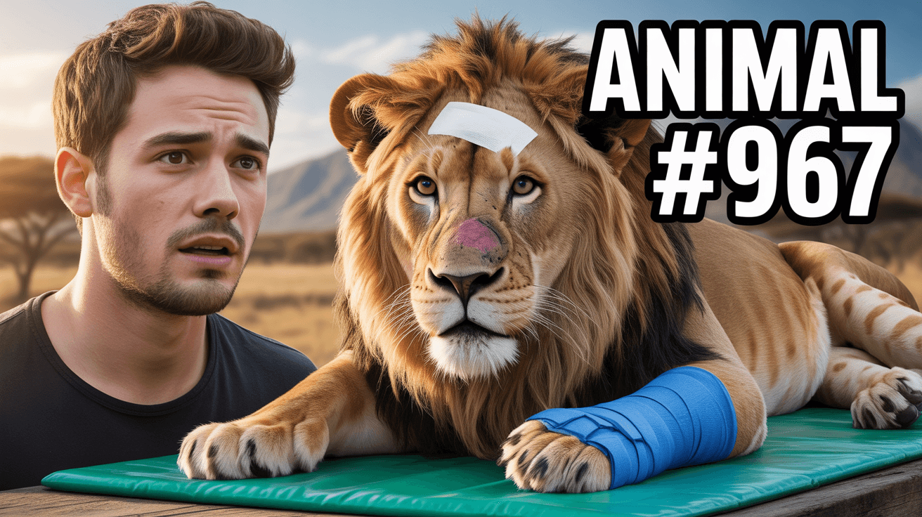
MrBeast Style: Animal Rescue YouTube Thumbnail Template
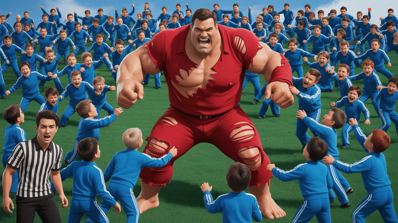
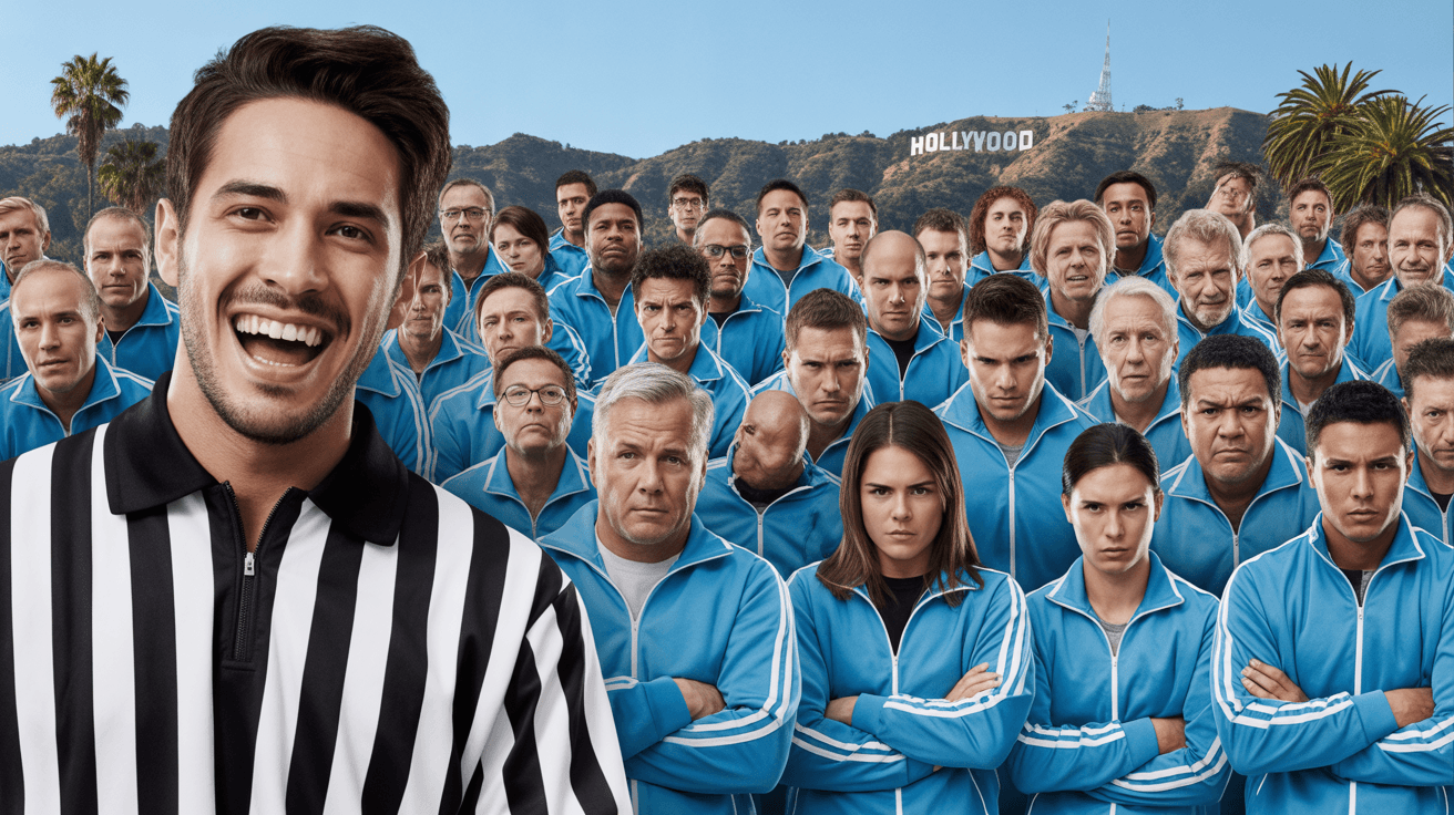
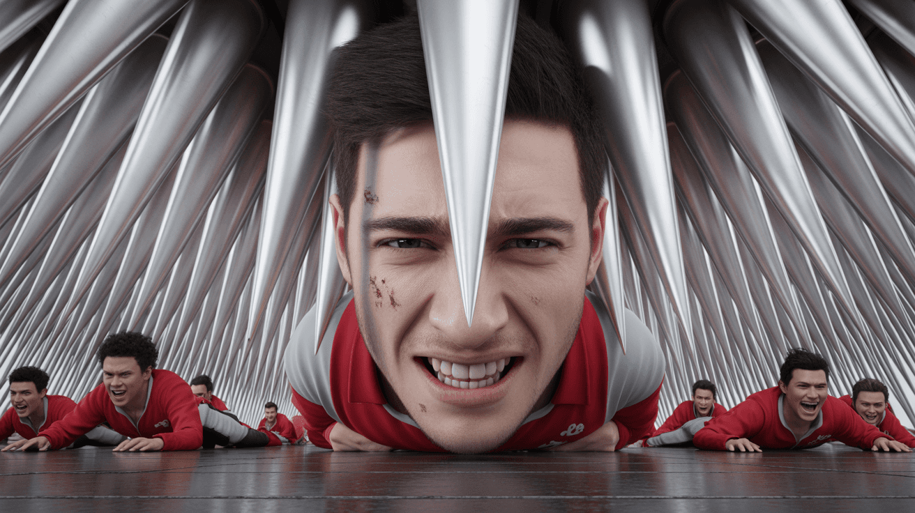
Mass Vs Battle YouTube Thumbnail Template
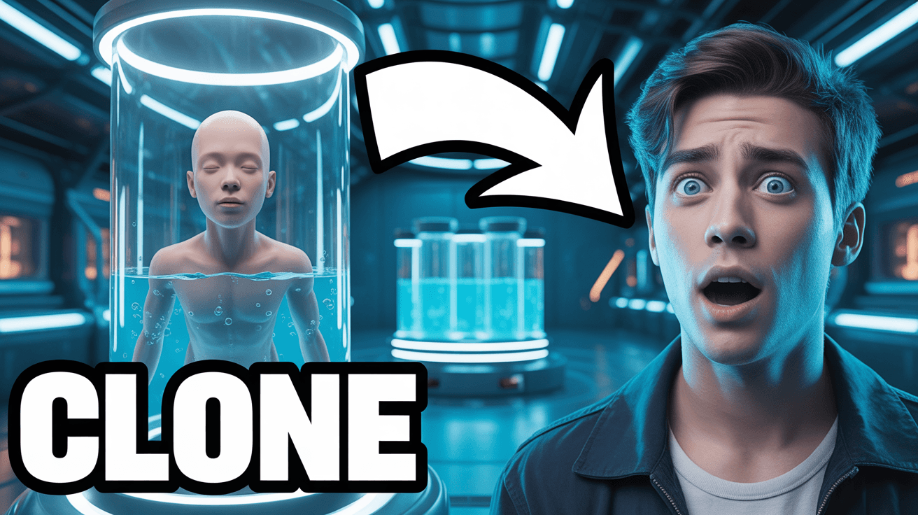
Future Self Message YouTube Thumbnail Template
Extreme Escape Challenge YouTube Thumbnail Template
Bunker Comparison YouTube Thumbnail Template
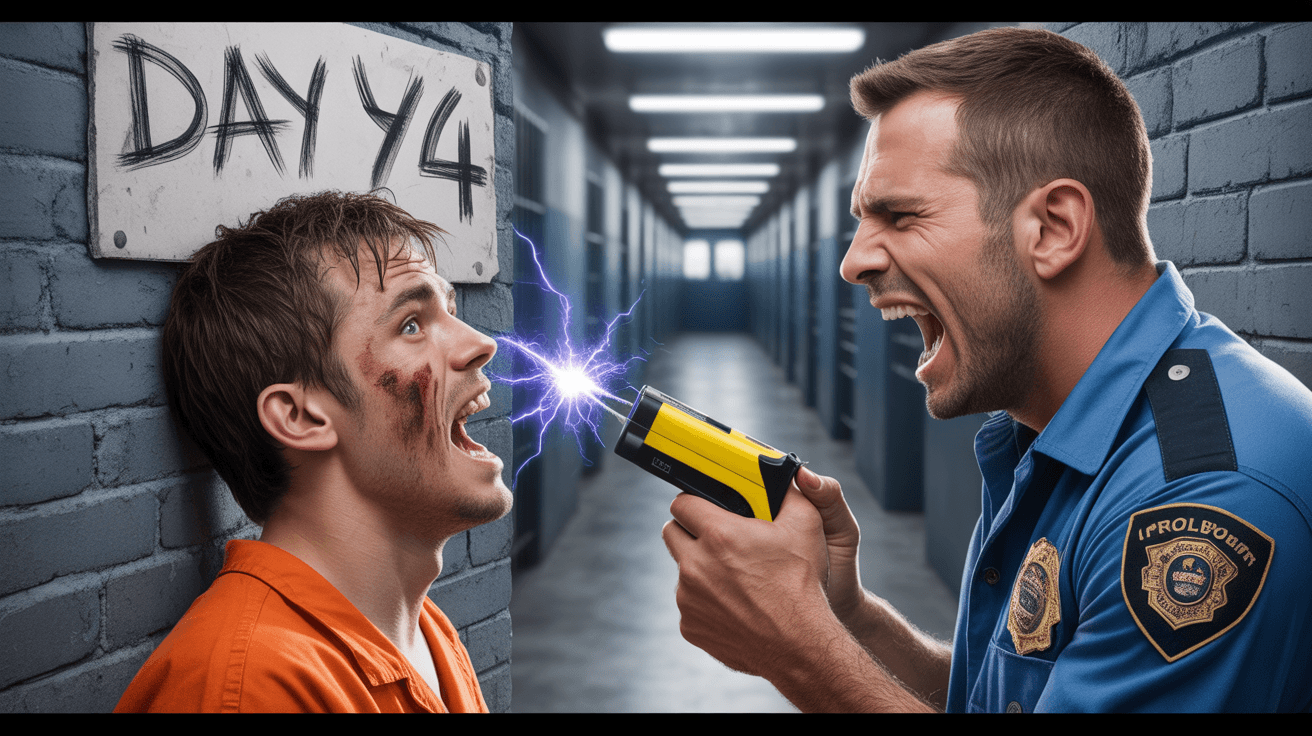
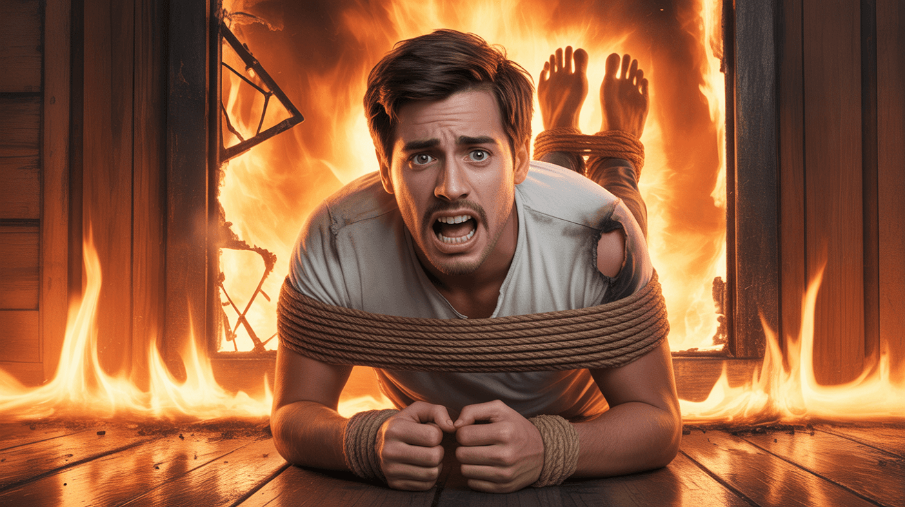
Prison Survival Challenge YouTube Thumbnail Template
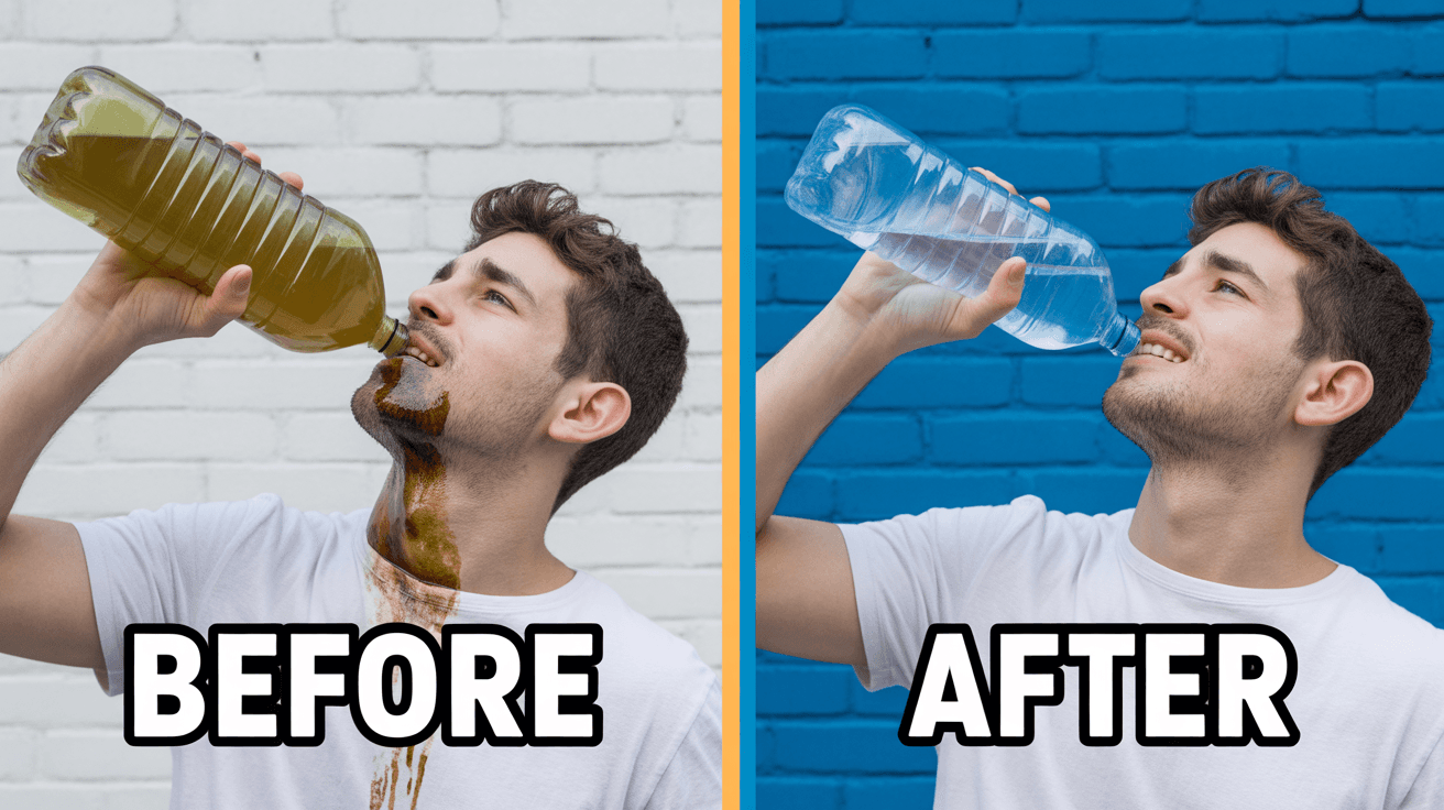
Clean Water Philanthropy YouTube Thumbnail Template
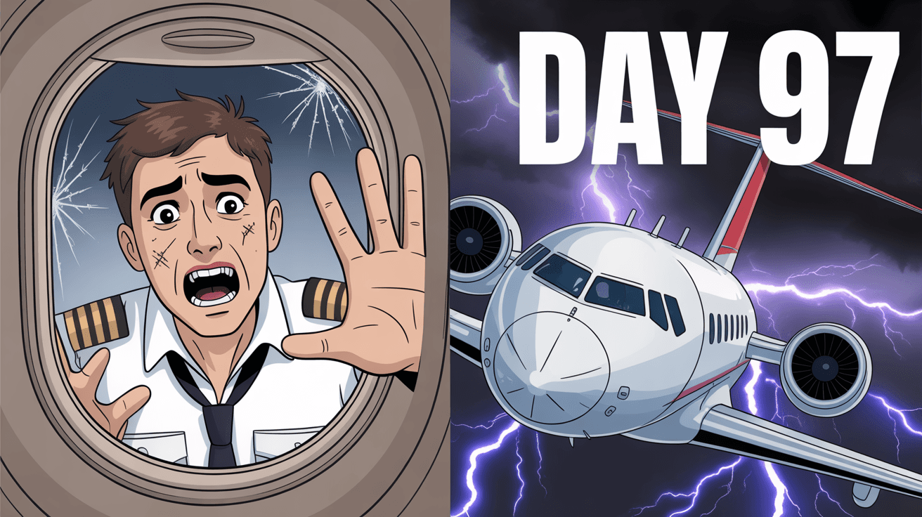
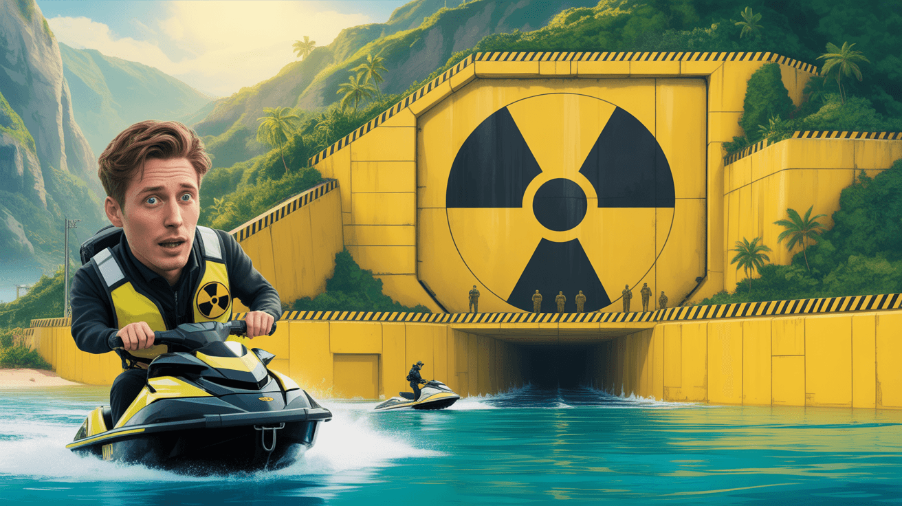
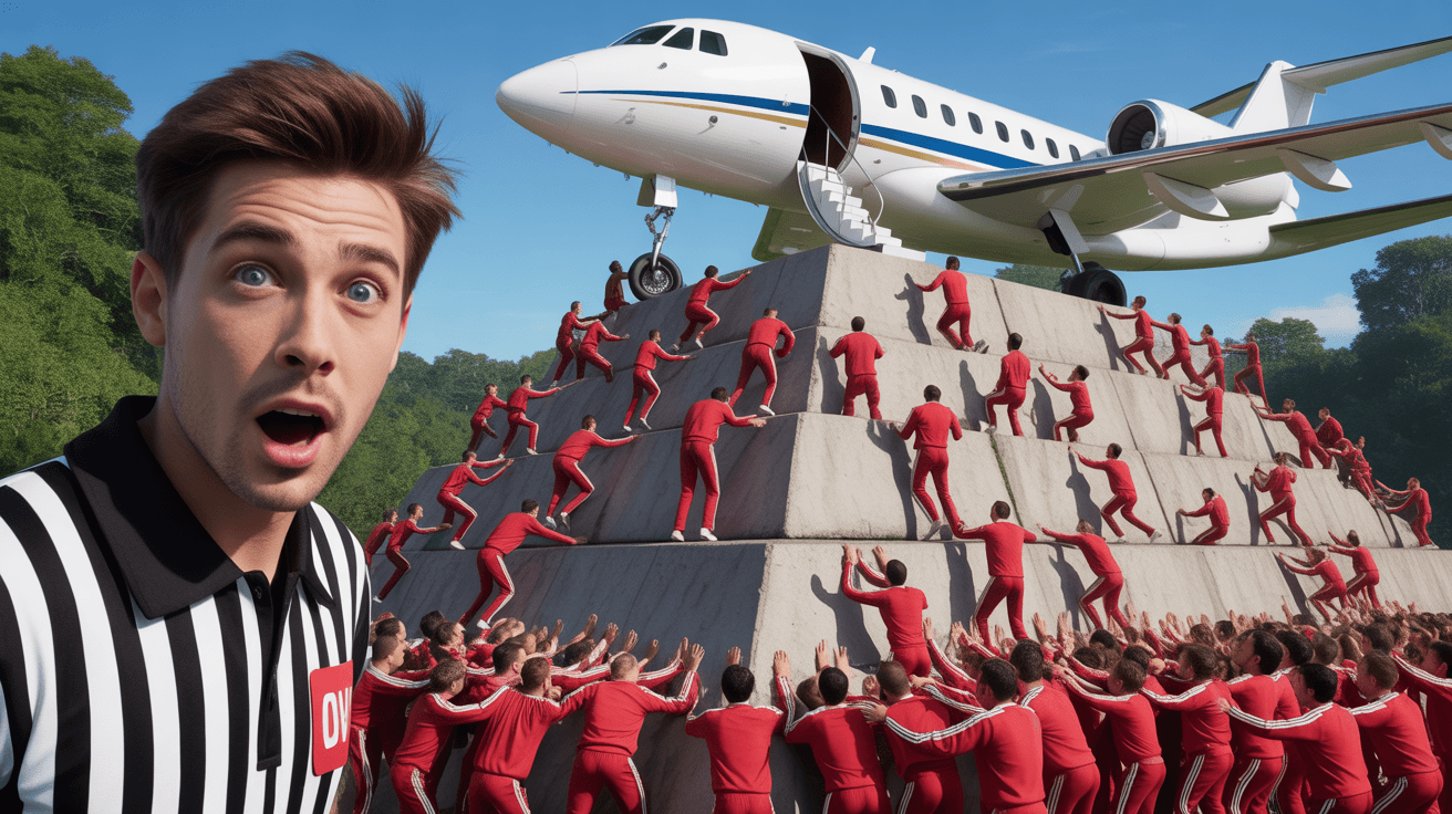
Private Jet Survival YouTube Thumbnail Template
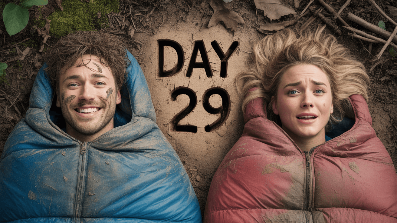
MrBeast Style: Survival Challenge YouTube Thumbnail Template
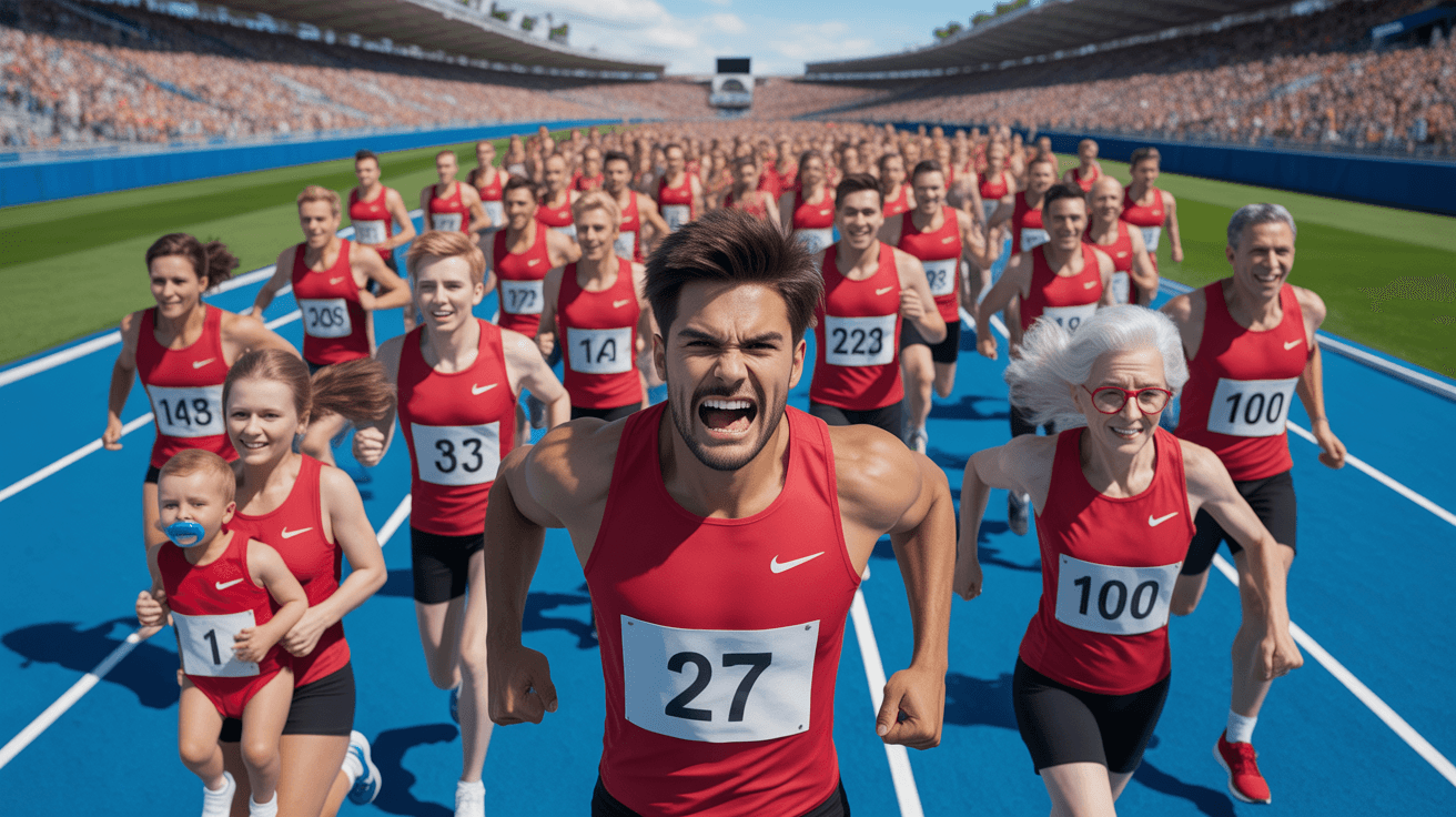
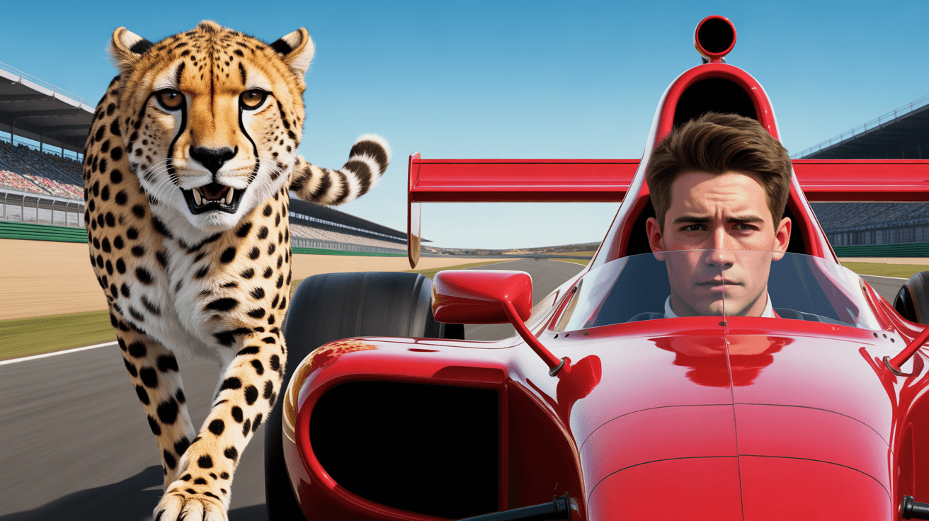
MrBeast Style: Competition Race YouTube Thumbnail Template
MrBeast Style: Tech Showcase YouTube Thumbnail Template
MrBeast Style: Mass Event YouTube Thumbnail Template
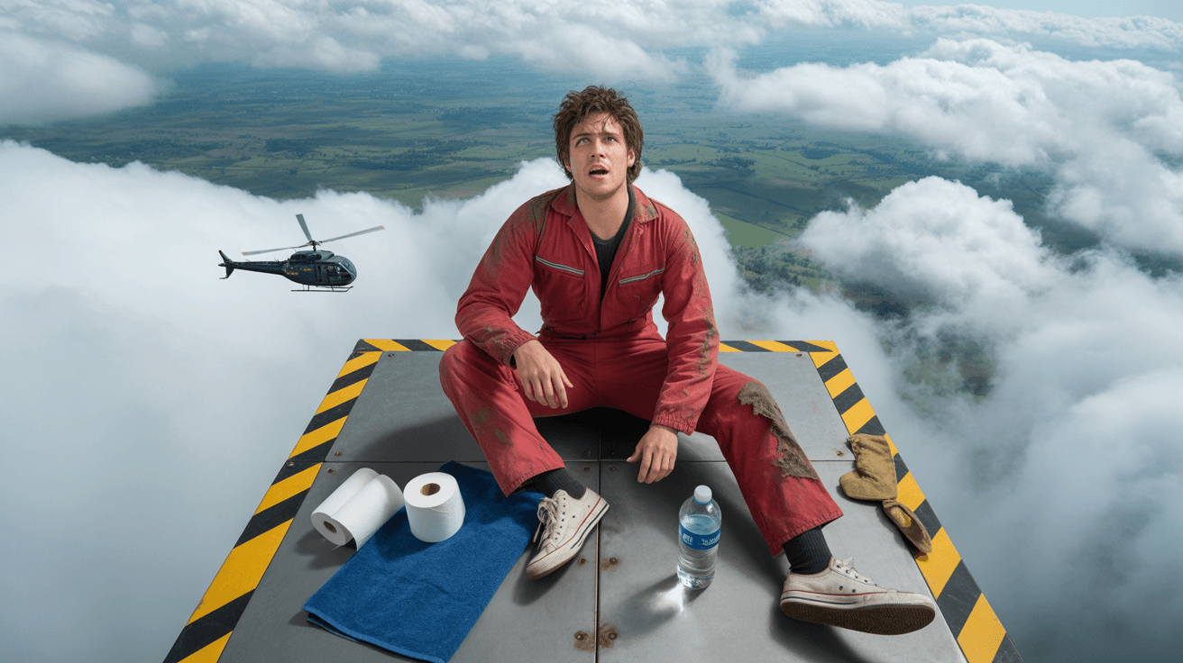
MrBeast Style: Extreme Stunt YouTube Thumbnail Template
MrBeast Style: Prize Challenge YouTube Thumbnail Template
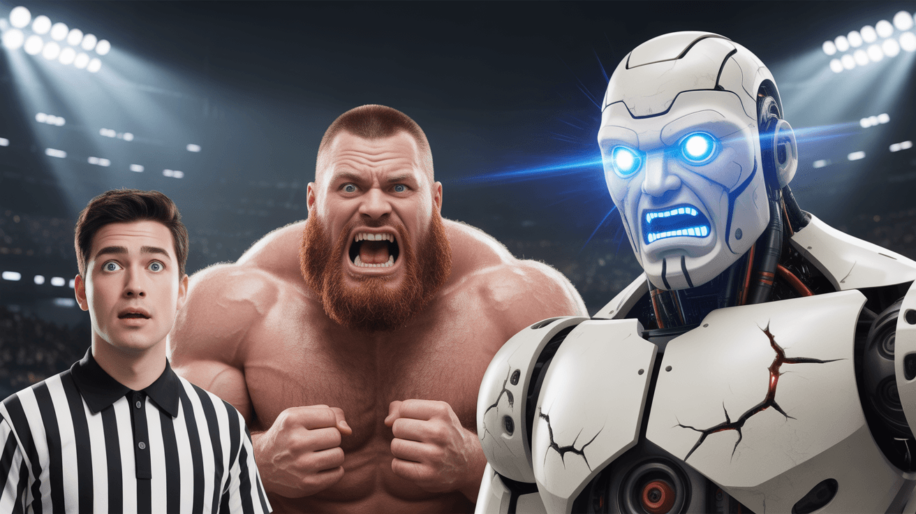
MrBeast Style: Vs Battle YouTube Thumbnail Template
MrBeast Style: Trap Challenge YouTube Thumbnail Template

MrBeast Style: Philanthropy YouTube Thumbnail Template
MrBeast Style: Survival Challenge YouTube Thumbnail Template
Design Principle
1. Color-Coded Conflict Zones
MrBeast's thumbnails use deliberately opposing color regions to communicate stakes without requiring text. The survival challenge template places blue against pink sleeping bags on neutral brown earth — cool tones signal composure while warm tones signal distress. The philanthropy template splits warm Mediterranean terracotta against bright American brick. This two-zone color system lets viewers process the core tension in under a second at any thumbnail size, because color contrast registers faster than text or facial expressions in peripheral vision.
2. Symmetrical Dual-Frame Layout
Both templates force equal visual weight on two competing elements — the overhead angle in the survival template eliminates hierarchy between two subjects, while the vertical split in the philanthropy template gives each location identical screen real estate. This balanced composition creates a surveillance or comparison effect that implies ongoing observation rather than a staged moment. Viewers instinctively scan both halves, increasing dwell time on the thumbnail before the click decision.
3. Earned Authenticity Markers
Text and environmental details in MrBeast's style feel discovered rather than designed. The survival template features DAY 29 carved into real dirt surrounded by moss and twigs — not a clean graphic overlay. The philanthropy template uses architectural landmarks and flag icons as location proof rather than generic labels. These earned markers signal that consequences are real and unscripted, which builds viewer trust before the click and separates the content from staged clickbait.
FAQ
Q1: How do I make thumbnails like MrBeast?
A: MrBeast's thumbnail system relies on three core techniques: color-coded visual splits that communicate conflict instantly, symmetrical compositions that force viewers to compare two elements, and environmental text or markers that feel earned rather than designed. Start by choosing a two-zone color contrast for your subjects or locations, frame them with equal visual weight, and add a text element that looks physically present in the scene rather than overlaid as a graphic.
Q2: What colors does MrBeast use in his thumbnails?
A: MrBeast's color strategy depends on content type rather than a fixed palette. For survival and challenge content, he uses earthy neutrals (brown, green) as a base with high-saturation accent contrasts — blue versus pink, or cool versus warm tones on opposing subjects. For philanthropy and impact content, he shifts to bright saturated warm tones — terracotta, sky blue, and lush greens — that signal optimism and tangible outcomes. The consistent principle is deliberate two-zone color contrast, not a specific set of colors.
Q3: What makes MrBeast's thumbnails get so many clicks?
A: Three psychological triggers drive MrBeast's click-through rates. First, asymmetric emotional expressions — one person grinning while another grimaces creates an information gap viewers need to resolve. Second, environmental proof of stakes — carved day counters, real buildings, and physical wear signal that consequences are genuine. Third, symmetrical framing that forces equal attention on both elements, making the viewer process the full conflict before scrolling past.
Q4: Can I use MrBeast-style thumbnails for survival challenge videos?
A: The overhead dual-expression layout is built specifically for survival and endurance content. Use color-coded elements to differentiate your subjects — sleeping bags, clothing, or background zones. Add a visible timeline marker (day counter, hour stamp) carved or written into the physical environment rather than overlaid digitally. The key is showing contrasting reactions to the same situation, which creates curiosity about what caused one person to break while the other persevered.
Q5: Will MrBeast-style thumbnails work for my smaller channel?
A: MrBeast's visual techniques are transferable regardless of channel size because they exploit universal psychology — color contrast, comparison framing, and authenticity signals work at any subscriber count. The survival template suits channels between 10K and 500K building a challenge brand, while the philanthropy template works for 5K to 300K channels in social impact or documentary content. The only styles to avoid are calm or luxury content, where the high-stakes visual language would feel incongruent with your brand.
Q6: How do I customize MrBeast thumbnail templates for my brand?
A: Each template has four swappable layers: subject, color accents, text elements, and background environment. For the survival template, replace sleeping bag colors with your brand palette, swap the day number to your challenge milestone, and adjust facial expressions to match your premise. For the philanthropy template, update location images with your project sites, change country labels and flags to your destinations, and swap the centered subject to your on-camera presenter. Keep the symmetrical split structure and environmental text placement intact — those are the click drivers.
Ready to 3x Your YouTube Views?
Join 10,000+ creators who've discovered the secret to viral thumbnails