/
/
/
/
MrBeast Style: Philanthropy YouTube Thumbnail Template
MrBeast Style: Philanthropy YouTube Thumbnail Template
Inspired by the visual language of @MrBeast's philanthropy videos. This split-screen comparison layout communicates global scale and tangible impact within a single glance. A confident figure in formal attire stands centered between two distinct school buildings representing different countries, each labeled with bold white text and flag icons. The bright saturated palette and clean compositing create a polished, authoritative feel that signals serious investment and real-world results.
Built for charity project reveals, international education content, or any before-and-after format comparing locations or outcomes. The centered-subject-over-split-background technique lets viewers instantly grasp scope — two places, one mission. The formal attire anchors credibility while the vivid architecture provides visual proof of impact. Replace the building images with your project locations, update the country labels, and swap the subject to match your on-camera presence.

mrbeast thumbnail, mrbeast style template, philanthropy thumbnail, split screen comparison design
1280x720
Best Use Cases for This Thumbnail Template
Charity & Social Impact Content
MrBeast's philanthropy thumbnails work because they show tangible outcomes rather than emotional appeals. The split-screen layout in this template visually proves scope — two buildings in two countries communicate international reach instantly. The centered suited figure acts as a trust anchor, signaling professional execution rather than amateur goodwill. This combination of visual proof and personal credibility is what drives clicks on impact content where viewers are skeptical of clickbait.
Customization tip: Replace COUNTRY A and COUNTRY B labels with your actual project locations and swap the flag icons to match — specificity increases perceived authenticity.
Example titles:
I Built 5 Water Wells Across Africa
We Renovated Schools In 3 Countries — Here's What Happened
How I Funded 100 Students' Education This Year
International Travel & Documentary Content
The split-location composition naturally frames any cross-country comparison — cultural differences, infrastructure gaps, or travel experiences. The bold country labels with flag icons create immediate geographic context that viewers process before reading the title. This template leverages the same visual shorthand that news broadcasts use for international stories, giving documentary-style creators instant credibility and a professional framing that elevates their content above casual vlogs.
Customization tip: Change the building styles to reflect the specific locations you visited — swap Mediterranean architecture for local landmarks or recognizable structures from your destinations.
Example titles:
Schools In Japan vs Schools In America — The Truth
I Compared Hospitals In 5 Different Countries
What $100 Gets You In Every Country I Visited
Before-After Project Reveals
Any creator documenting a building, renovation, or transformation project benefits from the side-by-side structure. The clean vertical split gives each state equal visual real estate, letting the contrast speak for itself. The centered presenter bridges both halves, implying personal responsibility for the change. The bright color saturation and clear sky backdrop ensure each building reads distinctly even at small mobile thumbnail sizes where detail is easily lost.
Customization tip: Use the left panel for the before state and right for after — match the western left-to-right reading direction so viewers naturally process the transformation in the correct sequence.
Example titles:
I Turned An Abandoned Building Into A Community Center
Our Classroom Makeover — 30 Days Start To Finish
Watch This Empty Lot Become A Skate Park
Why This Works
The high-saturation warm palette — terracotta oranges, sky blues, and lush greens — signals optimism and positive outcomes, a deliberate contrast to the darker tones used in challenge content. This color psychology primes viewers to expect a feel-good story before reading the title. For philanthropy and impact creators, warm saturation communicates success and completion rather than crisis, which increases click-through from audiences seeking uplifting content in their feed.
The centered subject positioned over a split background creates a visual hierarchy that reads in three layers: person first, then left location, then right location. This layered depth composition borrowed from MrBeast's impact videos forces the eye to the human element before the context, establishing the creator as the agent of change. The symmetrical split behind them implies balanced comparison, giving equal visual weight to both outcomes.
The formal suit and broad confident smile function as a trust signal that separates serious impact content from casual vlogs. In philanthropy thumbnails, viewer skepticism is high — the professional attire communicates investment and accountability. Combined with the labeled country flags and distinct architectural styles, this creates a visual evidence chain: credible person plus verifiable locations plus specific labels equals a click-worthy promise that the content delivers real results.
Creator Fit
Best fit: Creators who produce charity reveals, education projects, international development content, or large-scale building projects similar to MrBeast's philanthropic approach — professional tone, tangible outcomes, global scope. Ideal for channels between 5K and 300K subscribers establishing authority in social impact or nonprofit content where visual proof of work drives subscriber trust and donor engagement.
Not recommended for: Not suited for raw, grassroots activism content where the polished split-screen layout and formal suit would feel corporate and disconnected from community-level work. Gaming, comedy, or entertainment channels would find the architectural comparison and country labels irrelevant — the philanthropy-coded visual language creates expectations the content cannot fulfill.
Video Hooks:
Hook 1: "Behind me are two schools in two different countries — and I built both of them from the ground up."
Hook 2: "What does it actually cost to build a school? I found out the hard way — in ten different countries."
Hook 3: "Six months ago these buildings didn't exist. Today, hundreds of kids are walking through those doors for the first time."
The split-screen two-location thumbnail promises a cross-country comparison story — each hook immediately references multiple locations and the personal role in building them, matching the visual evidence of the suited figure standing between two distinct school buildings.
More you like

Speed Vs Battle YouTube Thumbnail Template
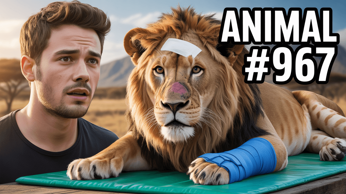
MrBeast Style: Animal Rescue YouTube Thumbnail Template
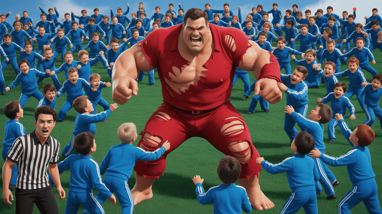
Mass Vs Battle YouTube Thumbnail Template
Future Self Message YouTube Thumbnail Template

Extreme Escape Challenge YouTube Thumbnail Template

Bunker Comparison YouTube Thumbnail Template
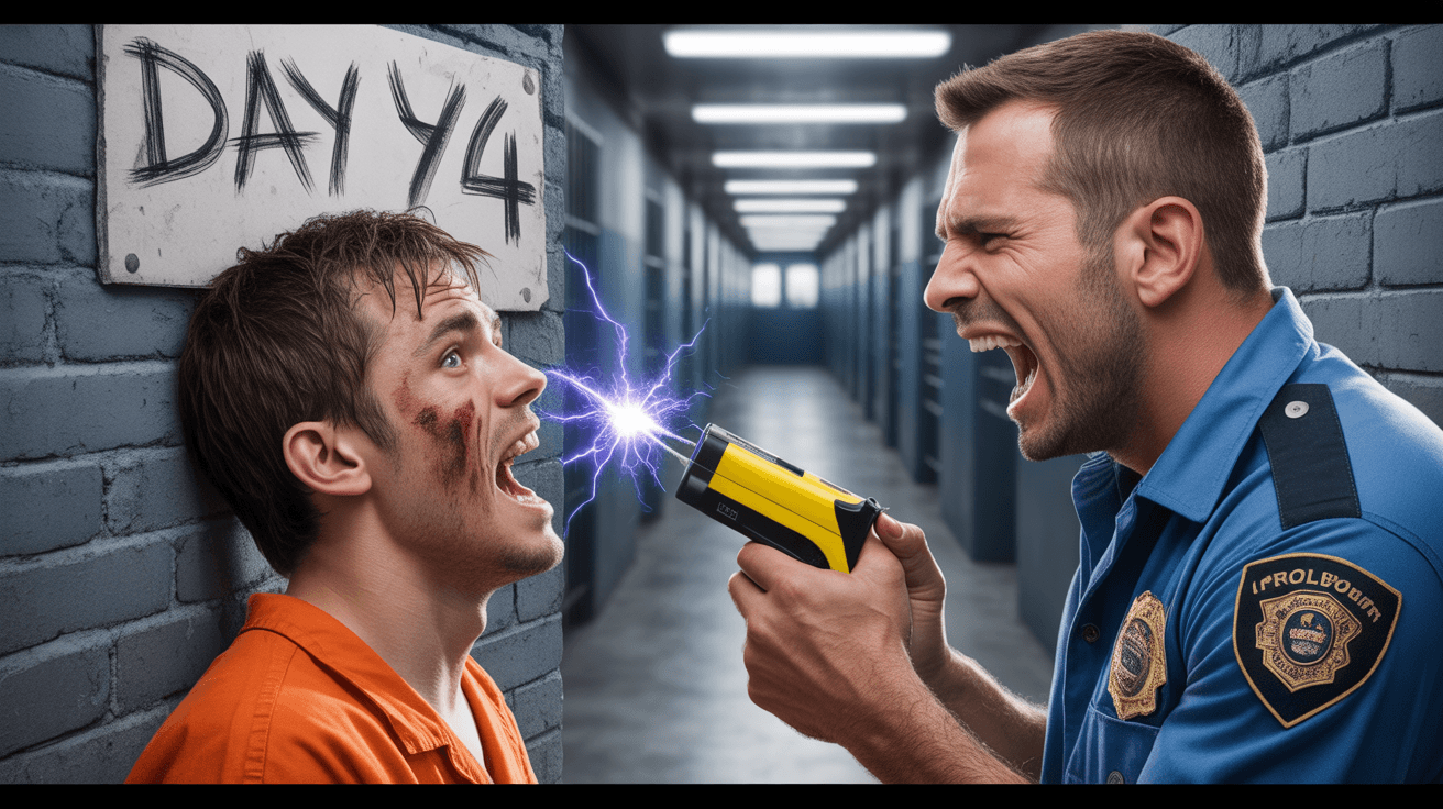
Prison Survival Challenge YouTube Thumbnail Template
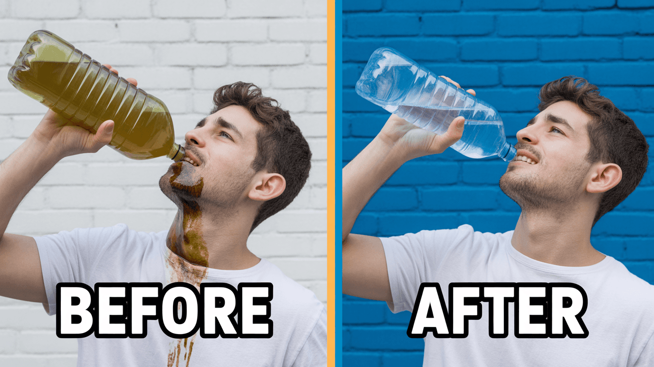
Clean Water Philanthropy YouTube Thumbnail Template
Ready to 3x Your YouTube Views?
Join 10,000+ creators who've discovered the secret to viral thumbnails