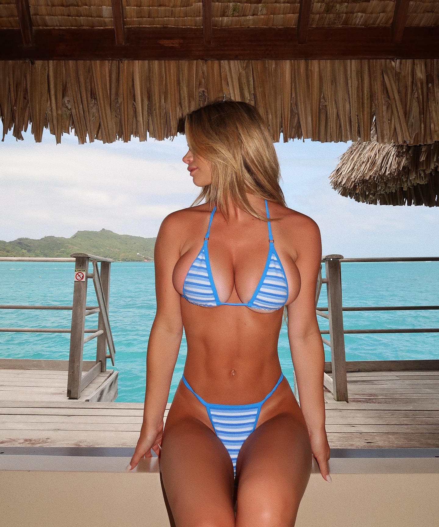


Bora Bora dump 🏝️🌺🐠
Bora Bora dump 🏝️🌺🐠
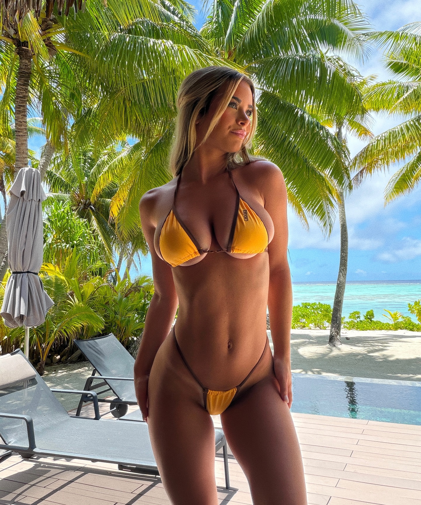
This image succeeds because it balances glamour with environmental credibility. The subject is clearly the focal point, but the palms, lounge chairs, folded umbrella, and ocean view all contribute just enough evidence to make the scene feel like a real place instead of a backdrop. That matters for creators. A lot of weak resort imagery looks expensive at first glance but falls apart because the setting feels generic or fabricated. Here, the terrace details make the fantasy believable.
The swimsuit color is also doing precise work. Yellow can easily become a novelty color, but in this frame it reads as intentionally tropical because it sits between the green palms and the blue water. The palette feels coherent. The turned face helps too. Instead of direct eye contact, the off-camera look introduces a quieter editorial tone. That choice keeps the image from becoming too aggressive or overly posed. For AI image prompting, this is a useful lesson: when the location is already visually rich, a softer expression often produces a more premium result.
The frame has strong thumbnail readability because the body silhouette is clear, the bikini color is singular, and the location cues are immediately legible. It also holds attention longer because the viewer keeps discovering layers in the palms, terrace, and shoreline. That combination of speed and depth is exactly what makes social visuals travel well.
| Signal | Evidence (from this image) | Mechanism | Replication Action |
|---|---|---|---|
| Clear tropical color harmony | The yellow bikini sits between green palms, pale sand, and turquoise sea. | The wardrobe pops without clashing, which makes the frame feel more premium. | Choose one warm garment color and place it against cool natural tones. |
| Strong environmental truth | Lounge chairs, umbrella, deck, and palms all support the resort story. | Specific setting cues make the scene feel lived-in and believable. | Use 3-5 concrete resort elements instead of generic luxury adjectives. |
| Soft off-camera gaze | The subject looks to the side instead of into the lens. | Averted attention lowers the feeling of performance and creates editorial softness. | Prompt a side gaze when the environment already carries a lot of visual energy. |
| Palm-filtered daylight | Sunlight is bright but slightly shaped by overhead fronds. | Natural light variation adds realism and keeps the scene from looking flat. | Describe filtered tropical light rather than only saying “sunny beach”. |
This style fits tropical swimwear campaigns, resort marketing, destination creator branding, and AI-generated vacation portraits that need to look luxurious without becoming too polished. It works especially well when the brand wants a private, upscale mood rather than party energy.
This approach is less suited to sporty beachwear, crowded social vacation scenes, or high-drama fashion editorials. The value here is calm exclusivity.
The strongest aesthetic decision here is the way the background frames the body without overwhelming it. The palms create visual abundance, but the subject remains dominant because the pose is quiet and upright. That balance is hard to get right. Many tropical images either feel empty or overcrowded. This one lands in a stronger middle zone where the setting feels lush but still controlled.
The second useful detail is how the side gaze changes the mood. Direct eye contact would have pushed the frame toward standard influencer posing. Looking away makes it feel more like a resort editorial. For prompt writing, this matters because expression direction can change the perceived quality of an image almost as much as lighting does. When the scene is already rich, softer facial engagement usually upgrades the result.
| Observed | Why it matters | How to recreate |
|---|---|---|
| Palm canopy above the subject | Builds lush tropical identity without crowding the foreground | Frame the upper image area with large leaves or fronds |
| Yellow swimwear as single warm accent | Creates immediate focal clarity | Use one concentrated warm wardrobe color against cooler landscape tones |
| Side-looking expression | Adds editorial distance and reduces obvious posing | Prompt a three-quarter head turn away from camera |
| Terrace furniture kept low in frame | Supports the location story while keeping the subject first | Place loungers and umbrella low or to the edges instead of behind the face |
| Prompt chunk | What it controls | Swap ideas (EN, 2-3 options) |
|---|---|---|
| "mustard-yellow triangle string bikini" | Wardrobe clarity and color temperature | "coral bikini set", "white crochet bikini", "olive halter swimsuit" |
| "standing on a tropical terrace looking off to the side" | Pose mood and editorial tone | "leaning on railing", "hands relaxed by sides", "looking down toward the deck" |
| "grey lounge chairs, folded umbrella, palm trees" | Resort specificity and premium context | "cabana drapes and daybed", "stone sun deck with parasol", "wood deck with woven chairs" |
| "bright daylight filtered through fronds" | Natural light realism and shadow behavior | "clean noon sun", "soft late-afternoon tropical light", "hazy morning brightness" |
| "turquoise ocean beyond the deck" | Destination cue and depth layering | "lagoon water view", "cliffside sea horizon", "private pool and bay" |
The easiest way to weaken a scene like this is to overbuild the luxury. If the palms, deck, loungers, and water are already visible, adding drinks, beach bags, hats, and extra accessories usually makes the result look cheaper, not richer.
Start by locking three things: the terrace setting, the side-looking expression, and the single warm-color bikini. Those three choices define the entire image. Then change one or two variables at a time.
Baseline Lock:
- setting: luxury tropical terrace with palms and ocean beyond
- expression: soft side gaze away from camera
- wardrobe: one warm-color string bikini

One-change rule:
Change architecture first, wardrobe second, expression third.
Do not alter all three in one pass.