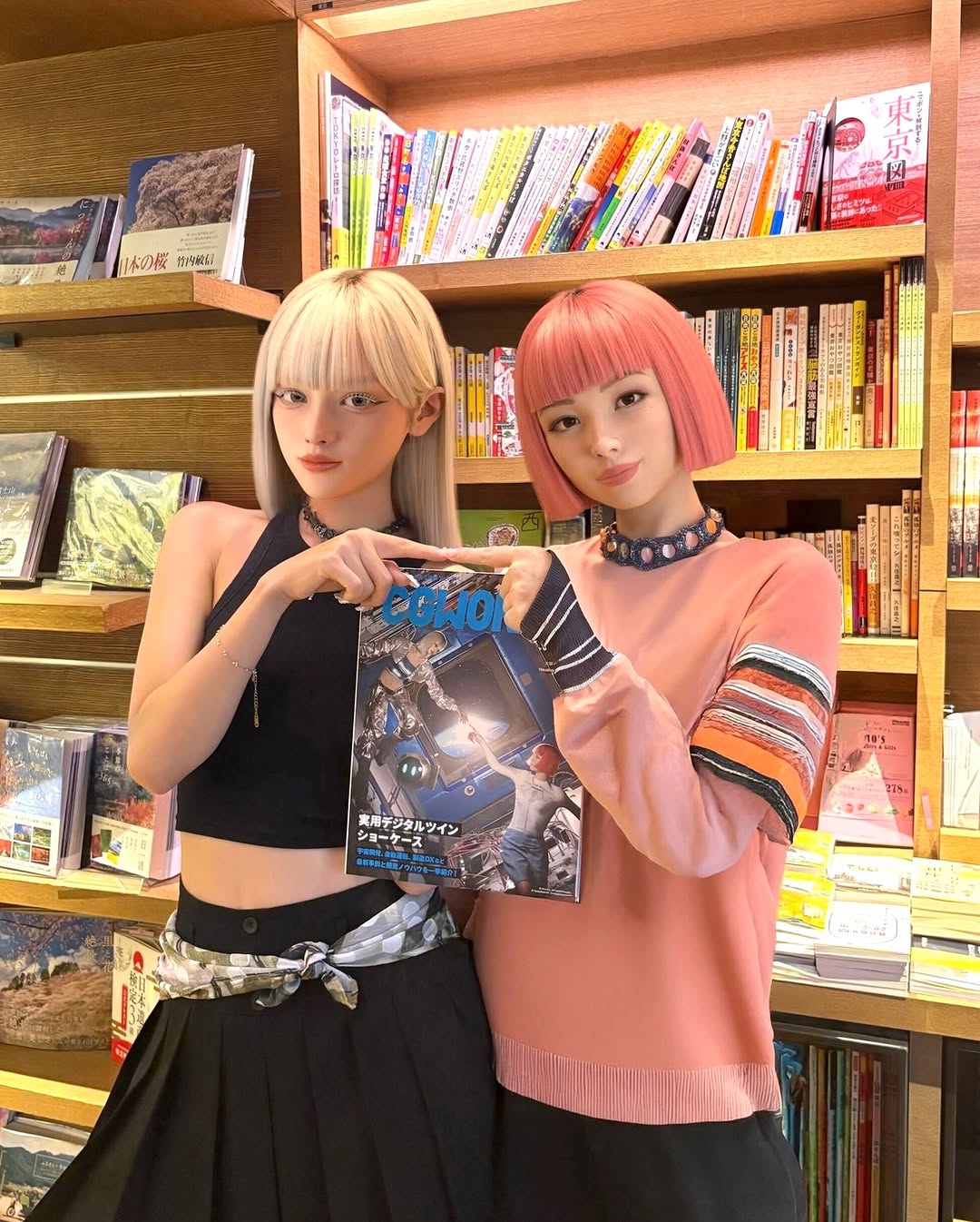
#cgworld cover of… us ✨ 🤖👉👈🧠
#cgworld cover of… us ✨ 🤖👉👈🧠
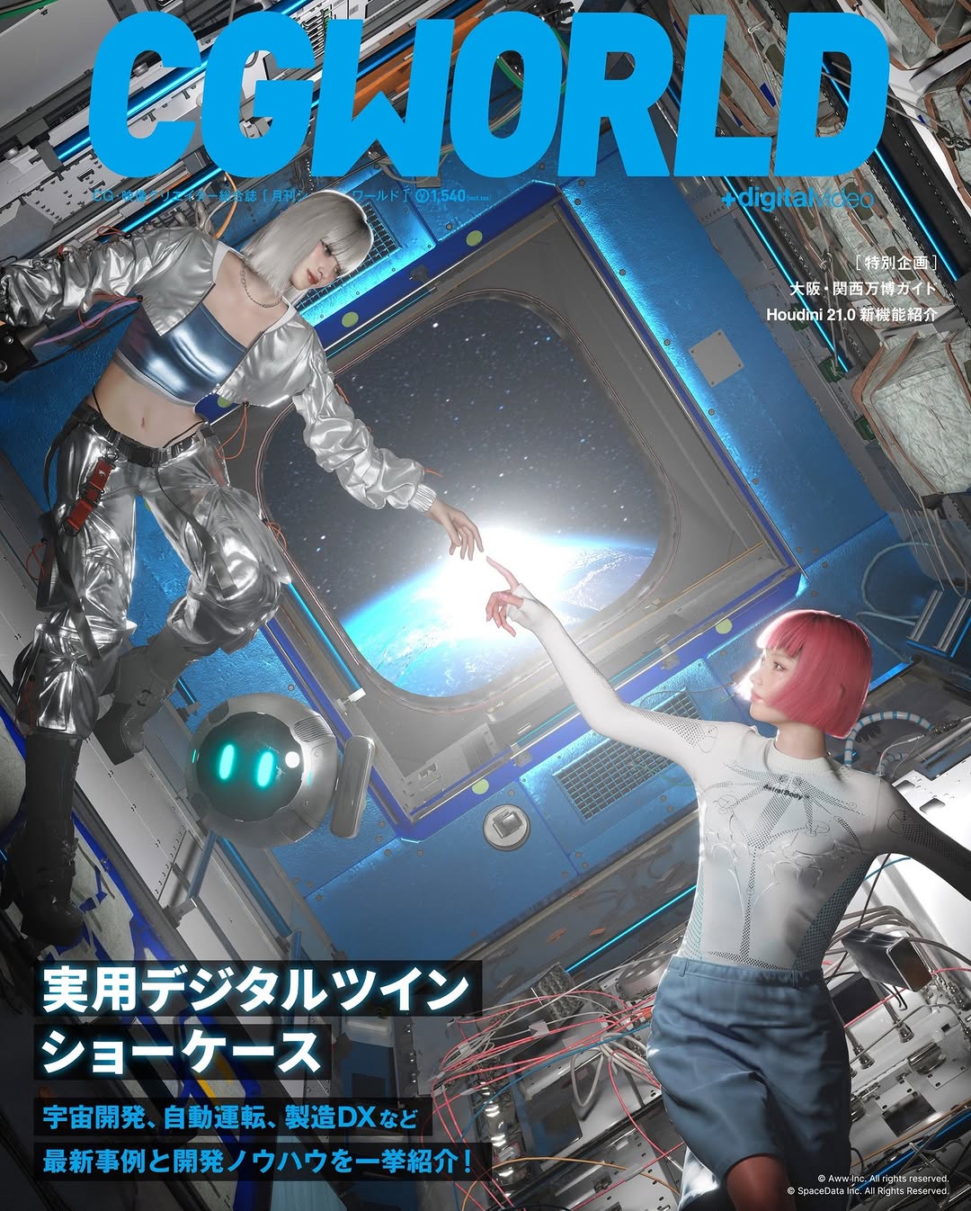
This image is a strong growth model because it does not rely on a single hook. It stacks three hooks at once: a narrative gesture, a believable sci-fi environment, and bold cover typography that signals authority.
The fingertip near-touch in the center creates immediate narrative tension. Viewers ask: are these two characters connecting, rescuing, or synchronizing? That question extends attention time.
The second engine is editorial framing. Large masthead text and structured callouts make the image feel like a publishable cultural object, not just another render. Authority cues increase saves and shares, especially in design and tech communities.
| Signal | Evidence (from this image) | Mechanism | Replication Action |
|---|---|---|---|
| Narrative focal gesture | Two characters reaching toward each other at center | Creates story tension and rewatch behavior | Design one explicit interaction point between subjects |
| World depth anchor | Central spacecraft window with Earth view | Adds scale and context instantly | Use one deep-space portal/background element as core depth device |
| Editorial authority | Bold masthead and structured text blocks | Makes content look collectible and "issue-worthy" | Treat typography as composition, not afterthought |
| Tech texture density | Cables, panels, and metallic interiors around edges | Raises perceived production value | Pack peripheral detail while preserving central readability |
Not ideal: minimal lifestyle brands, soft documentary diaries, or posts where text overlays must stay extremely low.
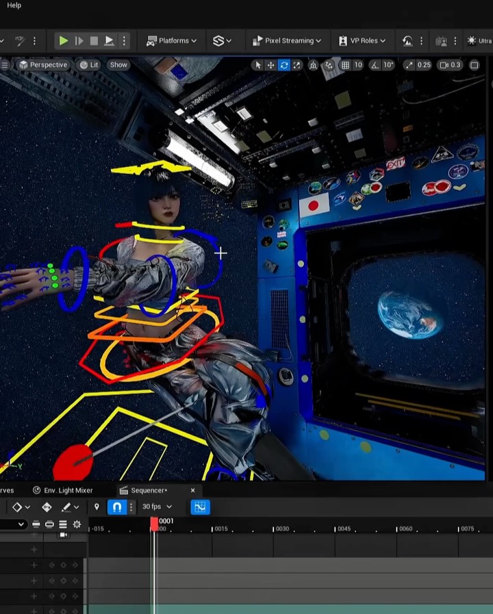
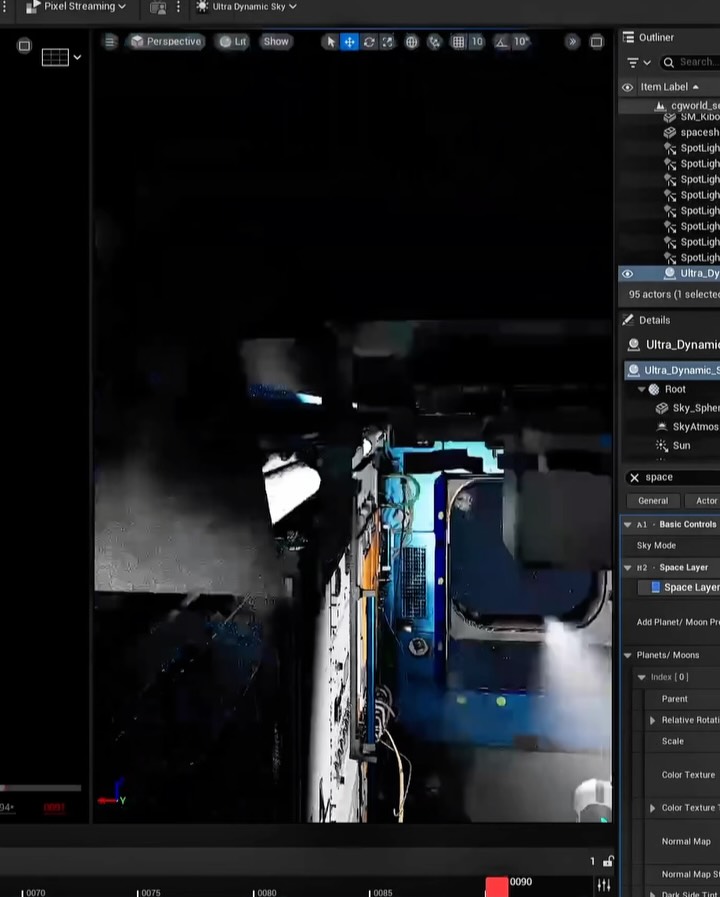
{editorial cover layout} {dual-character narrative pose} {iconic depth backdrop} {bold masthead + callouts}{high-detail environment frame} {center interaction focal point} {contrasting character styles} {publication typography system}{cover-title hierarchy} {hero visual narrative} {secondary info columns} {clear issue framing}This image balances complexity and control. Complexity lives on the edges: machinery, cables, text layers. Control lives in the center: a clean light portal and one interaction gesture. Color strategy is also deliberate: cyan and metallic neutrals dominate, while hair colors provide identity contrast. When reproducing this style, lock hierarchy first. Without hierarchy, dense sci-fi detail becomes noise.
| Prompt chunk | What it controls | Swap ideas (EN, 2-3 options) |
|---|---|---|
| "dual-character near-touch center gesture" | Narrative tension | "almost-contact hands", "synchronized reach", "connection moment" |
| "central window with Earth glow" | Depth and scale | "planet horizon portal", "space viewport core", "backlit cosmic window" |
| "bold cyan masthead" | Editorial authority | "dominant top title", "issue-name banner", "publication header" |
| "dense peripheral machinery" | Production richness | "edge-detail tech clutter", "industrial frame components", "mechanical envelope" |
| "cool sci-fi lighting" | Mood coherence | "blue-cyan high-tech tone", "cold metallic highlights", "futuristic contrast palette" |
Baseline lock: lock center interaction point, lock title hierarchy, lock main depth portal.
In cover-driven growth content, composition hierarchy is the conversion layer.