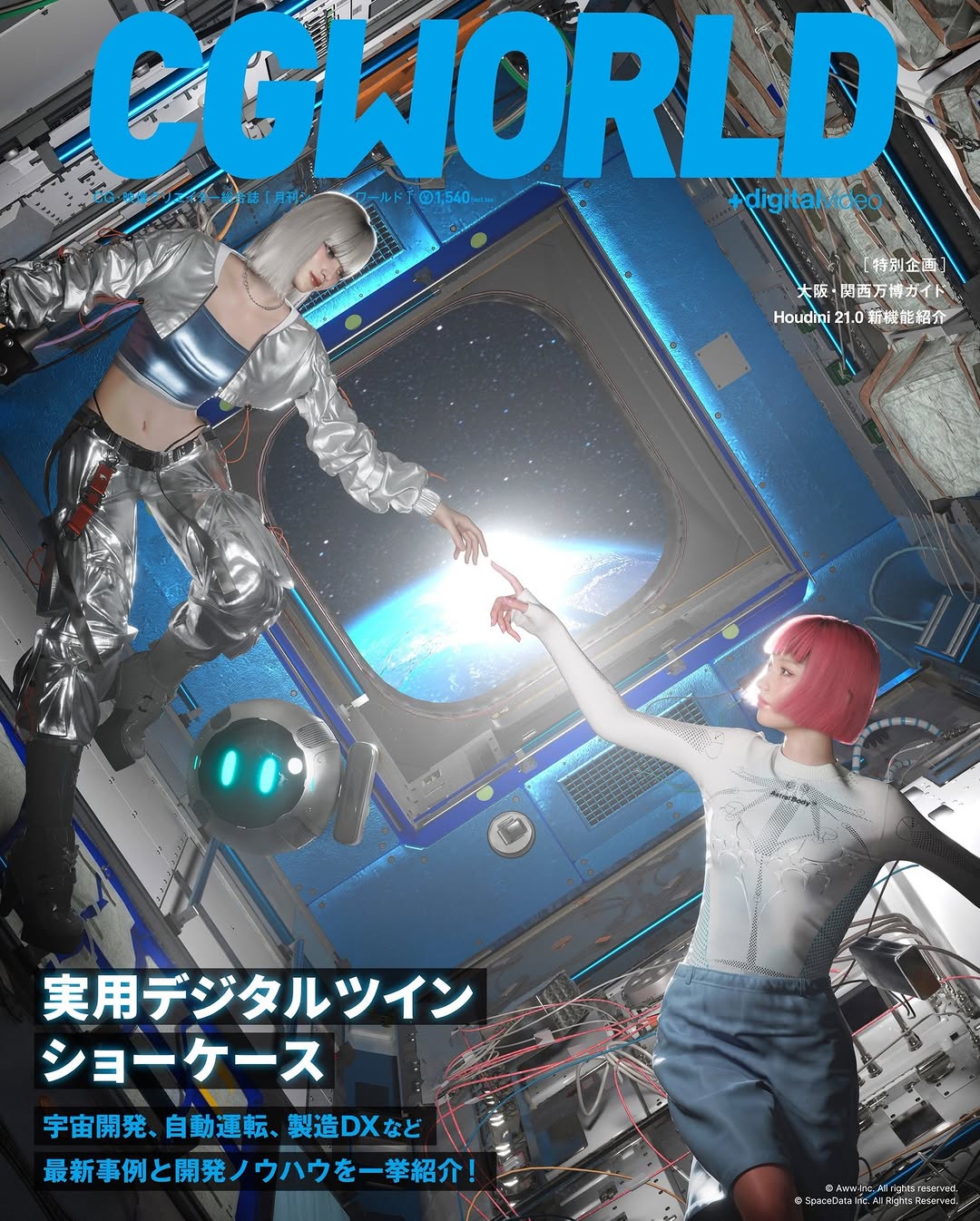
How imma.gram Shared This CGWORLD Cover Process Screenshot
This post does not show a polished hero image first. It shows the workspace. That choice sends a strong signal: this creator is not only a face or brand, but a builder with process.
Why this workflow screenshot spreads
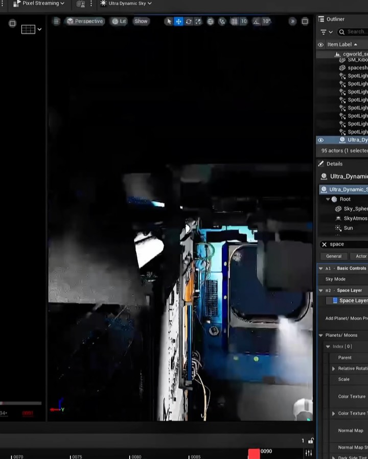
The first mechanism is credibility through transparency. Showing the editor interface, object lists, and timeline tells the audience this is real production work, not just a final output drop. In creator ecosystems, process proof increases trust and often drives higher-quality comments.
The second mechanism is identity positioning. A clean final render could belong to anyone. A captured workspace with recognizable tool structure positions the creator as technically involved and pipeline-aware. That matters especially when announcing a major milestone such as cover work, because audiences want evidence of craft depth.
The third mechanism is visual contrast discipline. Dark UI framing with a bright blue viewport creates a natural focal hierarchy: interface context first, creative world second. This makes the image both informative and atmospheric, which improves retention without sacrificing clarity.
Signal
Evidence (from this image)
Mechanism
Replication Action
Process transparency
Full editor UI visible with outliner and settings.
Proves hands-on production rather than surface-level output.
Share one true workspace frame whenever announcing major creative milestones.
Technical depth cue
Dense right-side object/parameter panel and timeline strip.
Signals pipeline complexity and professional rigor.
Keep at least two technical UI regions visible (hierarchy + timing or settings).
Mood-rich viewport anchor
Blue-lit sci-fi scene sits inside dark interface frame.
Balances tutorial-like utility with artistic intrigue.
Use one high-contrast viewport scene as the visual hook within the UI frame.
Authentic imperfection
Slight screen-capture softness and cluttered labels remain.
Reduces "over-curated" distance and feels more real.
Avoid over-cleaning interface captures; preserve believable production mess.
Use Cases and Transfer Paths
Best-fit scenarios
Cover reveal or publication milestones where credibility of production process matters.
Portfolio posts for CG/3D creators who need to show both craft and final aesthetic direction.
Recruitment or collaboration signals that attract technically capable partners.
Educational teaser posts before releasing full workflow breakdown content.
Not ideal
Mass-market audience campaigns where tool UI complexity may reduce accessibility.
Emotion-first storytelling posts requiring clear human facial connection.
Pure minimal-brand feeds that avoid dense technical visual language.
Three transfer recipes
Animation Pipeline Transfer
Keep: full software context with hierarchy and timeline visible.
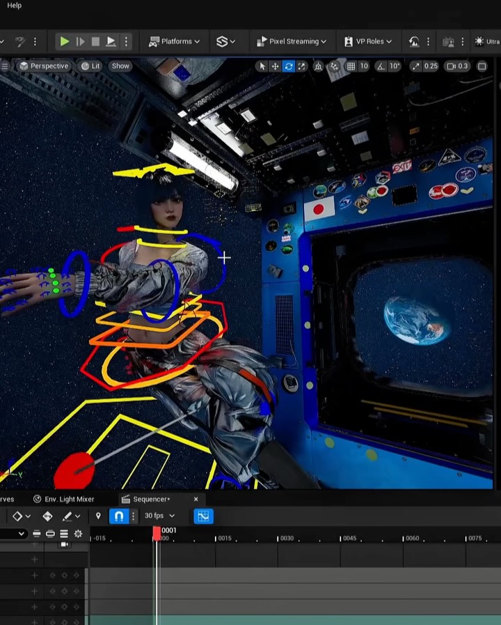
Change: sci-fi viewport to character rig scene and animation curves panel.
Slot template (EN): {dark_editor_ui} {viewport_scene_hook} {hierarchy_panel} {timeline_or_curve_panel}
VFX Breakdown Transfer
Keep: dense inspector panel and process-first framing.
Change: viewport to compositing pass layers and effect previews.
Slot template (EN): {production_workspace_capture} {effect_stack_visibility} {technical_label_density} {artifact_realism}
Game Environment Transfer
Keep: dark UI + atmospheric viewport contrast.
Change: blue industrial scene to biome environment blockout with lighting passes.
Slot template (EN): {engine_interface_fullframe} {environment_preview} {outliner_and_details} {authentic_workbench_tone}
Aesthetic Read
The composition intentionally prioritizes context over polish. The viewer sees the creative world through the software frame, not as an isolated art piece. This "frame-within-frame" structure creates a narrative of making, which is often more compelling than output alone.
Color hierarchy is clean: dark neutral UI surrounds one luminous blue focal zone. That contrast pulls the eye into the viewport while preserving technical readability on the right. The bottom timeline strip subtly reinforces the sense of time-based production work, which is especially valuable when signaling professional pipeline maturity.
For creator growth, this format is powerful because it answers an implicit audience question: "Can this person actually build at this level?" The screenshot says yes without needing a long claim.
Observed
Why it matters
How to recreate
Editor chrome fully visible
Anchors authenticity
Avoid cropping out top bars and side panels
High-contrast blue viewport core
Provides immediate visual hook
Keep one bright scene element against dark interface
Object hierarchy + details panel
Signals technical depth
Include inspector regions with dense labels
Timeline strip present
Suggests active production workflow
Show frame/time controls even in teaser screenshots