We just launched AI Motion Graphics with Anthropic. Think vibecoding for motion design.
The cost of professional motion work just dropped to zero.
All generated from a single prompt. Small teams can now produce the same quality as large agencies.
No After Effects, no templates, no code — just describe what you want.
Comment ‘MOTION’ for access.
Case Snapshot
This video is a classic B2B social promo built around one clear product promise: AI can help users create polished motion graphics quickly. Instead of trying to explain the entire platform in detail, the clip narrows its focus to a single visual category and then proves breadth through a fast sequence of use cases. That is a smart format for short-form product marketing because it keeps the message simple while still feeling substantial.
The strongest structural choice is the category ladder. After the opening partnership and headline cards, the video moves through product demo, infographic, app walkthrough, educational, and case-study examples. This makes the platform feel versatile without overwhelming the viewer with a feature checklist. Each category acts like a proof point. The result is a compact but convincing social ad for creative software.
What You're Seeing
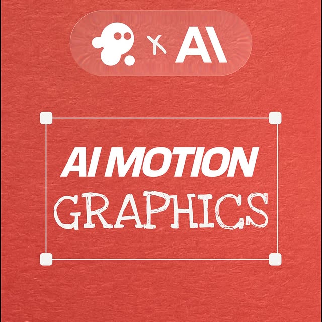
1. A dark premium SaaS visual system
The navy and teal gradients, white typography, and subtle glows place the brand firmly in modern AI-software aesthetics.
2. Headline-first communication
The clip uses strong centered text to deliver the core promise quickly. This is important because short-form B2B content often gets watched without sound at first.
3. Example-driven persuasion
Rather than listing abstract features, the video shows template outputs by category. That makes the product easier to understand in seconds.
4. Category segmentation creates clarity
Product demo, infographics, app walkthrough, educational content, and case study each speak to different buyer needs. The segmentation broadens relevance.
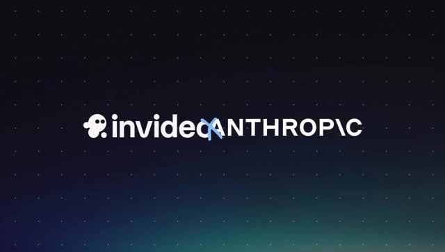
5. Brand collaboration adds authority
The co-branded opening signals that this is not just a random template teaser. It frames the launch as something aligned with major AI tooling momentum.
6. The ending cards close the loop
Returning to AI motion graphics branding and InVideo end frames gives the short video a proper product-marketing finish instead of leaving it as a loose montage.
Why It Went Viral
It makes a complex product easy to grasp
Motion graphics generation can sound abstract. By showing concrete template categories, the video helps viewers understand immediately what the tool is for.
The headline promise is strong and broad
“Beautiful motion graphics” is specific enough to be attractive but broad enough to cover many creator and business use cases. That makes the message scalable.
It is optimized for feed consumption
Fast category cards, legible titles, and high-contrast UI mockups are a good fit for social feeds where the user gives only a few seconds at first.
It appeals across creator and business audiences
Product marketers, startup teams, educators, app builders, and social-media creators can all see themselves in at least one example category.
The partnership angle increases curiosity
When a product video opens with recognizable AI branding, viewers are more likely to pause and infer that something new or strategically important is being announced.
It is highly repurposable
The same clip structure can be reused for launch posts, ad variations, landing-page embeds, investor updates, and internal enablement. That makes it a strong content asset.
How to Recreate It
Lead with one promise, not five
Start by deciding what single output category you want to own in the viewer's mind. Here, that category is AI motion graphics. Everything else supports it.
Use category examples as proof
Showing actual use cases is more persuasive than listing features. Viewers should quickly see where the product fits in their workflow.
Design a cohesive motion-brand system
Dark gradients, restrained glows, and consistent white typography make the clip feel like one product universe instead of a patchwork of random slides.
Keep transitions brisk but readable
Each card should land quickly, but not so quickly that category names become hard to process. Product trust depends on readability.
End on brand, not on demo clutter
Finishing with a clean end card helps the viewer remember the product name and positioning. Never let the last frame feel accidental.
Suggested prompt ingredients
Useful prompt phrases include SaaS launch promo, dark AI branding reel, motion graphics template showcase, product demo slide, infographic example, app walkthrough template, educational content preview, and case study motion design. These reflect the footage accurately.
What to avoid
Avoid crowded dashboards, inconsistent typography, generic stock scenes, or long feature narration. The strength of this format is clarity through examples.
Growth Playbook
Turn each category into its own follow-up reel
This master promo naturally creates a downstream content plan: one reel for product demos, one for app walkthroughs, one for educational templates, one for case studies, and so on.
Segment audiences by use case
Different buyer groups care about different outputs. A creator may care about social visuals, while a startup team may care about product demos. Category-first content supports better targeting.
Reuse the design language everywhere
Once a dark premium motion-brand system is established, it should appear in ads, onboarding, webinars, and landing pages to increase brand coherence.
Repurpose for AI prompt education
This clip is useful for prompt writers because it demonstrates how software marketing can be built from typography, screen examples, and category framing rather than human presenters alone.
Monetization and GTM angle
For software teams, videos like this support launches, paid social, conversion campaigns, outbound sales collateral, and partnership storytelling. The value is not only views but clearer product understanding.
Keep message discipline
The more features a company wants to stuff into one short reel, the weaker it becomes. This video works because it stays inside a tight promise area.
FAQ
What is the main hook of this video?
The main hook is the promise that AI can generate polished motion graphics, demonstrated quickly through multiple template categories.
Why does the dark visual style work?
It signals premium software branding and helps bright text and product examples stand out clearly.
Why show categories instead of one long walkthrough?
Because categories communicate product breadth faster and help more viewer types identify a relevant use case immediately.
Does this need a human presenter?
No. For this kind of SaaS promo, typography and template examples can carry the entire message if the hierarchy is strong.
Who can learn from this format?
SaaS marketers, AI tool builders, motion designers, prompt writers, and startup GTM teams can all learn from this structure.
What is the main creative lesson?
Use example categories to prove a product promise quickly, then close with clean brand reinforcement.