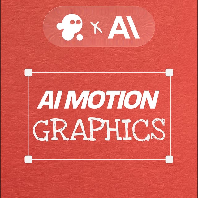
How invideo.io Framed This Anthropic Motion Graphics Launch Card AI — and How to Recreate It
This frame is intentionally boring—in the best way. It’s a clean, centered partnership bumper: two wordmarks on a dark gradient, a subtle dotted grid, and a restrained teal glow. That minimalism is not a lack of effort; it’s a strategy. When the goal is credibility and clarity, your design should remove friction, not add decoration.
For creators and small teams, this is also a great pattern to copy because it’s scalable. The same template can become a product intro, a chapter card, a transition bumper, or an end slate—just by swapping the wordmarks and keeping the style system consistent.
Why it spreads: it signals “real product” instantly
In tech and creator tools, people decide in seconds whether something feels legit. A minimal title card with clean spacing and a restrained palette is a fast legitimacy signal. It reads like professional motion design even as a still.
It also works because it’s optimized for motion. The dotted grid can drift subtly, the glow can breathe, and the wordmarks can slide in or fade with ease. Simple elements animate beautifully.
Signal table
| Signal |
Evidence (from this image) |
Mechanism |
Replication Action |
| Legibility |
Centered white wordmarks on dark background |
Readable everywhere (feed, stories, thumbnails) |
Use high contrast and keep copy to one line |
| Negative space |
Lots of empty space around the logos |
Feels premium and intentional |
Reduce elements until the layout breathes |
| Subtle tech texture |
Dotted grid/starfield pattern |
Adds depth without clutter |
Use one quiet background texture at low contrast |
| Motion-ready layers |
Gradient + dots + glow are separate visual layers |
Easy to animate into a polished bumper |
Design in layers so each can move slightly (parallax, drift) |
Use cases & transfers
Best-fit scenarios
- Product launches: partnership bumpers and feature intros.
- YouTube chapters: clean interstitials between segments.
- Reel openers: 0.5–1.5s logo hits before the content.
- Portfolio reels: makes your work feel cohesive and agency-like.
Not ideal
- Entertainment posters: you may need more narrative imagery.
- Text-heavy announcements: this template is for one-line clarity.
- Overly playful brands: minimal tech aesthetic might feel too serious.
Transfers (3 recipes)
-
Recipe 1: Partnership bumper
- Keep: dark gradient + dotted grid + centered wordmarks
- Change: swap {brand A} and {brand B}
- Slot template: “{brand A} × {brand B} centered, minimal tech title card, subtle grid”
-
Recipe 2: Feature card
- Keep: same background system
- Change: replace logos with {feature name}
- Slot template: “single feature title centered, subtle teal glow, dotted grid”
-
Recipe 3: End slate
- Keep: spacing and contrast
- Change: add one CTA line under the logo (only one)
- Slot template: “logo centered, one short CTA line, minimal layout”
Aesthetic read: restraint is what reads “expensive”
Professional motion design often looks simple because the complexity is hidden in timing, easing, and micro-movement. A restrained title card like this gives you room to add those motion details later—without fighting a busy composition.
If you want your graphics to feel like an agency deliverable, start by mastering spacing and contrast. The rest is optional.
Prompt technique breakdown (lego blocks)
| Prompt chunk |
What it controls |
Swap ideas (EN) |
| “dark navy gradient background” |
Premium base |
“pure black”, “deep purple”, “charcoal” |
| “subtle dotted grid pattern” |
Tech texture |
“noise grain”, “thin line grid”, “soft particles” |
| “soft teal glow at bottom” |
Depth and modern feel |
“magenta glow”, “blue glow”, “no glow” |
| “centered white wordmarks, one line” |
Legibility and hierarchy |
“stacked layout”, “smaller marks”, “single logo only” |
| “lots of negative space” |
Agency-like polish |
“tight crop”, “logo near bottom”, “top-left corner layout” |
Starter prompt
Minimal tech launch title card, 16:9. Deep navy-to-black gradient background with a very subtle dotted grid/starfield pattern, soft teal glow near the bottom edge, mild vignette. Centered white wordmarks on one line: “invideo” with a small rounded icon on the left, and “ANTHROPIC” on the right, with a stylized “A” mark bridging between them. Crisp vector typography, lots of negative space, no photos, no extra text.
Remix steps: build a reusable motion system
Baseline lock
- Palette: dark base + white type + one accent glow
- Layout: centered, one-line headline
- Texture: one subtle grid/noise layer
One-change rule (example 4 runs)
- Run 1: lock spacing and alignment.
- Run 2: change only the accent glow color.
- Run 3: change only the background texture (dots → thin grid).
- Run 4: change only layout (one line → stacked) and compare readability.