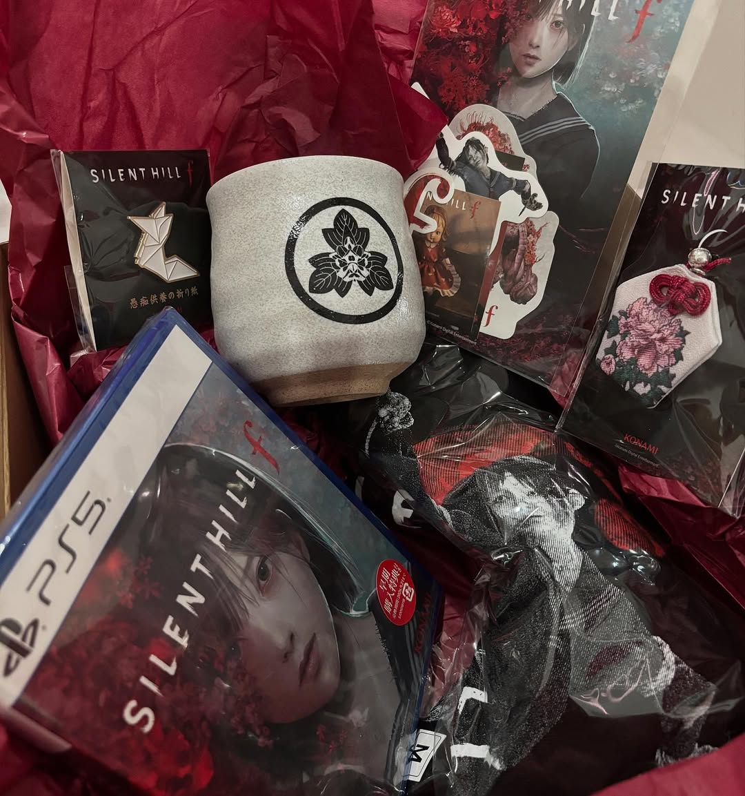
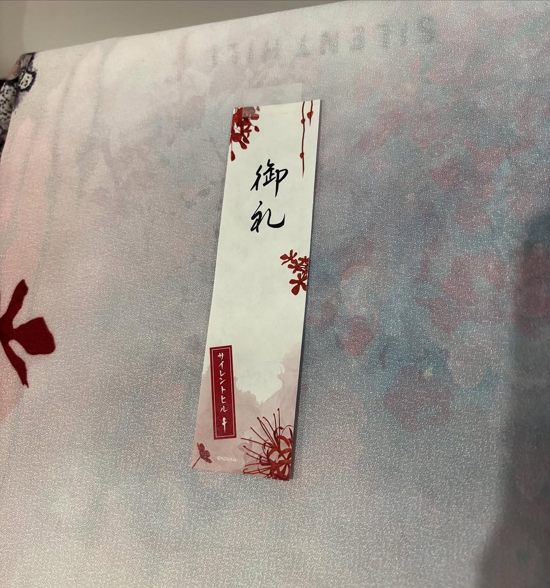
Cinta matik sm Silent Hill F, aku jenggirat pas buka paket isinya bginian 😭✨ Kotoyuki suka sama aku yah??? Ini invitation menuju Silent Hill yah??? Iyah nanti yah Kotoyuki syg 🥰🩵
Cinta matik sm Silent Hill F, aku jenggirat pas buka paket isinya bginian 😭✨ Kotoyuki suka sama aku yah??? Ini invitation menuju Silent Hill yah??? Iyah nanti yah Kotoyuki syg 🥰🩵
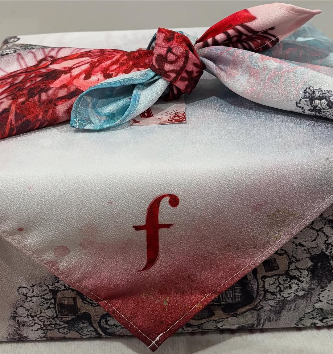
This image is a strong example of detail-led merchandising. There is no model, no dramatic scene, and no complex setup. Instead, the post focuses on texture, print language, and folding structure. That choice works because it invites viewers to inspect craftsmanship, which is exactly what drives saves and purchase intent for textile products.
The red lowercase letter, knotted top scarf, and layered illustrated print create three visual anchors. Together, they signal brand identity, material quality, and design depth in one frame. For creators and small brands, this is a high-efficiency format when you want to make your product feel collectible.
| Signal | Evidence (from this image) | Mechanism | Replication Action |
|---|---|---|---|
| Texture-first framing | Satin sheen and stitched edges dominate the crop | Tactile cues increase perceived quality | Use close crops that reveal weave, seam, and fold transitions |
| Identity marker | Small red lowercase "f" on main fold | Subtle branding improves memorability without ad fatigue | Place one minimal brand mark in a high-contrast zone |
| Layered complexity | Top knot + underlayer print visible simultaneously | Multi-layer depth rewards longer viewing | Stack 2-3 fabric layers with one intentional overlap point |
| Color restraint | Ivory base with controlled red and cyan accents | Balanced palette looks premium and collectible | Limit palette to one base + one hero accent + one minor accent |
The design power comes from controlled proximity. By moving close to the fabric, the post converts material into narrative. Shine, seam lines, and gentle shadow gradients communicate quality better than broad lifestyle scenes in this context.
Another key is directional layering: top knot, center fold with logo, and patterned base. This creates a visual path for the eye and prevents the image from feeling flat. For product creators, that layered path is often the difference between a quick glance and an actual save.
| Observed | Recreate Action |
|---|---|
| Satin micro-reflections | Use soft overhead diffusion to reveal sheen without glare |
| Visible stitching and fold geometry | Avoid over-ironing; keep natural construction lines readable |
| Localized brand mark | Place logo where fold angle naturally points viewer attention |
| Layered print reveal | Expose a secondary pattern under the main folded piece |
| Prompt chunk | What it controls | Swap ideas (EN, 2-3 options) |
|---|---|---|
| "folded satin scarf close-up" | Material feel and category clarity | "silk square", "linen bandana", "cotton neckerchief" |
| "knotted top layer with red/cyan print" | Depth and visual entry point | "twisted fold", "ribbon tie", "rolled edge knot" |
| "lowercase red brand letter" | Identity cue without heavy branding | "small monogram", "embroidered icon", "minimal patch" |
| "soft diffuse tabletop lighting" | Premium product mood | "window-light softbox", "top bounce", "neutral studio diffusion" |
| "tight layered crop" | Inspection behavior and detail focus | "macro corner crop", "diagonal fold crop", "centered flat-lay crop" |
Baseline lock: material sheen, layered fold structure, and one minimal brand marker.
If the image looks flat, increase fold overlap before increasing saturation. Structural depth usually performs better than color intensity.