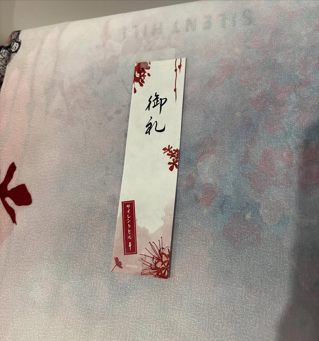
Cinta matik sm Silent Hill F, aku jenggirat pas buka paket isinya bginian 😭✨ Kotoyuki suka sama aku yah??? Ini invitation menuju Silent Hill yah??? Iyah nanti yah Kotoyuki syg 🥰🩵
Cinta matik sm Silent Hill F, aku jenggirat pas buka paket isinya bginian 😭✨ Kotoyuki suka sama aku yah??? Ini invitation menuju Silent Hill yah??? Iyah nanti yah Kotoyuki syg 🥰🩵
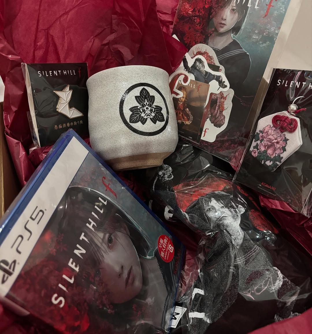
This image functions as a fandom collector spread: physical game media plus themed accessories arranged in a red-black gift-box environment. The composition immediately signals "limited merch haul" through object variety, layered packaging, and tactile contrast. It feels personal, like a curated reveal from a fan account rather than a sterile catalog layout.
The crumpled red tissue is the mood engine. It frames every item with horror-coded color context and helps unify mixed materials into one visual story.
Anchor product clarity: The PS5 case is unmistakable and instantly readable.
Merch density: Multiple accessories imply value and exclusivity.
Texture richness: Ceramic, textile, plastic, and print surfaces create tactile depth.
Color cohesion: Red/black palette supports franchise mood without extra effects.
Create a square top-down collector flat lay in a deep red and black horror aesthetic. Place a PS5 game case diagonally in the lower-left area as the hero item. Surround it with themed collectibles: pin, stickers, acrylic card, fabric charm, and small packaged accessories. Include a ceramic cup with a dark emblem near center. Use crumpled burgundy tissue as the background liner. Light the scene softly from above, preserving moody shadows while keeping product details readable. Style should feel like a premium fan haul photo for social media.
| Layer | Instruction | Result |
| Hero object | Diagonal game case in lower-left | Immediate product recognition |
| Support objects | Pins, cards, charms, stickers | Signals collector bundle value |
| Backdrop | Crumpled red tissue paper | Sets thematic horror tone |
| Material handling | Show gloss, fabric, ceramic textures | Adds realism and richness |
| Light strategy | Low-key overhead with soft shadows | Preserves mood and readability |
| Exclusions | No unrelated props or bright palette | Keeps frame coherent |
Collector post: Main image for "haul complete" updates.
Pre-order recap: Showcase what is included in bundle tiers.
Community engagement: Ask followers to vote for favorite merch piece.
Store teaser: Post as "merch reveal" tile before product links go live.
Excitement: "Finally got the full set in hand."
Detail-driven: "The textile charm and pin quality are better than expected."
Community: "Which item would you keep sealed and which one would you use?"
Keep white elements neutral so branding remains readable. Apply selective contrast in center objects only; avoid crushing shadows in corner zones. Reduce magenta cast if reds shift too pink. If publishing as carousel cover, test crop safety around game title text.
Variant A - Minimal Grid: Arrange items in cleaner rows for catalog feel.
Variant B - Candlelight: Add warm side glow for ritual-like mood.
Variant C - Desk Setup: Integrate keyboard/mouse for lifestyle gaming context.
Variant D - Archive Scan: Add light film grain and paper date tags for collector-log style.
The success of this image comes from emotional materiality: users feel the ownership moment through texture and arrangement. For fandom commerce content, that feeling often converts better than polished product-only renderings.