
Cinta matik sm Silent Hill F, aku jenggirat pas buka paket isinya bginian 😭✨ Kotoyuki suka sama aku yah??? Ini invitation menuju Silent Hill yah??? Iyah nanti yah Kotoyuki syg 🥰🩵
Cinta matik sm Silent Hill F, aku jenggirat pas buka paket isinya bginian 😭✨ Kotoyuki suka sama aku yah??? Ini invitation menuju Silent Hill yah??? Iyah nanti yah Kotoyuki syg 🥰🩵
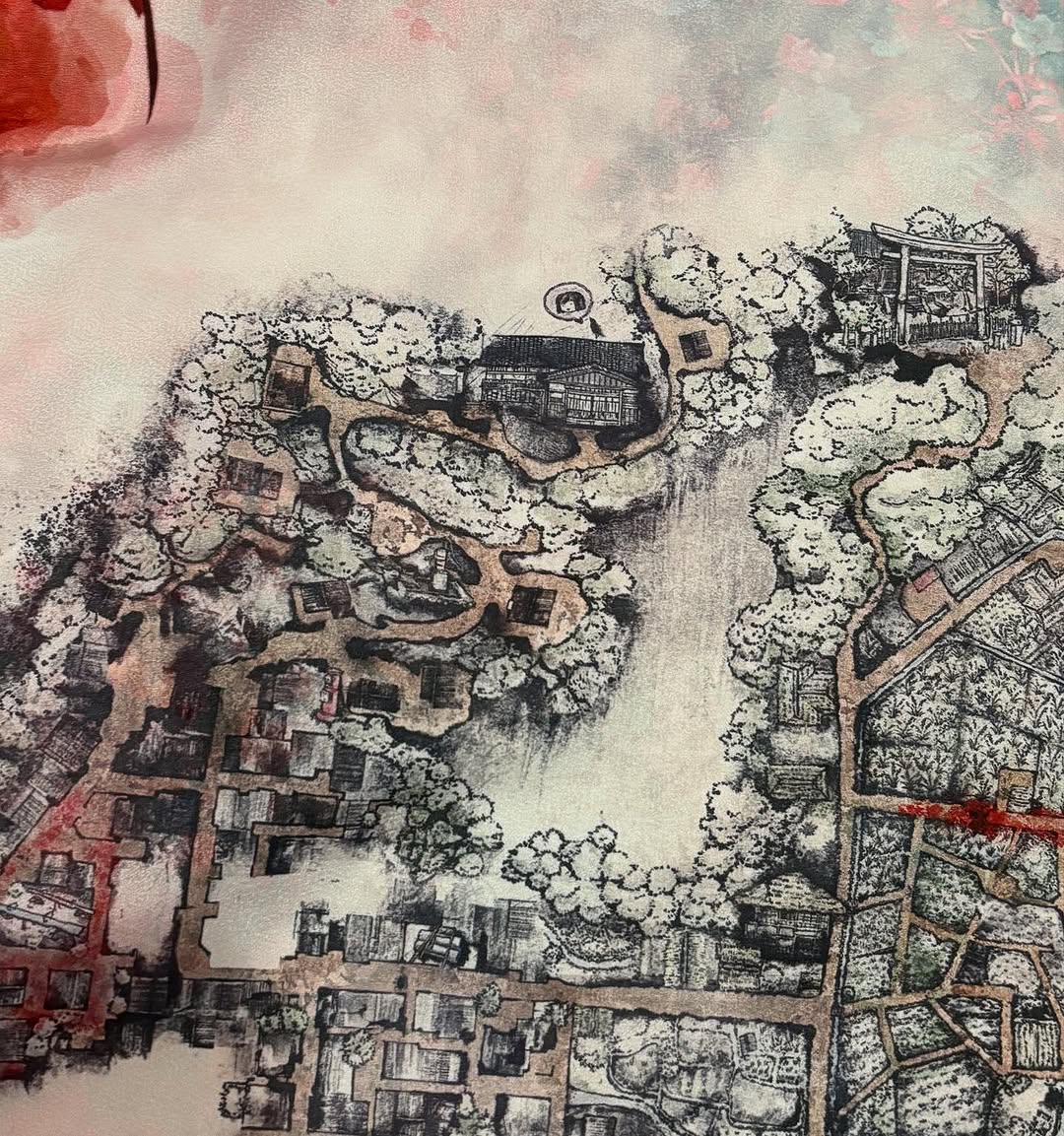
This visual reads as a cartographic memory object rather than a modern map. It does not prioritize precision coordinates; it prioritizes atmosphere, settlement rhythm, and landscape character. The center has intentionally sparse treatment, while the perimeter is rich with structures and vegetation clusters, creating a sense of historical depth.
The line quality and muted wash palette suggest archival craft. It feels like a page from a field notebook where mapping, storytelling, and local memory overlap.
Imperfection as authenticity: Uneven lines and stains make the artifact believable.
Selective detail: Dense edges + open center produce visual pacing.
Topographic poetry: Roads, blocks, and tree masses imply life patterns without explicit labels.
Material realism: Paper grain and wash bleeding anchor the analog aesthetic.
Create a square top-down hand-drawn map illustration in vintage ink-and-wash style. Use a parchment-like paper base with black and brown contour lines. Draw clustered villages, roads, tree canopies, and field parcels with imperfect sketch strokes and crosshatching. Keep the center area partially empty with fog-like wash to suggest age or unfinished cartography. Add subtle red accent traces and slight stain marks. The final image should look like a scanned historical atlas page, not a digital GIS map.
| Module | Instruction | Purpose |
| Base material | Parchment texture + watercolor wash | Establishes archival medium |
| Linework | Ink contours, crosshatching, jitter | Delivers hand-drawn credibility |
| Spatial grammar | Villages, paths, tree masses, parcels | Conveys cartographic structure |
| Negative space | Soft central void | Adds visual rhythm and mystery |
| Color policy | Desaturated earth tones + faint red traces | Keeps historical mood coherent |
| Exclusions | No GPS pins, no modern labels | Protects period illusion |
Worldbuilding asset: Fantasy or historical fiction setting map.
Exhibition graphic: Museum or culture-space interpretive visual.
Album/Book art: Cover or chapter divider for narrative projects.
Interactive lore post: Social carousel where each zone gets a story caption.
Narrative: "A place remembered before it was measured."
Design-focused: "Ink first, coordinates later."
Archive mood: "Every road is a sentence from an older language."
Keep edge vignetting subtle so map details are not crushed. Avoid over-sharpening, which can break the organic ink character. If printing, test on warm-white stock to preserve the parchment feel. For digital delivery, add a tiny scanner-like luminance variation to avoid sterile flatness.
Variant A - Monsoon Archive: Add water-run streaks and darker wash patches.
Variant B - Scholar Edition: Include tiny handwritten note fragments in margins.
Variant C - Night Cartography: Invert tonal relationship with dark paper and pale ink.
Variant D - Ritual Route: Highlight one pilgrimage path using restrained vermilion accents.
The strength of this image is its refusal to be fully literal. It invites exploration and interpretation, which makes it valuable for storytelling systems where mood and memory matter as much as coordinates. For creators, this is a reusable style framework for maps that feel lived-in rather than machine-generated.