⋆꙳•̩̩͙❅*̩̩͙‧͙ 𝙼𝚒𝚍𝚗𝚒𝚐𝚑𝚝 𝙰𝚞𝚛𝚘𝚛𝚊: 𝙰 𝚆𝚒𝚗𝚝𝚎𝚛 𝙸𝚍𝚘𝚕 𝙽𝚒𝚐𝚑𝚝 ‧͙*̩̩͙❆ ͙͛ ˚₊⋆ 3D Birthday Countdown ~ ! ✨𝘁𝗼𝗺𝗼𝗿𝗿𝗼𝘄✨ TOMORROW ON MY YOUTUBE CHANNEL~~~ !!! YAY YAY YAY ❄️12 December 2025❄️ #3DKobornday2025
⋆꙳•̩̩͙❅*̩̩͙‧͙ 𝙼𝚒𝚍𝚗𝚒𝚐𝚑𝚝 𝙰𝚞𝚛𝚘𝚛𝚊: 𝙰 𝚆𝚒𝚗𝚝𝚎𝚛 𝙸𝚍𝚘𝚕 𝙽𝚒𝚐𝚑𝚝 ‧͙*̩̩͙❆ ͙͛ ˚₊⋆ 3D Birthday Countdown ~ ! ✨𝘁𝗼𝗺𝗼𝗿𝗿𝗼𝘄✨ TOMORROW ON MY YOUTUBE CHANNEL~~~ !!! YAY YAY YAY ❄️12 December 2025❄️ #3DKobornday2025
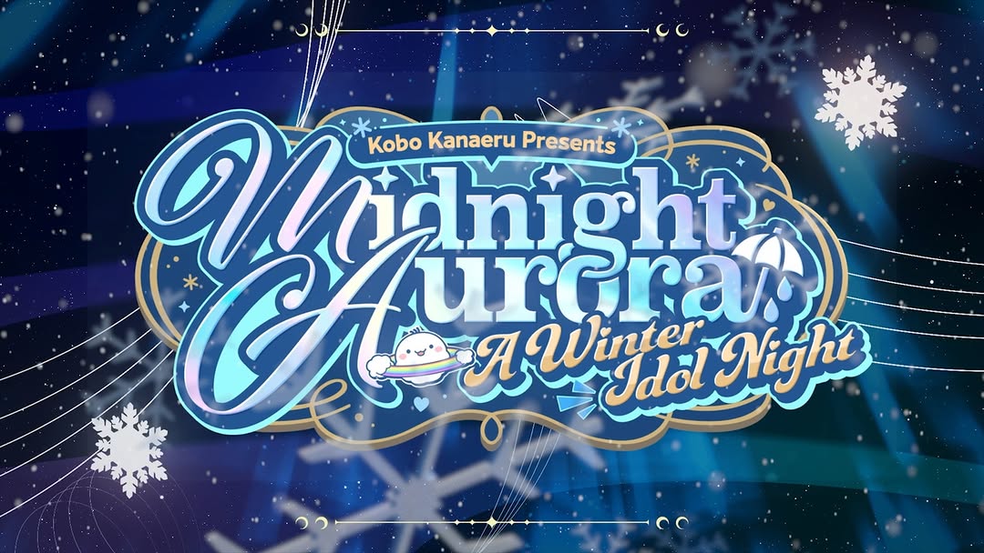
This creative is a typography-first hype asset. It does not rely on character portraits; it relies on event identity, seasonal atmosphere, and clear naming to prime audience anticipation.
Spring Festival Variant
Keep: central ornate lockup and decorative seasonal motifs.
Change: winter snow motifs to floral/petal motifs.
Slot template (EN): {presenter name} + {event title} + {season subtitle} in {theme palette}
Anniversary Live Variant
Keep: typography-led hero composition and glow effects.
Change: subtitle to anniversary milestone and date badge add-on.
Slot template (EN): {channel presents} {anniversary title} + {limited event subtitle}
Collab Stage Variant
Keep: decorative lockup and reusable countdown structure.
Change: include co-host names while preserving visual hierarchy.
Slot template (EN): {host A x host B presents} {event title} {theme subtitle}
The card functions like a logo system rather than a single post. The title uses layered strokes, glow, and shadow to remain readable over complex blue backgrounds. Snow and celestial elements stay peripheral, so they enrich theme without overpowering text. Gold accents add prestige and stage-event feeling. This is strong event design because it balances decorative density with hierarchy discipline.
| Observed | Concrete evidence | Recreate move |
|---|---|---|
| Central lockup dominance | Main title occupies majority of frame center | Scale title large enough to anchor all supporting elements |
| Seasonal ornament framing | Snowflakes and star lines around perimeter | Keep decorative elements near edges, not over main text |
| Palette coherence | Navy/cyan base with light and gold highlights | Use one dominant cool palette plus one warm accent |
| Legible complexity | Ornate script remains readable through contrast layering | Add clear outlines and spacing before adding glow effects |
| Prompt chunk | What it controls | Swap ideas (EN, 2-3 options) |
|---|---|---|
| "presenter + title + subtitle central typographic lockup" | Brand memory and event identity | "host + tour title" / "channel + live special" / "artist + concert night" |
| "winter motifs with snowfall and snowflakes" | Theme immersion | "spring petals" / "summer stars" / "autumn leaves" |
| "aurora-blue gradient and light beams" | Mood atmosphere | "purple galaxy" / "sunset amber" / "emerald night" |
| "gold decorative outlines and flourishes" | Prestige and stage vibe | "silver trim" / "neon white trim" / "minimal no-trim" |
| "16:9 title card composition" | Cross-platform promo compatibility | "1:1 feed card" / "9:16 story version" / "banner header crop" |
Change only one layer per variant: title wording, motif set, or accent trim. Keep layout grid constant so fan recognition compounds over countdown posts.