
⋆꙳•̩̩͙❅*̩̩͙‧͙ 𝙼𝚒𝚍𝚗𝚒𝚐𝚑𝚝 𝙰𝚞𝚛𝚘𝚛𝚊: 𝙰 𝚆𝚒𝚗𝚝𝚎𝚛 𝙸𝚍𝚘𝚕 𝙽𝚒𝚐𝚑𝚝 ‧͙*̩̩͙❆ ͙͛ ˚₊⋆ 3D Birthday Countdown ~ ! ✨𝘁𝗼𝗺𝗼𝗿𝗿𝗼𝘄✨ TOMORROW ON MY YOUTUBE CHANNEL~~~ !!! YAY YAY YAY ❄️12 December 2025❄️ #3DKobornday2025
⋆꙳•̩̩͙❅*̩̩͙‧͙ 𝙼𝚒𝚍𝚗𝚒𝚐𝚑𝚝 𝙰𝚞𝚛𝚘𝚛𝚊: 𝙰 𝚆𝚒𝚗𝚝𝚎𝚛 𝙸𝚍𝚘𝚕 𝙽𝚒𝚐𝚑𝚝 ‧͙*̩̩͙❆ ͙͛ ˚₊⋆ 3D Birthday Countdown ~ ! ✨𝘁𝗼𝗺𝗼𝗿𝗿𝗼𝘄✨ TOMORROW ON MY YOUTUBE CHANNEL~~~ !!! YAY YAY YAY ❄️12 December 2025❄️ #3DKobornday2025
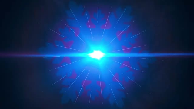
Not every post needs a character or a scene. Sometimes the best growth move is to build anticipation with a symbol. This frame is basically one idea: a midnight-blue world punctured by a bright cyan starburst. It feels like the start of something, and that feeling is what makes people follow the countdown.
The image is aggressively simple. A centered light source, a horizontal lens flare, and a dark field of negative space creates instant readability. That matters on mobile: the viewer understands it in one blink. Then the texture kicks in. Thin rays and tiny particles reward a second look, which adds dwell time.
The deeper mechanism is promise. A burst of light is not “content,” it is a signal that content is coming. Pair that with a hard date and the audience does the work for you: reminders, comments, shares to friends, and story reposts to mark the moment.
| Signal | Evidence (from this image) | Mechanism | Replication Action |
|---|---|---|---|
| Instant readability | Centered cyan core with a clean horizontal flare | Low cognitive load increases scroll-stop | Lock one centered symbol and remove everything else |
| Countdown-ready symbolism | Light burst reads as “beginning” or “reveal” | Symbolic visuals amplify anticipation | Choose one universal symbol (light, door, clock, snow) for the whole countdown |
| Premium motion-graphics language | Cinematic glow, clean rays, subtle particles | Feels like a trailer, not a random post | Use a VFX-style flare recipe and keep it consistent across episodes |
| Save value | Wallpaper-like minimal composition | Saves boost distribution and resurface the post | Design one “wallpaper frame” per campaign to drive saves |
The trailer feeling comes from restraint and glow discipline. The core is bright, but the bloom is controlled. The rays are thin, not messy. The background stays dark, so the eye has no escape. This is exactly how cinematic intros work: one focal point and one line of motion language.
If you want the same effect, think like a motion designer. Your “subject” is not a person. Your subject is the light behavior: core, flare, rays, particles, and color grading.
| Observed | Recreate | Why it matters |
|---|---|---|
| Centered cyan core | Place the brightest point exactly in the center | Creates instant readability |
| Horizontal lens flare | Add a clean flare line from edge to edge | Signals “cinematic camera” language |
| Thin starburst rays | Use fine streaks, not thick beams | Keeps the design premium |
| Dark negative space | Remove background objects and keep particles sparse | Prevents noise at thumbnail size |
| Prompt chunk | What it controls | Swap ideas (EN, 2–3 options) |
|---|---|---|
| core light + bloom | Where the eye lands | cyan core; icy blue core; gold core |
| lens flare line | Trailer / camera feel | horizontal flare; anamorphic flare; subtle flare |
| ray density | Energy level | thin streaks; sparse rays; dense starburst |
| background particles | Depth and texture | sparse dust; light snow; tiny stars |
| palette discipline | Clean vs noisy feel | cyan + navy; purple + black; teal + charcoal |
Baseline Lock: (1) centered core position, (2) horizontal flare, (3) dark negative space.
One-change rule: change only 1–2 knobs per run. Example sequence: